Janet Lawler’s final post: It’s all about story.

IT’S ALL ABOUT STORY

When I began my research on the relationship between text and art in picture books, I was hoping to uncover the “secrets” of some of the author/illustrators whose work is housed in the Northeast Children’s Literature Collection archives. I studied a number of different collections, and I am leaving with many ideas of how to improve my craft. My writing process will now include consistent creation of picture book mock-ups (dummies), and I have a greater understanding of specific approaches to writing text that “leaves room” for an illustrator.

Interestingly, though, I conclude my research with one overriding thought. The very best picture books—whether written by an author and illustrated by someone else, or created by an author/illustrator—have at their heart a good story. So authors and author/illustrators have equal opportunity to begin their creative picture book journeys in the same place – at the deep well of great stories we each have within us, stories about memorable characters who change as they solve problems or encounter conflict.

Revising text plays an important role in refining such stories (although the author/illustrator also revises art to strengthen his or her work). But always, it is the story that is the starting point. I will share a fine example:

WINGS: A TALE OF TWO CHICKENSby James Marshall

The kernel of this story appears to have been James Marshall’s vision of an old, hungry fox trying to outwit foolish fowl to find a meal. A preliminary sketch shows the disguised fox tricking a chicken into a bag.

insert_1 small

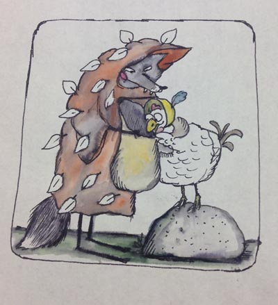
Marshall, James. WINGS: A Tale of Two Chickens. Sketch of fox bagging chicken. Series I, Box 12: Folder 217 of James Marshall Papers. All rights reserved. No reproduction of any kind allowed.

When two silly geese sisters offer to help transport the heavy bag, the fox says, “This is too good to be true.”

insert_2 small

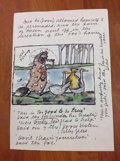
Marshall, James. WINGS: A Tale of Two Chickens. Sketch of fox and geese, in Series I, Box 12: Folder 217 of James Marshall Papers. All rights reserved. No reproduction of any kind allowed.

An incomplete, early dummy of this story line shows a “chicken crossing” sign and a fox hiding behind a tree:

insert_3 small

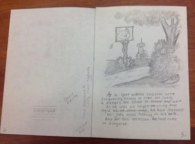
Marshall, James. WINGS: A Tale of Two Chickens. Untitled, incomplete dummy, p.3. Series I, Box 12: Folder 216 of James Marshall Papers. All rights reserved. No reproduction of any kind allowed.

The text on this opening page reads:

At a spot where chickens were

frequently known to cross the road,

a hungry fox came to stand and wait.

As he was no longer young

and agile, he had learned

to rely more heavily on his wits.

And for this occasion, he had come

in disguise.

The focus on the fox as protagonist continues in this version of the story, where we see the fox waiting in his chicken disguise:

insert_4 small

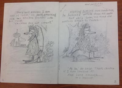
Marshall, James. WINGS: A Tale of Two Chickens. Untitled, incomplete dummy, pp. 4–5. Series I, Box 12: Folder 216 of James Marshall Papers. All rights reserved. No reproduction of any kind allowed.

However, it appears that James Marshall soon decided he could tell a better story from  another angle (the incomplete dummy ends on page 6).

The first complete dummy reveals that the plot has taken a very different turn. Marshall completely switches the beginning to focus on two chickens who are close friends (maybe the two silly goose sisters in his preliminary sketches inspired this turn); the fox still plays a key role, but he is no longer a protagonist.

The title of the book, shown on this hand-drawn dummy cover, is:

WINGS

A TALE OF TWO CHICKENS

insert_5 small

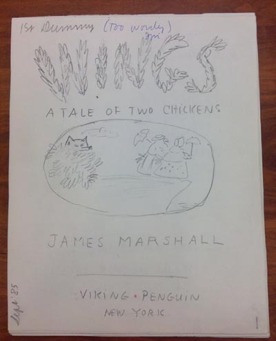
Marshall, James. WINGS: A Tale of Two Chickens. Sept. ’85 dummy, cover. Series I, Box 12: Folder 215 of James Marshall Papers. All rights reserved. No reproduction of any kind allowed.

Two chickens, with parasols, stand side by side at the edge of a precipice, and a fox hides in bushes in the background. The reader immediately knows this is a story of friendship and danger, and the first line of the dummy introduces Edna and Winnie (Harriet and Winnie in the published version) who are “as different as two chickens could possibly be.”

insert_6 small

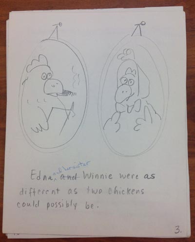
Marshall, James. WINGS: A Tale of Two Chickens. Sept. ’85 dummy, p.3. Series I, Box 12: Folder 215 of James Marshall Papers. All rights reserved. No reproduction of any kind allowed.

The first page in the published book shows the two good friends sharing tea:

insert_7 small

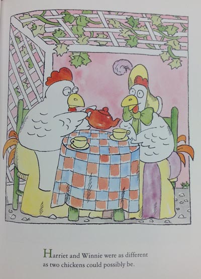
Marshall, James. WINGS: A Tale of Two Chickens (New York: Viking Kestrel, 3. Photo taken from CLC C38, Archives and Special Collections at the Thomas J. Dodd Research Center, University of Connecticut Libraries.

Edna (Harriet) loves reading and hobbies. Winnie would “rather swat flies than read” and is easily bored. Marshall sets up this pair of friends immediately, and when the disguised fox appears and offers foolish Winnie a ride in a hot air balloon, Edna (Harriet) fears for Winnie’s safety. A whole series of events follows, with the dastardly fox ultimately outwitted by Harriet, disguised as a fox. The plot twists and understated text are hilarious, and readers cheer for the friends right up until the closing page, when Harriet tucks Winnie into bed.

Marshall revised and refined his text zealously—on the top of the cover of his Sept. ‘85 draft (see above) there is a parenthetical note he wrote to himself in blue pen, “too wordy.”  The following pages are replete with red pencil cross outs and revisions, to pare the text of this story. For example:

insert_8 small

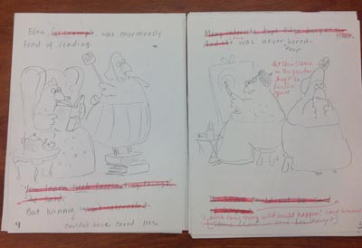
Marshall, James. WINGS: A Tale of Two Chickens. Sept. ’85 dummy, pp.4–5. Series I, Box 12: Folder 215 of James Marshall Papers. All rights reserved. No reproduction of any kind allowed.

Marshall clearly thought about pacing and forward movement as he revised. The above page 5 has a crossed-out, bracketed note he wrote to himself: [Some lead in here for story?]. He created that lead-in by penciling in the line spoken by Winnie just before the hot air balloon floats into the garden:

 “I wish something wild would happen,” said Winnie.

And the story takes off from there. James Marshall continued to revise his text to strengthen his story and characters throughout that first complete dummy, a second dummy, a final dummy, and various pages of text revised within some of his sketchbooks.

As for character growth? Winnie is at last reading a book— about foxes. She exclaims, “Mr. Johnson was a fox!” Meanwhile, Harriet hasn’t given up on her friend. “Maybe there’s hope for her yet,” said Harriet. 

insert_9 small

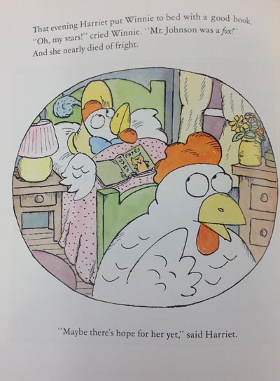
Marshall, James. WINGS: A Tale of Two Chickens (New York: Viking Kestrel, 32. Photo taken from CLC C38, Archives and Special Collections at the Thomas J. Dodd Research Center, University of Connecticut Libraries.

INSPIRATION

 I am concluding my research at the Northeast Children’s Literature Collection greatly inspired.  For several months, I have been working on a picture book, Chipmunk and Robin, about two close friends who are very different. As I polish and revise this story, I will draw on my new knowledge of how some of the best picture book story tellers (who happen to also be illustrators) craft character, crisis, and resolution into a full and satisfying story arc. Even though it will be a lot of work, the real secret is—it will be a lot of fun!

Janet Lawler’s Blog Post 2: Looking at Layers

Looking at Layers

A picture book starts with a great story told in words (and in the sound of words read out loud). Illustrations accompany the author’s story. In the best picture books, the illustrations actually expand the story. The adult reader, as well as the child listening, feast visually on these layers that enrich the text in delightful and often unexpected ways.

As a picture book author, I focus my drafting and revision efforts on the story I want to tell. An illustrator’s considerable contribution to the final product most often comes long after I am done with my personal revision process (and any revisions guided by an acquiring editor). The publisher’s editor and art director usually select, guide, and supervise the artist. So the illustrator’s role seems a bit remote to me as I ply my craft. But remembering that layers can and should be added via art will help me create opportunities for an illustrator to deepen and expand my stories.

As I study the NCLC author/illustrator archives, I am examining the layering of art in picture books created by author/illustrators, whose creative talents allow them to tackle the words and art together. Author/illustrators don’t forget to leave room for layers—they create them as the picture book progresses in a unified way. They revise both words and illustrations to create balance and get it “just right.”

What does one find in the layers added to a picture book by illustration? Here are some thoughts, based on examples from author/illustrator archival material.

 Emotion

Anita Riggio writes and illustrates from the heart. Emotion is the starting point for her wonderful stories. In Smack Dab in the Middle, Rosie Roselli is “smack dab in the middle” of her large, busy Italian family. Her many joyful accomplishments at school are ignored when she tries to share them at home, and she starts to wonder if maybe she isn’t the center of her loving family universe after all.

As I reviewed Anita’s process for Smack Dab in the Middle, I studied the text and illustrations on each spread, comparing what each separately communicates to readers. A particularly touching spread contains these words on page 20:

Rosie Roselli

really needed a hug.

She needed a hug

right this minute,

but her mother’s arms

were full of Rosie’s sister.

Rosie Roselli couldn’t wait.

She stepped up close.

She breathed in.

Talcum powder

and lavender water.

It smelled like a hug.

But it didn’t feel

like one.

Then and there,

Rosie Roselli decided

just want she

must do.

Anita’s evocative words tell us of Rosie’s need; they give the reader an expanded sense of story by dwelling on the scents (which can’t be illustrated) that she associates with her mother.

The related illustration (see below) shows Rosie’s mom’s back turned; she is attending to Rosie’s sister. Rosie’s head is bowed, her eyes are closed. The text doesn’t say, “Rosie felt disappointed, ignored, and rejected.” Those emotions are flowing from the illustration, creating a strong emotional layer to add to and support the text. (Even Anita’s placement of text and art emphasize Rosie’s loneliness here; the text snakes down the left page of this spread; there is empty space continuing onto the right page, where mom is facing away, almost out of the picture at the far right margin.)

lawler 1Riggio, Anita. Smack Dab In the Middle! (New York: G.P. Putnam’s Sons, 2002), 21. Photo taken from CLDC776, Archives and Special Collections at the Thomas J. Dodd Research Center, University of Connecticut Libraries.

Plot expansion

Sometimes, illustrations take readers to places not even mentioned in the text. In Mabel the Tooth Fairy and How She Got Her Job, Katie Davis had some ideas about what might happen to a tooth fairy who works in the dark. The starting point for such an opportunity (to take the reader places) is text that is spare and full of possibilities. Here are three variations of a line of text Katie entertained (the third is final text):

After a few false starts, Mabel was considered an expert in the field.

After a few false starts, Mabel got to really like her work.

 Working in the dark presented its own challenges.

All text versions support the three scenes shown below, although the final version perhaps is the funniest, with its spare understatement. The illustrations show the tooth fairy being accosted by the household mutt, slipping and falling on spilled “marbles,” and making noise by stepping on a toy horn.

The pictures transport the reader; the text does not say, “The dog of the house attacked me. I stumbled over a jar of spilled eyeballs…” Another whole layer of action/plot (with humor—the marble jar reads, “Slimy Eyeball Game”) has been added to the story through these illustrations.

lawler 2


Davis, Katie. Mabel the Tooth Fairy and How She Got Her Job (Orlando: Harcourt, Inc., 2003), 16. Photo taken from CLCD1438, Archives and Special Collections at the Thomas J. Dodd Research Center, University of Connecticut Libraries.


Humor

Author/illustrator Tomie dePaola also shares humor via his illustrations. His creative process for Strega Nona Meets Her Match began with a handwritten story accompanied by parenthetical notes to his editor. In this picture book, Big Anthony (Strega Nona’s loyal lunk of an assistant) “defects” to work for the competition, Strega Amelia. When Strega Amelia is away and Big Anthony is left in charge, he messes up the magic big time. Tomie’s earliest draft includes pertinent text (italicized) as well as his illustration ideas set forth in parentheses:

Big Anthony was in charge! (Series of pictures showing Big Anthony reading instructions and making big mistakes on the Husband and Wife wheel – mismatched couples – confusing wart cream and hair restorer – hair falls out, warts increase.)

Things weren’t going too well. (Source:Tomie dePaola Papers Box 41:125K).

Tomie then created illustrations (see below example of mixing up wart cream and hair restorer) to develop the humor of Big Anthony’s bumbling efforts.

lawler 3


Illustration for Strega Nona Meets Her Match, folder 125Y, Box 41 of Tomie dePaola papers. All rights reserved. No reproduction of any kind allowed.


What is interesting, however, is that Tomie’s editor suggested adding text to provide more at this point in the story, explaining that “for read aloud purposes it was important to have a few words.”  (Source:  Letter from Margaret Frith, Tomie dePaola Papers: Box 41:125L).  Ultimately, the spare text was revised as suggested, and lengthened to:

Big Anthony smiled. He was in charge.

The first day he ran the husband and wife machine backwards.

The second day he confused the wart cream with the hair restorer.

Things weren’t going well.

As an author, I suspect that this lengthier text is where I would start my writing process for the same story action. How else would a reader know of the funny mishaps I envision? One possibility would be to include brief illustration suggestions to go with spare text. However, unlike an author/illustrator, who can write such notes to him or herself or to the editor (as Tomie did), an author must tread carefully when making suggestions for art so as not to be directing or limiting the illustrator’s creativity.

The right balance of text and art is achieved on pages 21–23 of the published book (see below). The complexity of Tomie’s illustration panels benefit from the added text that helps communicate his intent and humor regarding Big Anthony’s bumbling. The added text also nicely paces the story, allowing the reader to dwell on these silly mishaps.

lawler 4

[text: Big Anthony smiled. He was in charge.]

lawler 5

[text: The first day he ran the husband-and-wife machine backward.]

lawler 6

[text: The second day he confused the wart cream with the hair restorer.]

dePaola, Tomie. Strega Nona Meets Her Match (New York: G.P. Putnam’s Sons, 1993), 21–23. Photo taken from CLDC776, Archives and Special Collections at the Thomas J. Dodd Research Center, University of Connecticut Libraries.

Authors as well as author/illustrators must be mindful that there is a balance to be found between the read-aloud component and the illustrations in a picture book. However, an author who writes minimal text (even though he or she has a vision for what an illustrator might add) may run the risk of creating a manuscript that seems too slight or unclear to an editor, or perhaps, to young readers who may need some words to decode illustrations.

Conclusion

As I write and revise stories, I’ll keep thinking about layers. I’ll remember that my words need not dwell on emotions that an artist can convey with illustrations. I will deepen stories by words that can’t be shown in the art. I’ll choose words that may give an illustrator opportunities to take my protagonist to places (literally) other than those I may have had in mind. And if I am writing “funny,” I’ll strive for spare text that will encourage a clever artist to add visual jokes and hyperbole. I shall have trust to let an illustrator help tell my story—so that “our” story will marry text and art in a truly memorable picture book.

 About Janet Lawler:

A recipient of a 2014 Billie M. Levy Research grant, Janet Lawler of Farmington, CT, is studying the relationship between art and text in picture books at the Northeast Children’s Literature Collection. Through studying the work and process of author-illustrators, she hopes to better understand how a story’s text interfaces with the art. She is searching for a deeper comprehension of why the best picture books are those where the final product is “greater” than the sum of the parts (text + illustrations). She looks forward to applying knowledge gleaned from her research to her own work process as a children’s author.

Ms. Lawler’s picture books have been published by major and specialty publishers. Two have been Children’s Book of the Month Club main selections, and two have been licensed into the Scholastic Book Clubs. If Kisses Were Colors has been translated into Spanish, Japanese, Hebrew, and Korean. Her recent credits include Ocean Counting (National Geographic, 2013 (named a 2014 Outstanding Science Trade Book by the National Science Teachers Association)) and Love Is Real (HarperCollins, 2014). National Geographic will publish Rain Forest Colors in November of 2014.


Janet Lawler’s blog post 2: Looking at Layers

Looking at Layers

A picture book starts with a great story told in words (and in the sound of words read out loud). Illustrations accompany the author’s story. In the best picture books, the illustrations actually expand the story. The adult reader, as well as the child listening, feast visually on these layers that enrich the text in delightful and often unexpected ways.

As a picture book author, I focus my drafting and revision efforts on the story I want to tell. An illustrator’s considerable contribution to the final product most often comes long after I am done with my personal revision process (and any revisions guided by an acquiring editor). The publisher’s editor and art director usually select, guide, and supervise the artist. So the illustrator’s role seems a bit remote to me as I ply my craft. But remembering that layers can and should be added via art will help me create opportunities for an illustrator to deepen and expand my stories.

As I study the NCLC author/illustrator archives, I am examining the layering of art in picture books created by author/illustrators, whose creative talents allow them to tackle the words and art together. Author/illustrators don’t forget to leave room for layers—they create them as the picture book progresses in a unified way. They revise both words and illustrations to create balance and get it “just right.”

What does one find in the layers added to a picture book by illustration? Here are some thoughts, based on examples from author/illustrator archival material.

 Emotion

Anita Riggio writes and illustrates from the heart. Emotion is the starting point for her wonderful stories. In Smack Dab in the Middle, Rosie Roselli is “smack dab in the middle” of her large, busy Italian family. Her many joyful accomplishments at school are ignored when she tries to share them at home, and she starts to wonder if maybe she isn’t the center of her loving family universe after all.

As I reviewed Anita’s process for Smack Dab in the Middle, I studied the text and illustrations on each spread, comparing what each separately communicates to readers. A particularly touching spread contains these words on page 20:

Rosie Roselli

really needed a hug.

She needed a hug

right this minute,

but her mother’s arms

were full of Rosie’s sister.

Rosie Roselli couldn’t wait.

She stepped up close.

She breathed in.

Talcum powder

and lavender water.

It smelled like a hug.

But it didn’t feel

like one.

Then and there,

Rosie Roselli decided

just want she

must do.

Anita’s evocative words tell us of Rosie’s need; they give the reader an expanded sense of story by dwelling on the scents (which can’t be illustrated) that she associates with her mother.

The related illustration (see below) shows Rosie’s mom’s back turned; she is attending to Rosie’s sister. Rosie’s head is bowed, her eyes are closed. The text doesn’t say, “Rosie felt disappointed, ignored, and rejected.” Those emotions are flowing from the illustration, creating a strong emotional layer to add to and support the text. (Even Anita’s placement of text and art emphasize Rosie’s loneliness here; the text snakes down the left page of this spread; there is empty space continuing onto the right page, where mom is facing away, almost out of the picture at the far right margin.)

lawler 1Riggio, Anita. Smack Dab In the Middle! (New York: G.P. Putnam’s Sons, 2002), 21. Photo taken from CLDC776, Archives and Special Collections at the Thomas J. Dodd Research Center, University of Connecticut Libraries.

Plot expansion

Sometimes, illustrations take readers to places not even mentioned in the text. In Mabel the Tooth Fairy and How She Got Her Job, Katie Davis had some ideas about what might happen to a tooth fairy who works in the dark. The starting point for such an opportunity (to take the reader places) is text that is spare and full of possibilities. Here are three variations of a line of text Katie entertained (the third is final text):

After a few false starts, Mabel was considered an expert in the field.

After a few false starts, Mabel got to really like her work.

 Working in the dark presented its own challenges.

All text versions support the three scenes shown below, although the final version perhaps is the funniest, with its spare understatement. The illustrations show the tooth fairy being accosted by the household mutt, slipping and falling on spilled “marbles,” and making noise by stepping on a toy horn.

The pictures transport the reader; the text does not say, “The dog of the house attacked me. I stumbled over a jar of spilled eyeballs…” Another whole layer of action/plot (with humor—the marble jar reads, “Slimy Eyeball Game”) has been added to the story through these illustrations.

lawler 2


Davis, Katie. Mabel the Tooth Fairy and How She Got Her Job (Orlando: Harcourt, Inc., 2003), 16. Photo taken from CLCD1438, Archives and Special Collections at the Thomas J. Dodd Research Center, University of Connecticut Libraries.


Humor

Author/illustrator Tomie dePaola also shares humor via his illustrations. His creative process for Strega Nona Meets Her Match began with a handwritten story accompanied by parenthetical notes to his editor. In this picture book, Big Anthony (Strega Nona’s loyal lunk of an assistant) “defects” to work for the competition, Strega Amelia. When Strega Amelia is away and Big Anthony is left in charge, he messes up the magic big time. Tomie’s earliest draft includes pertinent text (italicized) as well as his illustration ideas set forth in parentheses:

Big Anthony was in charge! (Series of pictures showing Big Anthony reading instructions and making big mistakes on the Husband and Wife wheel – mismatched couples – confusing wart cream and hair restorer – hair falls out, warts increase.)

Things weren’t going too well. (Source:Tomie dePaola Papers Box 41:125K).

Tomie then created illustrations (see below example of mixing up wart cream and hair restorer) to develop the humor of Big Anthony’s bumbling efforts.

lawler 3


Illustration for Strega Nona Meets Her Match, folder 125Y, Box 41 of Tomie dePaola papers. All rights reserved. No reproduction of any kind allowed.


What is interesting, however, is that Tomie’s editor suggested adding text to provide more at this point in the story, explaining that “for read aloud purposes it was important to have a few words.”  (Source:  Letter from Margaret Frith, Tomie dePaola Papers: Box 41:125L).  Ultimately, the spare text was revised as suggested, and lengthened to:

Big Anthony smiled. He was in charge.

The first day he ran the husband and wife machine backwards.

The second day he confused the wart cream with the hair restorer.

Things weren’t going well.

As an author, I suspect that this lengthier text is where I would start my writing process for the same story action. How else would a reader know of the funny mishaps I envision? One possibility would be to include brief illustration suggestions to go with spare text. However, unlike an author/illustrator, who can write such notes to him or herself or to the editor (as Tomie did), an author must tread carefully when making suggestions for art so as not to be directing or limiting the illustrator’s creativity.

The right balance of text and art is achieved on pages 21–23 of the published book (see below). The complexity of Tomie’s illustration panels benefit from the added text that helps communicate his intent and humor regarding Big Anthony’s bumbling. The added text also nicely paces the story, allowing the reader to dwell on these silly mishaps.

lawler 4

[text: Big Anthony smiled. He was in charge.]

lawler 5

[text: The first day he ran the husband-and-wife machine backward.]

lawler 6

[text: The second day he confused the wart cream with the hair restorer.]


dePaola, Tomie. Strega Nona Meets Her Match (New York: G.P. Putnam’s Sons, 1993), 21–23. Photo taken from CLDC776, Archives and Special Collections at the Thomas J. Dodd Research Center, University of Connecticut Libraries.

Authors as well as author/illustrators must be mindful that there is a balance to be found between the read-aloud component and the illustrations in a picture book. However, an author who writes minimal text (even though he or she has a vision for what an illustrator might add) may run the risk of creating a manuscript that seems too slight or unclear to an editor, or perhaps, to young readers who may need some words to decode illustrations.

Conclusion

As I write and revise stories, I’ll keep thinking about layers. I’ll remember that my words need not dwell on emotions that an artist can convey with illustrations. I will deepen stories by words that can’t be shown in the art. I’ll choose words that may give an illustrator opportunities to take my protagonist to places (literally) other than those I may have had in mind. And if I am writing “funny,” I’ll strive for spare text that will encourage a clever artist to add visual jokes and hyperbole. I shall have trust to let an illustrator help tell my story—so that “our” story will marry text and art in a truly memorable picture book.

 About Janet Lawler:

A recipient of a 2014 Billie M. Levy Research grant, Janet Lawler of Farmington, CT, is studying the relationship between art and text in picture books at the Northeast Children’s Literature Collection. Through studying the work and process of author-illustrators, she hopes to better understand how a story’s text interfaces with the art. She is searching for a deeper comprehension of why the best picture books are those where the final product is “greater” than the sum of the parts (text + illustrations). She looks forward to applying knowledge gleaned from her research to her own work process as a children’s author.

Ms. Lawler’s picture books have been published by major and specialty publishers. Two have been Children’s Book of the Month Club main selections, and two have been licensed into the Scholastic Book Clubs. If Kisses Were Colors has been translated into Spanish, Japanese, Hebrew, and Korean. Her recent credits include Ocean Counting (National Geographic, 2013 (named a 2014 Outstanding Science Trade Book by the National Science Teachers Association)) and Love Is Real (HarperCollins, 2014). National Geographic will publish Rain Forest Colors in November of 2014.


Meet Janet Lawler, Levy Research Grant Recipient

Blog Post 1: Author-Illustrators

 As a writer, I confess to a long-held jealousy of the author/illustrator who gets to “play” with both parts of the picture book package, from idea through publication. I somehow had the idea (prejudice?) that creating a picture book is easier for these multi-talented people because they can “see” the whole project; the story (and related art) must just flow for them. I suspected that their process would not include the painstaking attention that I give to every word, and to every one of multiple variations of a story.

Although I have had several well-received picture books published, I continue to strive to improve my craft. I decided that a study of the process of author/illustrators might well help me better understand the magical interface of text and art that occurs in the best picture books. I hope my research helps improve my skill as a picture book writer, even if unlocking the secrets of author/illustrators can’t turn me into an artist.

Because I mostly write for the very young, I started my research with archival material of author/illustrator Katie Davis, who also writes for this audience. While I have only completed a review of two of her picture books, Kindergarten Rocks! and I Hate to Go to Bed!, I have already learned so much. And I have totally discarded my assumptions and prejudices.

Katie’s author/illustrator process is meticulous and time-consuming. For I Hate to Go to Bed! I studied twenty-seven dummies that Katie created. Each one included text revisions and illustration revisions, as she tweaked her story in major and minor ways. It appeared that many of these versions were done as part of her creative process before she came to the point where she was satisfied and ready to show a dummy to an editor. (I hope to interview Katie, to confirm this and ask other questions).

I now think that the author/illustrator’s job of writing a story may even be harder than mine because he or she thinks visually and can see so many possibilities.

Text and illustration revision of I Hate to Go to Bed! by Katie Davis

As a representative sample, here are several text revisions Katie played with for the opening spread of this book:

 I hate to go to bed! This is because I’m a very outgoing person and I can’t stand the idea that I’m missing something. And I just know I’m missing something really fantastic.


I hate to go to bed. This is because I’m a very fun person and I can’t stand the idea that I’m missing something fun. And when I’m sent to bed, I just know I’m missing something really fantastic.


I hate to go to bed! My mama and daddy absolutely swear nothing good is happening and that I won’t miss anything but I’m not too sure.


I hate to go to bed! This is because I’m a very fun person and I just know I’m missing something really fantastic.


I hate to go to bed! Because I just know I’m missing something really fantastic.


I HATE to go to bed! I just KNOW I’m missing something.


I HATE to go to bed! I just know I’m missing something!


A study of the illustrations in these many dummies reveals a similar “visual” revision process. All of the dummies show a frowning little girl (Katie captured her protagonist immediately). Some of the earliest dummies show “thought bubbles” of her parents partying after she is asleep. Others show her room with piles of toilet paper rolls (from which she later makes binoculars for spying). In some, her matching fowl (ducks/chicks?) slippers are quipping back and forth.

Here are three examples of Katie’s many illustrations drawn for the opening spread of I Hate to Go to Bed!  Click on each image to enlarge.


Opening spread of I Hate to Go to Bed!, 1st dummy in Box 4: Folder 15 of Katie Davis Papers.  All rights reserved. No reproduction of any kind allowed.

Opening spread of I Hate to Go to Bed!, 1st dummy in Box 4: Folder 15 of Katie Davis Papers. All rights reserved. No reproduction of any kind allowed.


A later version, with simplified text:

Opening spread of I Hate to Go to Bed!, 2nd dummy in Box 4: Folder 18 of Katie Davis Papers. All rights reserved. No reproduction of any kind allowed.

Opening spread of I Hate to Go to Bed!, 2nd dummy in Box 4: Folder 18 of Katie Davis Papers. All rights reserved. No reproduction of any kind allowed.

And the final opening spread found in the published book:

Davis, Katie. I Hate to Go to Bed! (New York: Harcourt Children’s Books, 1999), 4-5. Photo taken from : CLDC1438, Archives and Special Collections at the Thomas J. Dodd Research Center, University of Connecticut Libraries

Davis, Katie. I Hate to Go to Bed! (New York: Harcourt Children’s Books, 1999), 4-5. Photo taken from : CLDC1438, Archives and Special Collections at the Thomas J. Dodd Research Center, University of Connecticut Libraries

The study of both text and illustrations reveals that Katie kept working the text and art, paring both to their essence.  Her final version of the first spread immediately grabs a reader and sets the stage for the storyline to play out in a well-paced way over the rest of the book.

The frowning face of the determined protagonist remains almost identical throughout all versions of the first spread. Ultimately, that face, along with twelve words in two short sentences, clearly share her BIG problem with the reader.

Throughout the many variations of the remaining storyline, Katie explores different approaches, both with art and text, to reveal how her protagonist tackles and solves her dilemma. All versions include varied layers of meaning and humor. Sometimes, the same words, illustrated in different ways, change the plot and the story’s pacing.

How will what I’ve studied so far change my own process as an author?

I plan to slow my process down to focus more clearly on my story’s essence. I will try to pare text to get to the universal—the situation, emotion, or problem that every kid can relate to in my writing.

I hope slowing down will help me to imagine different ways the story arc might play out around the universal theme. I shall play “what if?” and “why not?” with my words in a way that will let an illustrator fill in blanks. I will strive to be less wedded to the “first” story I write; there may be other words or plot angles that offer more opportunities for an illustrator.

If I am to truly leave room for an illustrator, I need to focus even more on making every single word musical and meaningful.

Writers should make dummies as part of their process

To accomplish all of the above, or to strive to do so, I plan to create a dummy (for the text) for every story I write. I have done this with some of my manuscripts, but not all, since I have developed a good sense of story arc and appropriate length for a 32-page picture book. However, I believe parsing the text of each story I write, and placing it on the pages, will further improve my craft by encouraging me to 1) better examine what words belong on each page/spread, 2) consider whether my words allow for expansion of my story through different actions/illustrations, 3) improve forward plot motion and page turns,4) evaluate alternate story possibilities and pacing, and, just perhaps, 5) “see” more clearly how a better story might be told.

I can’t wait to start! And I can’t wait to continue my research!


Meet Janet Lawler, Levy Research Grant Recipient

Blog Post 1:  Author-Illustrators

 As a writer, I confess to a long-held jealousy of the author/illustrator who gets to “play” with both parts of the picture book package, from idea through publication. I somehow had the idea (prejudice?) that creating a picture book is easier for these multi-talented people because they can “see” the whole project; the story (and related art) must just flow for them. I suspected that their process would not include the painstaking attention that I give to every word, and to every one of multiple variations of a story.

Although I have had several well-received picture books published, I continue to strive to improve my craft. I decided that a study of the process of author/illustrators might well help me better understand the magical interface of text and art that occurs in the best picture books. I hope my research helps improve my skill as a picture book writer, even if unlocking the secrets of author/illustrators can’t turn me into an artist.

Because I mostly write for the very young, I started my research with archival material of author/illustrator Katie Davis, who also writes for this audience. While I have only completed a review of two of her picture books, Kindergarten Rocks! and I Hate to Go to Bed!, I have already learned so much. And I have totally discarded my assumptions and prejudices.

Katie’s author/illustrator process is meticulous and time-consuming. For I Hate to Go to Bed! I studied twenty-seven dummies that Katie created. Each one included text revisions and illustration revisions, as she tweaked her story in major and minor ways. It appeared that many of these versions were done as part of her creative process before she came to the point where she was satisfied and ready to show a dummy to an editor. (I hope to interview Katie, to confirm this and ask other questions).

I now think that the author/illustrator’s job of writing a story may even be harder than mine because he or she thinks visually and can see so many possibilities.

Text and illustration revision of I Hate to Go to Bed! by Katie Davis

As a representative sample, here are several text revisions Katie played with for the opening spread of this book:

 I hate to go to bed! This is because I’m a very outgoing person and I can’t stand the idea that I’m missing something. And I just know I’m missing something really fantastic.


I hate to go to bed. This is because I’m a very fun person and I can’t stand the idea that I’m missing something fun. And when I’m sent to bed, I just know I’m missing something really fantastic.


I hate to go to bed! My mama and daddy absolutely swear nothing good is happening and that I won’t miss anything but I’m not too sure.


I hate to go to bed! This is because I’m a very fun person and I just know I’m missing something really fantastic.


I hate to go to bed! Because I just know I’m missing something really fantastic.


I HATE to go to bed! I just KNOW I’m missing something.


I HATE to go to bed! I just know I’m missing something!


A study of the illustrations in these many dummies reveals a similar “visual” revision process. All of the dummies show a frowning little girl (Katie captured her protagonist immediately). Some of the earliest dummies show “thought bubbles” of her parents partying after she is asleep. Others show her room with piles of toilet paper rolls (from which she later makes binoculars for spying). In some, her matching fowl (ducks/chicks?) slippers are quipping back and forth.

Here are three examples of Katie’s many illustrations drawn for the opening spread of I Hate to Go to Bed! Click on each image to enlarge.


Opening spread of I Hate to Go to Bed!, 1st dummy in Box 4: Folder 15 of Katie Davis Papers.  All rights reserved. No reproduction of any kind allowed.

Opening spread of I Hate to Go to Bed!, 1st dummy in Box 4: Folder 15 of Katie Davis Papers. All rights reserved. No reproduction of any kind allowed.


A later version, with simplified text:

Opening spread of I Hate to Go to Bed!, 2nd dummy in Box 4: Folder 18 of Katie Davis Papers. All rights reserved. No reproduction of any kind allowed.

Opening spread of I Hate to Go to Bed!, 2nd dummy in Box 4: Folder 18 of Katie Davis Papers. All rights reserved. No reproduction of any kind allowed.

And the final opening spread found in the published book:

Davis, Katie. I Hate to Go to Bed! (New York: Harcourt Children’s Books, 1999), 4-5. Photo taken from : CLDC1438, Archives and Special Collections at the Thomas J. Dodd Research Center, University of Connecticut Libraries

Davis, Katie. I Hate to Go to Bed! (New York: Harcourt Children’s Books, 1999), 4-5. Photo taken from : CLDC1438, Archives and Special Collections at the Thomas J. Dodd Research Center, University of Connecticut Libraries

The study of both text and illustrations reveals that Katie kept working the text and art, paring both to their essence.  Her final version of the first spread immediately grabs a reader and sets the stage for the storyline to play out in a well-paced way over the rest of the book.

The frowning face of the determined protagonist remains almost identical throughout all versions of the first spread. Ultimately, that face, along with twelve words in two short sentences, clearly share her BIG problem with the reader.

Throughout the many variations of the remaining storyline, Katie explores different approaches, both with art and text, to reveal how her protagonist tackles and solves her dilemma. All versions include varied layers of meaning and humor. Sometimes, the same words, illustrated in different ways, change the plot and the story’s pacing.

How will what I’ve studied so far change my own process as an author?

I plan to slow my process down to focus more clearly on my story’s essence. I will try to pare text to get to the universal—the situation, emotion, or problem that every kid can relate to in my writing.

I hope slowing down will help me to imagine different ways the story arc might play out around the universal theme. I shall play “what if?” and “why not?” with my words in a way that will let an illustrator fill in blanks. I will strive to be less wedded to the “first” story I write; there may be other words or plot angles that offer more opportunities for an illustrator.

If I am to truly leave room for an illustrator, I need to focus even more on making every single word musical and meaningful.

Writers should make dummies as part of their process

To accomplish all of the above, or to strive to do so, I plan to create a dummy (for the text) for every story I write. I have done this with some of my manuscripts, but not all, since I have developed a good sense of story arc and appropriate length for a 32-page picture book. However, I believe parsing the text of each story I write, and placing it on the pages, will further improve my craft by encouraging me to 1) better examine what words belong on each page/spread, 2) consider whether my words allow for expansion of my story through different actions/illustrations, 3) improve forward plot motion and page turns,4) evaluate alternate story possibilities and pacing, and, just perhaps, 5) “see” more clearly how a better story might be told.

I can’t wait to start! And I can’t wait to continue my research!