|
| Irene’s projected path through the densely populated Northeast as of Thursday morning. |
Last week, I created a population density map with Hurricane Irene’s projected path overlayed for the CRE Blog. The following is a brief tutorial on how to do something similar…
1. Acquire Data – For this map, I acquired three types of data: Shapefiles from the census delineating politcal boundaries, a spreadsheet containing population data and Hurricane Irene’s projected path. The two former datasets are from the US Census while the latter comes from NOAA.
1A. Acquire Tiger Shapefiles – Tiger Shapefiles, from the US Census, can be acquired here.
1B. Acquire Census Population Data – 2010 Census Population data can be found through the American Fact Finder. To specify the Geographies I want, I must select them in the Select Geographies window. I decided to use County Subdivisions (Towns) for Maine, Massachusetts, New Hampshire, New York, Pennsylvania, Rhode Island, and Vermont.

1C. Acquire Hurricane Irene Data – Hurricane GIS data can be found on the National Hurricane Center website.
2. Join Population Data and Tiger Shapefiles – After acquiring the population shapefiles and data table, it is necessary to join the two. This must be done for all the towns, except for Connecticut. For the towns in CT, I downloaded (pre-joined) shapefiles from MAGIC’s GIS data page.

In order to join the non-CT shapefiles and data tables, I must use the Join dialog box (Right-click on the layer in your table of contents, “Joins and Relates”, “Join..”). In this box, select the common field for both your shapefile, and data table; for this exercise it is the “GEOid” field. It may be necessary to open the attribute table of your shapefile and data table independently to determine the common field. Because my data is in individual shapefiles by state, I must repeat this step for each of the states.
3. Symbolize Layers – Once the population data and shapefiles are joined, they are ready to be symbolized. I chose to create a dot density map based on total population. This is done under the Layer Properties.

Dot Density is found under Quantities on the left side of the dialog box; more than one field can be symbolized at once as long as it is a part of the attribute table of the respective shapefile you are working with. Again, because my data is in individual shapefiles by state, I must repeat this step for each of the states.
This is the point at which I symbolized my point, line and polygon hurricane layers, respectively. These were more straightforward: I used a single symbol (under Features) in the Symbology tab of the Layer’s Properties.

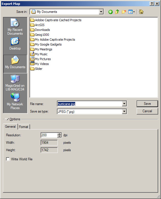
4. Export as .JPEG – Lastly, since my map was intended for web display, I chose to export it as a .JPEG (although you could also choose other common image files such as .PDF or .PNG). This can be done in the Export… dialog box which is accessed through the File tab of ArcMap.