Estimated population change for selected age groups in U.S. counties, 2010-2015

This visualization draws on another dataset made available through the U.S. Census Bureau’s American FactFinder data engine, Annual Estimates of the Resident Population for Selected Age Groups by Sex for the United States, States, Counties, and Puerto Rico Commonwealth and Municipos: April 1, 2010 to July 1, 2015.T The Census Bureau’s Population Division releases yearly data  population estimates by age, race, and ethnicity which update the most recent decennial census counts with the latest birth, death, and international and domestic migration data. The estimates’ methodology incorporates a variety of data sources including IRS, Medicare, and American Community Survey datasets, as well as National Center for Health Statistics birth and death data.

Last month the Census Bureau’s Population Estimate Program released the latest estimates for states, counties, and county subdivisions, including total estimated population for Connecticut towns as of July , 2015.

Since the 2010 Census, it is estimated that 61 towns gained population, while 108 lost population; Fairfield County gained about 3.4%, while towns in Litchfield County together lost an estimated 3.3% of their population since 2010.


State lottery system revenue and expenditures, 2014

This dashboard highlights another table available through the U.S. Census Bureau’s American FactFinder data portal:  Income and Apportionment of State-Administered Lottery Funds: 2014 from the 2014 State Government Finances data program.

The data – which includes total revenues of lottery systems, expenditures in lottery system administration and prizes, and total lottery revenue made available to fund state government – show a wide range of both public participation and approaches to state lottery administration among the 43 state lottery systems.

Compared with figures from the 2014 American Community Survey, Massachusetts had the highest lottery revenues from its adult population on a per-capita basis – about $900 of revenue for each adult 18 and over. Massachusetts also had the highest rate of payout to winners – returning  72% of gross lottery revenues in the form of prizes.  25.6% of Massachusetts state lottery revenues were made available to the state, compared with the national average of 34.6% – yet the state still ranked 4th in total lottery proceeds made available to finance other state functions – yielding more than $1.2 billion to the state in 2014.

Arkansas had the lowest percentage of lottery revenues returned to state government – 20.4% – and was the 12th most costly state system to run in terms of lottery administrative costs as a percentage of gross lottery revenue. West Virginia lottery system allocated the smallest percentage of gross lottery revenue on prizes – 17.1% – and returned the highest percentage of lottery  revenue back to the state – 77.8% –  to be made available for other government functions.


142 counties – with 92 million residents – experienced a significant increase in income inequality from 2008-2013

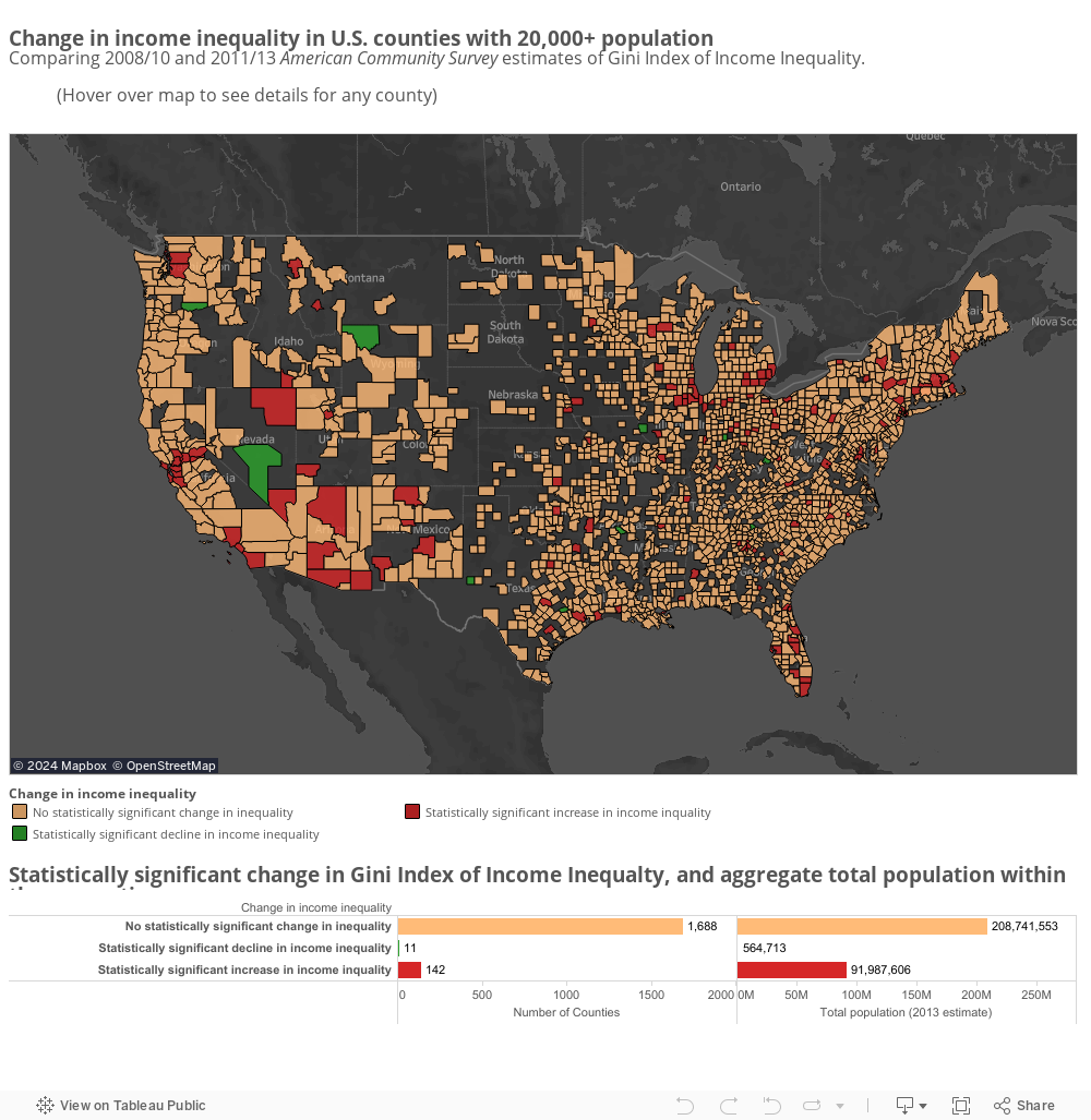
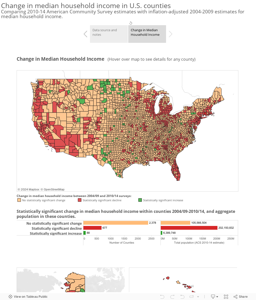
According to the U.S. Census Bureau’s American Community Survey estimates, income inequality increased significantly in 142 U.S. counties between the 2008-10 and 2011-13 survey periods. While this is relatively small compared to the number of counties where there was no significant change (1,688), almost 92 million people – nearly 30% of the U.S. population at the time – resided in these counties in 2013. Eleven counties – with a combined population of 565,00 – had significantly reduced income inequality over the 2011-2013 ACS survey period, compared with 2008-2010. Click any county in the map below to see a link to the original ACS data in the American FactFinder data engine.

This visualization uses table B19083 Gini Index of Income Inequality  from the 2010 and 2013 ACS 3-Year Estimates and compares the values for each county, and their margins of error, between the survey periods. Counties with very close Gini Index values from the two surveys (where the confidence intervals overlap) are considered not to have experienced a statistically significant change in income inequality. Counties which have an upper bound of the 2008-10 confidence interval which is smaller than the lower bound of the 2011-13 confidence interval are considered to have had a statistically significant increase in income inequality income between the two survey periods. Conversely, those counties which have a lower bound of the 2008-10 confidence interval which is greater than the upper bound of the 2011-13 confidence interval are considered to have experienced a statistically significant decline in median household income.

The 3-Year Estimates data series (now discontinued) reported data for counties with populations of 20,000 or more, so counties with smaller populations are excluded from the analysis. The counties in the map below had an aggregate total population of 301 million in 2013, compared with the total U.S. population 314 million at the time. The release of the ACS 2011-2015 5-Year data set in December 2016 will allow similar analysis for all U.S. counties, including those with populations under 20,000. Data from this survey will be able to be compared to results from the 2006-2010 5-Year data.

The Gini Index represents the concentration of income in a given state or country, in a range from 0 to 1. A higher Gini index indicates greater inequality – where income is concentrated among a relatively few individuals or households; a lower Gini score represents more even income distribution. The Gini index is a commonly used economic measure, reported by organizations such as the World Bank and CIA, in its World Factbook.

Change in median household income within U.S. counties between 2004-09 and 2010-14 American Community Surveys

This visualization compares county-level median household income from the 2004-2009 and 2010-2014 American Community Survey 5-Year Estimates and compares the confidence intervals of the surveys to determine whether there was a significant increase or decline in median household income between the surveys, or no statistically significant change. Estimates from the 2004-2009 survey were converted to 2014 inflation-adjusted dollars using the Bureau of Labor Statistics’ ‘Consumer Price Index – All Urban Consumers‘ benchmark. These adjusted figures were compared with the median household estimate from the 2010-14 ACS (which were originally published in 2014 inflation-adjusted dollars).

Counties with inflation-adjusted median household income estimates with overlapping margins of error between the two surveys (when both survey estimates are expressed in 2014 inflation-adjusted dollars) are considered not to have experienced a statistically significant change in median household income between the survey periods. Counties which have an upper bound of the 2004-2009 confidence interval which is smaller than the lower bound of the 2010-2014 confidence interval, are considered to have had a statistically significant increase in median household income between the two survey periods. Conversely, those counties which have a lower bound of the 2009-2014 confidence interval which is greater than the upper bound of the 2010-2014 confidence interval are considered to have experienced a statistically significant decline in median household income.

The American Community Survey data showed statistically significant increase in median household income in 88 counties between these survey periods; 2,378 showed no significant change, and 677 a statistically significant decrease in median household income. Notably, the majority of the U.S. population lives in the counties that showed a significant decrease in household income: according to the 2014 ACS population figures, about 202 million people – 64% of the U.S. population – resided in these 677 counties.

Note that this visualization’s inflation adjustment uses national level Consumer Price Index, which may not reflect inflation differences that exist across geographies or regional differences in housing, transportation, or other sectors. The American Community Survey confidence intervals used here are the originally published data, which was reported at a 90% confidence interval.

Educational attainment and earnings in Connecticut towns

The latest data from the American Community Survey 2010-2014 Estimates shows a clear correlation between educational attainment and median earnings in Connecticut towns. This visualization includes data on educational attainment levels for all 169 towns for persons 25 and older, as well as median earnings for men and women of different education levels. Follow the links that appear in the mouseover tooltip to download the original tables from the Census Bureau’s American FactFinder data tool.

Census Tracts Data Browser updated with latest American Community Survey Data

The map below of Connecticut Census Tracts data provides links into the Census Bureau’s American FactFinder data engine to gain easy access to tables of economic, housing, demographics and other data from the 2010-14 American Community Survey 5-Year Estimates. Hover over any Census Tract on the map to see links to eight data tables for the tract. You can use the map tools to pan or zoom into a particular area of the state, and by holding down Control (Command on a Mac), you can select multiple tracts and follow the links to see data for all selected areas. See the Instructions tab for more information.

Linked data tables include:

  • DP05 ACS Demographic and Housing Estimates: age, race/ethnicity, and housing unit counts
  • S1501 Educational Attainment: educational attainment and median earnings by level of education for the population age 25 and over
  • S2701 Health Insurance Coverage Status: insurance coverage rates by age, race, and income
  • S1101 Households and Families: characteristics of household structures
  • S1702 Poverty Status in the Past 12 Months of Families: poverty status by age, race, educational attainment, and presence of children in the household
  • DP03 Selected Economic Characteristics: unemployment, occupation,  employment by industry, and income and benefits data
  • DP04 Selected Housing Characteristics:  size, value, age, and other characteristics of housing units in the tract
  • DP02 Selected Social Characteristics: includes marital status, fertility, place of birth, language spoken at home, ancestry, and disability status characteristics of the tract’s residents

Demographic and Economic Profiles of Connecticut’s Electorate

In advance of the Connecticut primary on April 26, the U.S. Census Bureau presents a variety of statistics that give an overall profile of the state’s voting-age population and industries. Statistics include:

Electorate Profile: Connecticut


Per-pupil expenditures by school district, fiscal year 2013

This visualization uses data from the 2013 Annual Survey of School System Finances which provides per-pupil expenditures for various instructional and support services functions for over 13,000 school districts, including salaries, wages, and benefits of instructional staff, as well as administrative, instructional staff support, and other support service costs.

(Note that total per-student expenditures include expenses not included separately in Instruction and Support Services costs (see footnote [1] in original American FactFinder table).