Demographics of Oglala Lakota County

The Keystone Pipeline is an oil pipeline running from the Canadian Tar Sands in Alberta to the Gulf Coast in Texas. The plan for the fourth phase of this project proposes to run a new section of this pipeline under the Missouri River, just upstream of the Oglala Lakota sacred land. The Lakota people rely on this river for their livelihood. In the wake of the Flint, Michigan crisis, the main concern of locals is possible contamination of the water. The implications would be catastrophic leading to the inability to use the river to fish, irrigate crop land or even have clean water to drink.

This map visualizes 2 sets of data obtained from the US Census Bureau on family income and minority populations. The 2 maps show striking similarities. Upon some calculations and research into the maps it was quite apparent that the Oglala Lakota County had the highest percent minority population of any county in the entire United States. Oglala Lakota County also has the 3rd lowest mean family income in the country. It is one of three counties in the United States completely encompassed by a Native American reservation. The Lakota tribe considers the Missouri River sacred since it has been the tribes main source of life since they inhabited the land nearly 1200 years ago.

-Cody J. Crane

UConn MAGIC 2017

Discovering and Downloading USGS Topographic Maps

On a nice summer day, you may be thinking about going for a hike or exploring areas for your research. Whether you are looking for current or historical topographic maps, there are a number of options to discover and download this maps for free. Included below are examples of how to locate printer friendly, historic, and Connecticut focused USGS Topographic Quadrangle maps.

Printer-Friendly USGS Topographic Maps

Recently National Geographic released a U.S. Geological Survey (USGS) topographic map PDF Quad interface which allows users to search for a location and then obtain printer friendly topographic maps for that area in PDF format. Included below is an overview of the process for searching and downloading your own topographic map which will print on an 8.5″ by 11″ paper as a multi-page map.

  1. Go to http://www.natgeomaps.com/trail-maps/pdf-quads and scroll down to the interactive map.
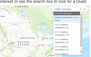
  2. In the search bar at the top right corner of the interactive map, search for a town, quadrangle, or place. search_national_geo_quad_PDF
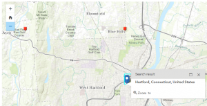
  3. The map will zoom to your area of interest. If you do not see any red pins on the map, zoom out the map by clicking the minus (-) sign on the left side of the map. pins_maps_national_geographic_quad_PDF
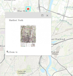
  4. Click the red pin closest to your location of interest, this pin represents the center of the topographic quadrangle which covers the area. The pin will display a preview quadrangle map. Click on the quadrangle map image. map_preview_national_geographic_quad_PDF
  5. This will download a PDF map of the quadrangle map which includes a total of 5 pages, the first being an overview quadrangle map, the next 4 maps which include a section of each quadrangle. These maps are designed to be printed on 8.5″ by 11″ paper and include scale, latitude, longitude, along with all the other details included on a USGS topographic map. If you want to know more about the different symbols on the map, check out the USGS Topographic Map Symbols legend.

Historical Topographic Maps from USGS

The USGS also offers a national index of digitized historical topographic maps called topoView which allows you to search by location for historical topographic maps and to download the maps in JPEG, KMZ, GeoPDF, and GeoTIFF format. While these maps may not be as printer-friendly as the PDF Quads from National Geographic, the topoView interface provides nationwide access to historical topographic maps at a range of scales. Included below is a quick overview of how to use the topoView interface:

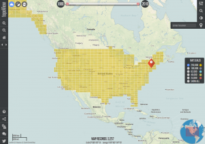
  1. Go to http://ngmdb.usgs.gov/maps/topoview/ and click on Get Maps.topoView_interface
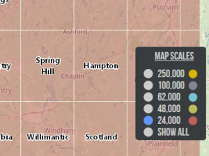
  2. From the topoView browser, search for a location and hit enter. This will zoom the map to area of interest. From the map scales menu (along the right side of the map screen) select the map scale you are interested in viewing or select Show All to see all the scales available. topoView_mapscales
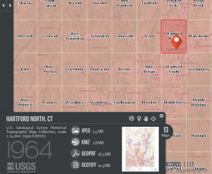
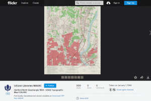
  3. Click on the orange map pin to bring up the map preview and download menu which will appear in the bottom left corner of the map. This will provide the option to download the map in JPEG, KMZ (Google Earth friendly format), GeoPDF, and GeoTIFF formats. If there is more than one map available, just to the right of the preview map will be a link with the number of maps available. In the sample below there are 13 historical maps to choose from for Hartford North, Connecticut.topoView_map_preview

Connecticut Historical Topographic Maps from MAGIC

If you are interested in more topographic maps for Connecticut, MAGIC offers a number of digitized topographic quadrangle maps which can be accessed via MAGIC’s website with a majority of this historic topographic maps available via the topoView application. Included below is a quick outline of how to locate and download topographic maps for areas in Connecticut from MAGIC’s website:

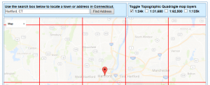
  1. Got to http://magic.lib.uconn.edu/topographic_maps.html and from the interactive Connecticut USGS Topographic Maps Mash-up interface, search for town (ex. Hartford, Connecticut).
  2. The map will zoom to the area of interest which will show a pin and an outline of the topographic quadrangle(s) nearby. Multiple scales of topographic maps may be available for your area and you can select which scale you want from the Toggle menu along the top right corner of the interactive map interface. More detailed maps will be at 1:24k scale while more general maps will be available at higher scales up to 1:125k.magic_topographic_maps_interface
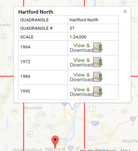
  3. Click the topographic quadrangle outline which covers your area and a pop-up menu will appear. Select the map of interest and click the View and Download link.magic_topographic_maps_interface_popup
  4. This will take you to MAGIC’s Flickr page where you can download the map as a JPEG (down area in right corner of map view window) or as a full-quality TIFF image (link is located below image). magic_topographic_maps_flickr

Three separate interfaces, each providing access to USGS topographic maps and providing access to current and/or historical quadrangle maps. Enjoy exploring each interface!


US Census Bureau tools

Several new tools have been made available by the US Census Bureau to aid in performing research. The following have been released recently:

My Congressional District App

  • Allows users to find basic demographic and economic statistics for every snapcongressional district in the US. Uses latest annual statistics from the American Community Survey.
  • Users can sort through stats in 5 key categories. Summary level statistics cover education, finance, jobs and housing, as well as basic demographic info. Can be downloaded and shared with others.
  • A selected district can be embedded on a user’s own webpage.

Tool for Assessing Statistical Capacity (TASC)

  • Sponsored by the U.S. Agency for International Development (USAID).
  • Measures overall capacity of a country’s national statistical office to conduct population and housing censuses or surveys.
  • Tool aids them in identifying areas where improvement is needed and can help them justify the need for additional training or funding for hardware and software. It also provides an objective, quantitative assessment of areas of strength and improvement over time.
  • The TASC takes roughly four days to administer, with scores calculated from answers provided by the staff of these offices. Specific areas measured by the TASC include mapping, questionnaire content and testing, sampling, field operations, data processing, data analysis and evaluation, and data dissemination.
  • The Census Bureau’s International Programs Center for Technical Assistance is available to administer the TASC and provide technical support on a reimbursable basis that addresses the primary needs of the statistical office as identified by the scores. However, the TASC is available to any expert for assessing statistical capacity. The TASC toolkit can be downloaded online at

Census Bureau Interactive Language Map

  • The map pinpoints the wide array of languages spoken in homes across the nation, along with a detailed report on rates of English proficiency and the growing number of speakers of other languages.
  • The 2011 Language Mapper shows where people speaking specific languages other than English live, with dots representing how many people speak each of 15 different languages. For each language, the mapper shows the concentration of those who report that they speak English less than “very well,” a measure of English proficiency. The tool uses data collected through the American Community Survey from 2007 to 2011.
  • The languages available in the interactive map include Spanish, French, French Creole, Italian, Portuguese, German, Russian, Polish, Persian, Chinese, Japanese, Korean, Vietnamese, Tagalog and Arabic. After selecting one of these languages from the menu, users will see a national population density map, with each dot representing about 100 people who speak the language at home placed where these speakers are concentrated. The map also allows users to zoom in to a smaller geographic area, where each dot represents 10 people. The dots were placed in a random location within census tracts to protect the confidentiality of speakers.

Summer 2013 Geofocus Newsletter

GF_SummerThe Summer 2013 issue of Geofocus is out!  Please visit the CT User to User website to access the newsletter: http://ctgis.uconn.edu/resources/newsletter.htm

In this issue, we here at MAGIC have announced that there are now 2 new aerial photography centerpoint indexes available in KML format, and .shp format coming soon! The indexes are for the 1934 and 1965 aerial photography collections, which encompass the entire state.

The indexes can be used to preview photos and to download a TIFF or PDF version of the photograph. The indexes serve as a reference point for the photographs, and none of the photographs have been georeferenced or orthorectified.

To access the indexes, please visit our website: http://magic.lib.uconn.edu/connecticut_data.html#indexes

Are you a pixel?

Many social media sites allow the option for “geotagging” – letting others know where you did something. Where you took a photo, where you made a comment or status update, etc. Obviously the most common two are Twitter and Facebook, but more and more applications ask for your location when you share a bit of information such as a status update, a photograph, or a 140-character bit of wisdom. Though this might seem relatively mundane, the location where you did or said something combined with what that thing was is one of the most powerful datasets available to not only geographers, but a slew of other disciplines including psychology, sociology, marketing and anthropology, to name a few. It is now apparent that a person, or the location where a person does something, is a data point or pixel in the context of the image that is the wider data world. So make your data count!

peoplepixel

People as pixels: Image by artist Craig Alan and from TechEBlog

Though this is not a new concept by any means, every day more and more individuals are using this information or finding new ways to create interesting and informative maps or visualizations that provide commentary on location-specific attributes of not only the United States, but the world. In addition to maps that contain spatial data, there are visualizations of textual data from social media sources, and social media and crowd-sourced mapping have also been used for crisis-mapping situations. For example, using the Twitter Search API, ESRI created maps that include a spatial representation of tweets overlaying other information for both the 2011 Japan earthquake, and the recent tornadoes in Oklahoma. Facebook even has its own page called Facebook Data Science that gleans information and creates visualizations that it posts.

Though this post is only skimming the surface of much broader academic and theoretical issues, here are some examples of maps and visualizations that we appreciated, and even some ways that you can make your own. If you know of other interesting examples that we missed, let us know!

The Geography of Hate

  • Using Twitter, all tweets containing each ‘hate word’ were aggregated to the county level and normalized by the total Twitter traffic in each county.

Geography and Football

  • Based on user’s status messages and their relationship to others, Facebook created a map showing locations of where people lived who supported specific teams.
  • This blog post went even further with that map, to try to explain some specific unexpected distributions (i.e. Minnesota Vikings fans living in North Carolina).

Mapping the world by “check-ins”

  • This map, posted on Facebook Data Science and created by Paul Butler in 2010, shows an image of the world created by visualizing where people “checked-in” on Facebook – each pixel represents 3 check-ins. The visualizations are stunning.
4s

Image courtesy of Joel Salisbury

Foursquare, in collaboration with Samsung, has recently also created the “Time Machine,” which allows users to create infographics of all of their check-ins, “ever”! Foursquare users can access this feature by going to http://www.foursquare.com/timemachine. In addition to the creation of a beautiful map (see below), foursquare will crunch the data to create graphs and other comparisons between types of places visited, recent check-ins, frequent connections, most visits to specific locations, and all kinds of mind-boggling statistics you might not have known about yourself until you see them summarized in a pretty image.


Other maps that have recently been in the news include 122 that depict dialect differences itsgrinderfor different regions in the United States. Joshua Katz, a PhD student in Statistics at UNC created a model to define dialect regions based on The Cambridge Online Survey of World Englishes, by Bert Vaux and Marius L. Jøhndal. The”Results” tab on their website also shows maps of various responses as points if you log in and take the survey yourself. Though only 22 of Joshua’s maps were published in this Business Insider article, all 122 can be seen here. Being from Rhode Island, I was a little surprised that “grinder” didn’t make it on to the subs vs hoagies map and similarly shocked that over 80% of respondents in Providence, Hartford and Boston said it was called a “sub”!)

Edit: Because I was so surprised by the lack of “grinder,” I went back to look at the original survey point data from the Cambridge Online Survey. Sure enough, the responses in the Northeast are much more nuanced than the above map suggests. Not only is “grinder” a fairly common response, but so is “hero” in the NYC and Long Island area. Neither response is really represented in the map above. Below is the map of the original point data. Another copy can also be accessed here.

NE_englishsurvey


legend


Finally, if you’d like to do some textual mapping, this article explains how to download your Twitter archive and create a word or tag cloud that visualizes your interests or most commonly-tweeted themes (a word cloud for this post is below!). Similarly, if there is a topic you find interesting, http://searchhash.com/ will allow you to search for every few days’ worth of hashtag topics on Twitter.

SM_wordmap


Another edit – just discovered a map, via GISLounge, where Twitter users are mapped globally by the type of smart phone that they use. You can pan and zoom to look at specific areas of the world. Pretty amazing!

http://www.mapbox.com/labs/twitter-gnip/brands/#10/41.4402/-71.7325

Metro/Micropolitan Populations

Oil and Gas Boom Driving Population Growth in the Great Plains, Census Bureau Estimates Show

According to recent Census Bureau estimates, metropolitan and micropolitan statistical areas (MSAs) and counties located in or near the Great Plains and West Texas were among the fastest growing areas last year. Midland, Texas, was the fastest-growing metro area over the July 1, 2011 to July 1, 2012 period with a population increase of 4.6 percent.

The 10 Fastest Growing Metro Areas from July 1, 2011, to July 1, 2012
Percent Increase
1. Midland, Texas 4.6
2. Clarksville, Tenn.-Ky. 3.7
3. Crestview-Fort Walton Beach-Destin, Fla. 3.6
4. The Villages, Fla. 3.4
5. Odessa, Texas 3.4
6. Jacksonville, N.C. 3.3
7. Austin-Round Rock, Texas 3.0
8. Casper, Wyo. 3.0
9. Columbus, Ga.-Ala. 2.9
10. Manhattan, Kan. 2.8
MSAPopgrowth

Click on image to interact with map/data

The 10 Fastest Growing Micro Areas from July 1, 2011, to July 1, 2012
Percent Increase
1. Williston, N.D. 9.3
2. Junction City, Kan. 7.4
3. Dickinson, N.D. 6.5
4. Andrews, Texas 4.7
5. Vernal, Utah 4.1
6. Heber, Utah 3.8
7. Elk City, Okla. 3.5
8. Elko, Nev. 3.5
9. Pullman, Wash. 3.4
10. Fort Polk South, La. 3.2

micropopgrowth

East Coast Power Outage Maps

https://www.ssd.noaa.gov/goes/east/eaus/rb-l.jpg
From the National Hurricane Center

As Hurricane Sandy approaches the Mid-Atlantic and New England here are some online resources to keep track of power outages.  We know that if you lose power these sites will be of little help, but you could share them with friends and relatives at a distance so they can give you updates.

Virginia:
Dominion Electric 

Maryland:
Maryland Power Outages 

Delaware:
Delmarva Power 
Delaware Electric Co-op 

District of Columbia:
Pepco

New Jersey:
Jersey Central Power and Light
PSE&G

Pennsylvania:
Multiple Carriers from First Energy

New York:
ConEdison
National Grid (Upstate)
Long Island Power Authority (LIPA)

Connecticut:
Connecticut Light & Power
United Illuminating Company

Rhode Island:
National Grid

Massachusetts:
National Grid
Western Massachusetts Electric

Vermont:
Vermont Outages

New Hampshire:
Public Service of New Hampshire
New Hampshire Electric Co-op

Maine:
Central Maine Power 

As always never forget to check with the National Weather Service and the National Hurricane Center for further update.  Be safe!

Using GIS to Evaluate Vulnerability to Climate Change: A Case Study of Martha’s Vineyard

Dukes County, Massachusetts is composed of the county subdivisions on the island of Martha’s Vineyard and the Elizabeth Islands, which form the town of Gosnold. A few weeks ago, I completed my M.A. thesis in the Geography department which investigates where climate change could impact Dukes County. My study evaluates vulnerability to climate change through the examination of social vulnerability and vulnerability to climate sensitive hazards (i.e. sea level rise and storm surge events) and is designed to coincide with the jurisdiction of the Martha’s Vineyard Commission. The thesis includes maps created in ArcMap, with data from MassGIS, that locate vulnerable areas in the county as well as quantify the potential impact of hazards on specific land use categories. Additionally, a social vulnerability index quantifies vulnerability based upon demographic data from the 2010 Census and 2010 American Community Survey.

The overarching goal for this project was to develop a theoretical framework that serves as a GIS-based decision support system for policy makers to determine where climate change adaptation policies are needed. This framework is operationalized through a case study of vulnerability of Dukes County, Massachusetts. The abstract of the study can be seen below:

Climate Action Plans (CAP’s) are recent innovations in policy that have been catalyzed by a need to adjust the relationship between human activity and the Earth’s climate system. CAP’s often are composed of methods to mitigate greenhouse gas emissions in addition to adaptation strategies. Research indicates, however, that many plans focus on mitigation strategies while adaptation policies related to predicted changes caused by climate change are often overlooked. This thesis presents an integrative framework for locating areas that are in need of adaptation strategies through a GIS based decision support system that visualizes vulnerability. It is operationalized through an empirical study of Dukes County, Massachusetts.


Dukes County is a New England county composed of the islands of Martha’s Vineyard and Gosnold. The county has a long history of commercial fishing, but more recently caters to affluent seasonal tourists. With both economic activities heavily reliant upon the ocean as a resource, climate sensitive hazards, such as sea level rise and tropical storms, pose an important risk to the population, built environment, and the natural environment that has made the study area a highly desirable New England tourist destination.

The results of my case study conclude that long term climate processes have shaped the way in which Dukes County has developed through the geomorphic influence of the last glaciation. The up-island towns of Martha’s Vineyard (Aquinnah, Chilmark, & West Tisbury) and Gosnold differ in geography- both physically and socially- from their down-island counterparts (Edgartown, Oak Bluffs, & Tisbury). This geographic variation results in an unequal distribution of vulnerability related to climate sensitive hazards distributed throughout the county, which have been identified as storm surge events in addition to chronic sea level rise. Generally speaking, my study concludes that…

Flatter land that is also lower in elevation down-island has traditionally been developed and inhabited more than the up-island land of Martha’s Vineyard and the islands of Gosnold. Consequently, larger populations and more developed land are at risk to hazards whose exposure is largely dependent upon elevation, like storm surge and sea level rise (down-island). 

The full text of this study is now available online through Digital Commons@UConn: An Integrated Approach for Developing Adaptation Strategies in Climate Planning: A Case Study of Vulnerability in Dukes County, Massachusetts

Historical Aeronautical Navigation Maps at MAGIC

Today in the United States we can fly coast to coast in a commercial airliner comfortably in less than 6 hours. Air travel has not always been this easy or seamless. Historical air navigation techniques and practices can help us envision the beginnings of air travel and air mail, and really show how drastically aviation navigation technology has evolved in just over 100 years of flight. To help relive and appreciate air navigation from the onset of commercial flight, the University of Connecticut Libraries Map and Geographic Information Center (MAGIC) brings you an interactive index to help users identify flight routes commonly used for passenger and air mail service in the 1920’s and 30’s. Back then there was no such thing as hitting the direct button on your Garmin and following the pink line to your destination!
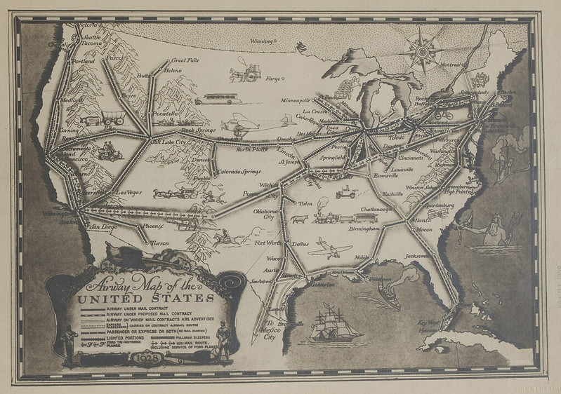
The creation of this historical aeronautical navigation chart index provides pilots and aviation enthusiasts with a glimpse into how far air navigation methods and technology have progressed since the inception of powered flight. The University of Connecticut Map and Geographic Information Center (MAGIC) includes an extensive collection of navigation charts spanning in time from 1923 through 1935. There are more than 150 charts in the collection that span across the contiguous United States. Pilots at the time used the charts for navigation purposes including airmail delivery and the first commercial passenger service provided by the Ford Tri-Motor aircraft. Ford Motor Company produced an artistic route overview map in 1928 that is contained in the collection.
When the collection was digitized by the University of Connecticut Libraries in spring of 2011, Trevor was in the process of trying to procure an internship as part of my undergraduate major in Geography for fall 2012. When Trevor mentioned his interests and background to the staff at MAGIC, immediately a project was identified to georeference and create an interactive index for the collection of historical air navigation maps from MAGIC’s collections. The project focused on developing an interface for fellow pilots and enthusiasts to access and appreciate these relics of aeronautical navigation technology that bear many striking resemblances to aeronautical sectional navigation charts of present day. In preparation for this project, the historical navigation charts would be digitized using a high-resolution camera in multiple sections over the summer of 2011 to be later digitally reassembled. For more information on the digitization equipment utilized by the University of Connecticut Libraries visit: http://digitalcollections.uconn.edu/equipment/equipment.html.  
In the fall, Trevor began the process of creating mosaics of two images captured for each chart. After a mosaic was created and the complete charts were saved in raw uncompressed TIFF format, they were ready to be georeferenced. Georeferencing the image provides a way for each map to be overlaid within GIS software applications, Google Earth, Google maps and other applications in a spatially meaningful way. Trevor Utilized Adobe Photoshop to convert the JPF files from the digitized original photographs to TIFF images, and then created mosaics of the full charts. It was a slow and tedious process and had to be done with great care so that the georeferencing would go smoothly and with minimal error. It took an entire semester and a few weeks of another semester to complete the mosaicing and georeferencing of each image. Once this was completed the files were digitally archived.
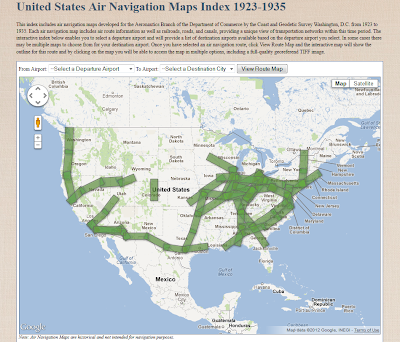
To make these maps accessible to the public, an index was created to enable users to easily locate and identify maps for specific routes. To create this index, ESRI’s ArcGIS ArcMap 10 software was used to create a shapefile based on the geographic extent of each map. Then this shapefile was converted to a Keyhole Markup Language (KML) file for viewing with Google Earth and Google Maps. The KML file was then uploaded to Google Fusion Tables and joined to a spreadsheet that included links to each air navigation map. To ensure the index interface was easy to use, the Google Fusion Tables map interface was customized using the Google Fusion Tables API to develop custom dropdown menus and to refine the appearance of the map. This index will enables users to locate and download full-quality georeferenced images of each map and will be the first time that these historic air navigation charts will be easily identified and made available for public viewing and use. 
Interface for viewing air navigation maps in the MAGIC collection

Using ArcGIS Online to Create and Share Interactive Web Maps — CLEAR workshop on June 7, 2012

UConn CLEAR’s Geospatial Training Program has just announced a new one-day training on Esri’s ArcGIS Online. The course will focus on the ArcGIS Map Viewer and ArcGIS Explorer Online. Topics will include creating and publishing interactive maps on the web, integrating GIS data, sharing maps and working with groups on ArcGIS Online, working with the Esri smartphone app and more! The training consists of short lectures and demonstrations followed by hands-on exercises and over the shoulder guidance from instructors.
When: June 7, 2012
Where: UConn Extension, Haddam, CT
Cost: $150
For more information about this and other GTP course offerings visit http://clear.uconn.edu/geospatial/training.htm or contact Cary Chadwick at 860-345-5216.
Other spring 2012 trainings include:
Intro to desktop GIS: April 18-20 and June 20-22 
Intro toModelBuilder for ArcGIS: April 25
Intro to Python Scripting: May 1-2 
Intro toGPS: June 14-15