Map of the Week #8


This “Map of the Week” post was inspired by some maps that were given as a gift. Yes, the best maps are the ones freely given! These maps came to me by a friend at the WV GIS Technical Center a couple years ago.

The best thing about these maps is that they came with a book! The book’s title is “Annual Report of the State Geologist for the Year 1907” The reports included within are:
The maps within outline the report on the Inland Waterway that may have more than a strong connection to the Intracoastal Waterway that was authorized in 1919 by the United States Congress. Below are the maps included with the text that can’t be found at Google Books or The N.J. DEP. As always the maps are available to download from MAGIC’s Flikr account! Click on the sheet title above each map for the corresponding Flikr page.
Additionally, you can view and download the report from the New Jersey Departement of Environmental Protection here. At the previous link you will have access to the Annual Report of the State Geologist for many different years.
If you want to examine current Intracoastal Waterway navigation maps, check out NOAA’s Office of Coast Survey Online Chart Viewer. This link will bring you to a portion of the New Jersey Intracoastal Waterway, while this link will bring you to an index of all the available charts for the Intracoastal Waterway for online viewing.
All this talk get’s me in the mood to go sailing! Maybe I should sign up for some lessons first?

MAGIC 2.0: Using GIS to Empower K-12 Curriculum Development.

ABSTRACT


Continued integration of spatial data sets into emerging web mapping platforms has increased the opportunities for non-expert users of GIS to perform spatial analysis. These web mapping platforms have become user-friendly and can enable the development of GIS resources and maps for learning opportunities in the K-12 environment. This poster will illustrate how the University of Connecticut’s Libraries Map and Geographic Information Center – MAGIC has developed simple learning experiences using GIS data and Google Maps which can be integrated within the K-12 curriculum. Through the blog “Outside the Neatline” MAGIC hopes to display a vast array of sample lesson plans/activities which integrate Web GIS and Maps, and is developing resources which encourage educators to integrate spatial thinking skills in an interdisciplinary fashion.


Outside the Neatline is a blog that began as a collaborative effort of graduate students who work at MAGIC with an aim to give the public a better understanding of what geographers do and how to use web mapping platforms. The blog grew and potential learning applications in the classroom using this site became evident. What we hope to illuminate now is the usefulness of historic maps, digitally storing and displaying paper maps, and how they may be used in current web mapping platforms. Our delivery mechanism just happens to be Outside the Neatline, which is composed of the following features:


Did You Know?

The “Did you know” segment of Outside the Neatline features how GIS professionals use geography everyday by professionals in the industry. Additionally, this category reports on news items, opportunities, and innovations in the field of Geography. These items are worth reporting on as it demonstrates that geographical concepts have concrete applications in the world outside of the classroom.


How in the World?

Demonstrates how geographic information from everyday sources (paper maps, GPS, literature) can be transformed into digital geographic information for use in a Geographic Information System. The importance of this category shows students that current digital geographic information comes from existing primary and secondary print resources.
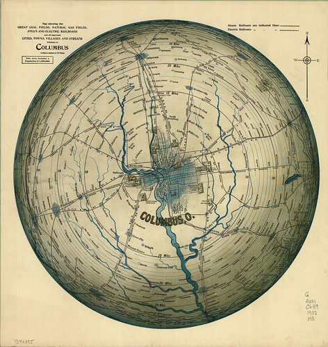
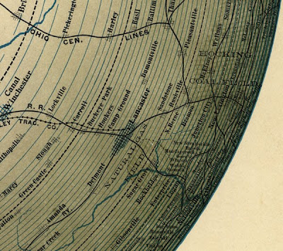
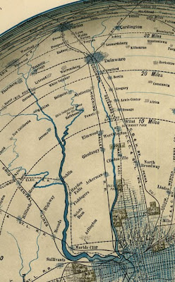
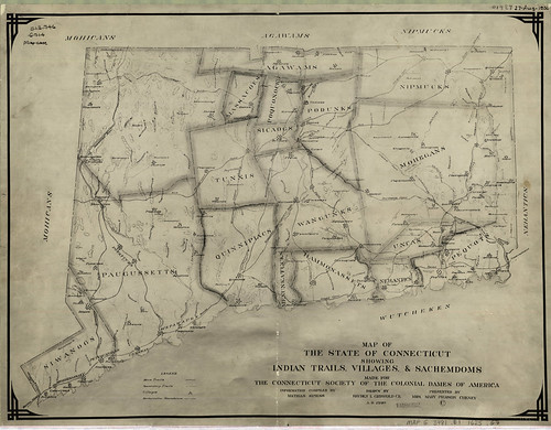


Map of the Week

Map of the Week draws its strength from bundling together many different content areas with a map as the common element. The featured map captures many different elements:


History

Maps are inherently temporal, freezing a moment in time. Often the maps content are directed by the context of when and where they were created. Outside the Neatline takes advantage of this information and provides a brief historical summary, web links to significant events, figures, and places related to the map, and when available photographs to illustrate the importance of that map.


Reading and Writing

The “Map of the Week” web feature is created in such a manner that there is much more then images to peer at. As described in the history portion a brief written history is included with web links to other informational websites. When available, a Google Book will be embedded on the “Map of the Week” page that is directly related to the map. While reading skills can be increased by an exposure to new vocabulary, improving writing skills is not out of the question. The creators of Outside the Neatline envision instructors using the “Map of the Week” posts to act as a springboard for creativity by inspiring writing exercises related to the story that a map can tell. The students imagination is clearly the only limit.


Science and Math

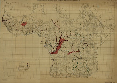
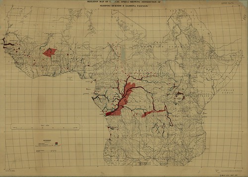
While there is much to be said about the science of map making, the content of the maps is what will spur scientific inquiry. Maps of precipitation, temperature and vegetation types could easily be integrated into climate and weather units. Distribution maps of tsetse flies and incidence of sleeping sickness infections in Africa lend themselves to discussions on human /environment interaction and biology. Even railroad maps can begin a dialog about the steam engine and the Industrial Revolution.


The next two sections are examples of how Web 2.0 GIS technology can be leveraged in the classroom.


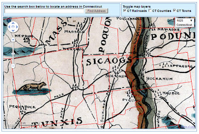
Google Maps GIS Exercise


The following is an excerpt from an Outside the NeatlineHow in the World?” blog post. The object of the page is to act as a spring board activity and to show users that the average person can access GIS data just as easily as mapping professionals.


Your browser does not support iframes.

Congratulations, you are now an experienced GIS user! In this exercise you have loaded, queried, and analyzed a GIS data layer! Now you can experiment with MAGIC’s other data layers and have fun making maps.


This activity has engaged the students and sets them up to find and give directions, search for adjacent places, plan how much money Jeff and Brandon will need for fishing equipment, and write about Jeff and Brandon’s fishing adventures!


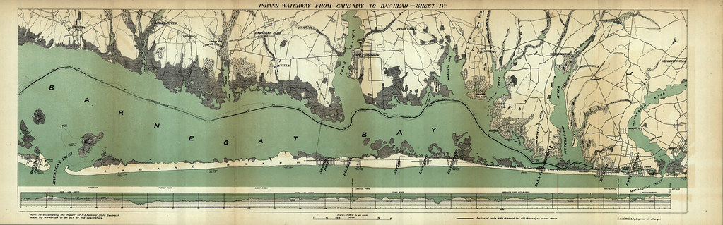
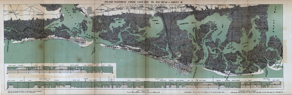
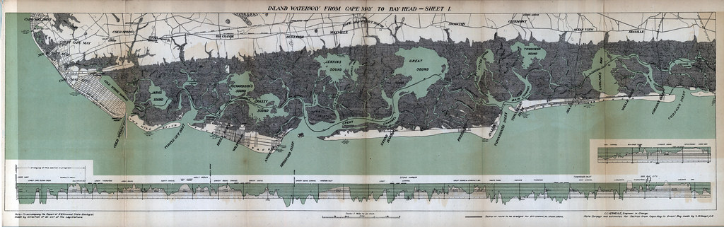
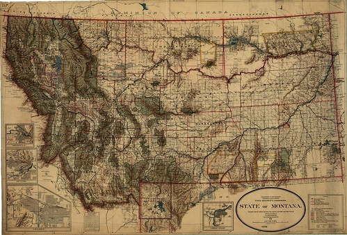
MAP OF THE WEEK AND MAP MASH – UPS

Map of the Week

The “Map of the Week” blog entry begins with a unique featured paper map from the MAGIC map collection. A brief introduction to the map outlines the origins and historical significance of the map to give it proper context. Individual features are selected from the map and highlighted in the blog entry. Each highlighted feature is linked to other websites that provide a greater depth of information.


The objective is to use the map as an aggregator of digital data . The strength of the “Map of the Week” blog entry is it’s ability to act as what others may term as a webquest or web assignment home page. Unlike the older concepts of webquests, a live blog in the Web 2.0 era allows educators to embed their own content, or content from Google books, or Google maps, or video from related sources on the internet. Additionally, in a Web 2.0 world, students can create their own map of the week!


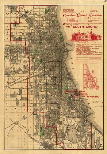
See Below for a “Map of the Week” blog entry that leads into a Map Mash – Up of Chicago, Illinois.

Your browser does not support iframes.

Map Mash-ups

A Google Map Mash-up is created by georeferencing and placing user created maps content in Google Maps web mapping engine. These are powerful learning tools on their own that can highlight the differences and similarities of a place over time. Additional custom content can be added to these maps in the form of KML layers.


Below is an example of a map mash-up created to supplement a “Map of the Week” blog entry on Chicago during the Worlds Fair in 1893. Places and addresses can be searched on this map using Google Maps geocoding engine and then compared to modern satellite or map layers.


The example below demonstrates the above capabilities in addition to how points of interest can be exported as KML layers that also have HTML pop up balloons that link to outside sources for further information.

Your browser does not support iframes.

FUTURE POSSIBILITIES


The previous examples are only a sample of what is possible in the classroom using Web 2.0 technologies in conjunction with geographic content. While these developments are exciting there are still more innovations on the horizon.


An innovation of interest is development of mobile technologies. Since these have become ever more prevalent the possibilities of Geo-Web 2.0 are only limited by the imagination.

Future releases from MAGIC include smartphone applications that allow access to:

  • Google Map Mash-up Campus Bus Routes
  • Google Map Mash-up Campus Building Maps
  • Academic Calendar
  • Outside the Neatline Blog and “Map of the Week” interdisciplinary posts.

We are most excited about using the smartphone to access Outside the Neatline and MAGIC historical maps via Quick Response (QR) bar codes.


The possible use of QR Codes for creative use in the classroom is an avenue we are looking forward to exploring further. We envision a geography treasure hunt where students find and access web maps and geography blogs using an enabled smartphone. QR codes are easily created and can be used so that individuals could access maps and other spatial information in near real-time.


By the way, the QR code below are active and will lead you to some of our URL’s. Go ahead, give it a try!


Map of the Week #7 – Montana 1911

State of Montana – Department of the Interior General Land Office Map – 1911

While searching for maps of Yellowstone National Park, this gorgeous map of Montana was discovered while exploring the map collection at MAGIC. This 1911 map includes Indian Reserves, National Parks, Reclamation Projects and U.S. Land Offices as well as several other features.

This map includes railroad lines and it is clearly visible that the Northern Pacific Railroad has a spur line which provides passengers with access to Yellowstone National Park. The desire to connect Yellowstone via rail is clearly evident in the History of Northern Pacific Railroad by Eugene V. Smalley in1883 which is included below.

Explore this map in the original size view (this may take a few moments to load) and share the amazing features relevant to your research with us by posting a comment.

Map of the Week #6 – Columbus, Ohio

Map Showing the Great Coal Fields, Natural Gas Fields, Steam and Electric Railroads: and All Important Towns, Villages, and Streams Tributary to Columbus Within a Radius of 70 miles

The above map depicts the city of Columbus, Ohio in 1902 in an azimuthal projection with the center focused on the city of Columbus. This unique perspective includes a limited view of the region with a 70 mile range and highlights numerous gas and coal fields along with railroads connecting the region.

A notable location on the map includes the Hocking Coal Fields (southeast of Columbus) which includes New Straitsville, Ohio. This was the site of the 1884 coal miners strike where striking coal miners planned for their strike in Robinson’s Cave, and pushed burning coal cars into a coal mine owned by the New Straitsville Mining Company, setting the mine ablaze.

While not completed until 1903, the Columbus, Delaware, and Marion interurban electric railway is clearly depicted on this map.

There are several other interesting locations on this map. Feel free to share you favorites by including them in the comments for this blog post.

Map of the Week# 5 Chicago’s World Fair 1893

Visitors map created on Rand McNally & Co’s. Map of Chicago 1890

The above map was modified to give visitors to the Worlds Columbian Exposition of 1893(A.K.A. The Worlds Fair) a guide to the city of Chicago and a subtle suggestion as to where to lodge, especially for the Christian visitors.

Notable locations on the map in regard to the Worlds Fair of 1893 are indicated by a red hashed area located in the southeast portion of the map. Details of the Columbian Visitors’ Association’s “South Shore” building and it’s location in relation to the World’s Fair Grounds are illuminated by an inset map set in Lake Michigan.

Above and Below: World’s Fair Grounds 1893


The “South ShoreColumbian Visitors Association

While not the primary focus of the map, many of Chicago’s Parks and Cemeteries are noted on the map in the color of green.

PARKS:
Some well known parks include Lincoln Park and Lake Park.


Left: Lincoln Park, Right: Lake Park

Lincoln Park originally served as a cemetery for the city beginning in 1843 and later became a city park in 1864. Attractions within this park include the Lincoln Park Zoo, a conservatory, and the Peggy Notebaert Nature Museum.

Lake Park, now known as Grant Park was officially named as a park in 1844. Grant Park contains and links many famous Chicago attractions and events. Most notable is the Buckingham Fountain pictured below.

Connected to Grant Park in the northwest corner is Millennium Park which hosts concerts and other events. Millennium Park is also the home of the sculpture Cloud Gate, affectionately referred to as “The Bean” by locals.

Institutions located within close proximity to Grant Park include:

Two of Jeff’s favorite events also take place at Grant Park:

  1. The Taste of Chicago – Usually around the week of the 4th of July.
  2. The Chicago Marathon – This year the start will take place October 11, 2009 at 7:30 a.m. Click here for the course map!

CEMETERIES:
Also noted on the map in the same shade of green as the parks are cemeteries within the city limits. These include:

Graceland Cemetery
Founded 1860


Oakwoods Cemetery
founded 1854

Rosehill Cemetery
founded 1859


Finally, there is one last feature on this map that I’d like to illuminate and share. The Union Stock Yards of Chicago, the source of inspiration for The Jungle published by Upton Sinclair in 1906.

Chicago has a long and interesting history, but this weeks map only provides a snap shot of the city in 1890. Hopefully I’ve covered some of the more interesting features, but I’m sure I’ve missed a multitude of fascinating stories and facts. Please feel free to take up where I’ve left off, there are many more parks, cemeteries, and places of interest left on the map to explore!

Map of the Week! #5 Sleeping Sickness in Africa 1909

Okay, so maybe there’s two maps this week, but they’re closely related!


Map 1.) Skeletal Map of Tropical Africa Showing Distribution of Tsetse Flies


Map 2.) Skeletal Map of Tropical Africa Showing Distribution of Sleeping Sickness and Glossina Palpalis

Both of these maps were published in 1909 by the Ordnance Survey of Great Britain. Map 1 shows the spatial distribution of Tsetse flies which were discovered to be the vector for the disease sleeping sickness (African Trypanosomiasis).

Tsete flies (Genus Glossina) have several species that exist on the African continent. On Map 1 you can see that there are several species of Glossina listed. These species have slightly different habitats as shown below (click the links for modern day maps, how do they compare to the 1909 maps?):

There are many other species of tsetse flies, for a brief list, click here.

The actual parasite that the tsetse flies act as vectors for is the protozoa Trypanosoma brucei , more specifically African Trypanosomiasis.


Trypansomiasis can be a fatal disease that first causes the lymphnodes to swell, insomnia at night and fatigue by day (hence “sleeping sickness”). For a list of symptoms and stages of the illness click here. It was not until 1902-1903 that it was discovered by Sir David Bruce that the tsetse flies were the vector for this parasitic disease. This cognitive leap must have prompted the mapping of tsetse fly habitats and distribution to predict the occurrence of sleeping sickness and take initial steps in mitigating the disease. Turn of the century GIS!
Oh yeah, if you want some GIS data on tsetse fly distribution, check out this page sponsored by the FAO.

“Hooray for geography and hooray for maps!” I say!

Map of the Week! #4 Paris from Charles V to Charles IX

The title of this weeks featured map is:

Paris depuis Charles V jusqu’a Charles IX, d’après le plan de l’Abbaye St. Victor.
OR

Paris from Charles V to Charles IX, after the plan of the Abbey St. Victor.

That’s quite a long time period. In fact, the end of Charles V reign is dated at 1380 and the beginning of Charles the IX reign is dated at 1560. The additional information in the title referencing that it is after the plan of Abbey St. Victor gives us little help in narrowing down the dates of the map as the abbey was formed circa 1113. Also of note is that this map was published with the text “Tableau de Paris” By Louis-Sébastien Mercier in 1893. This is surely a later revised edition as Louis-Sébastien Mercier passed away in 1814.

To read an edition of this work look below to the embedded Google book. The edition is in French but if you copy the URL of the book and paste it in Google’s Translate tool you should be able to read it in English. (Tip: Set the text to “Plain Text” located in the upper right before translating)

Important features located on the map include Nostre Dame Cathedral now spelled Notre Dame:

St. Victor Abbey:

La Bastille, an icon of royal power that was stormed at the beginning of the French Revolution:

St. Eustache Cathedral with a pipe organ numbering ~8000 individual pipes rivaling the pipe organ in Notre Dame. For photos of St. Eustaches stained glass windows click here.


And Porte Saint-Denis, a fortified gate in the walls of old Paris.

Also for fun, see how many windmills you can find on the map here’s an example:

Map of the Week! #3 Hartford in 1640 and 1893

Today’s featured map was made in 1838 and shows landowners in Hartford in 1640, shortly after the city was founded. Initially, a pastor named Thomas Hooker led a group of about 100 people from Cambridge, Massachusetts to Connecticut to form a new colony. They chose present day Hartford as their new settlement site.

In 1639, government officials of Connecticut colony, including Thomas Hooker and John Haynes, created a document called the “Fundamental Orders of Connecticut.” It is arguably the first written constitution in Western society, and helped give Connecticut the nickname of “the Constitution State”. The document emphasized individual rights and democracy.

The second map comes from the Connecticut State Atlas in 1893. The 1893 street network in Hartford is generally the same as today, but the river going through the southern part of the city (called the Little River in the historic maps, now called the Park River) is completely removed from maps and aerial photographs today. So what happened to it? In the 1940s, the Army Corps of Engineers rerouted the river through underground concrete channels in an effort to control flooding in Downtown Hartford. Click below to view a recent New York Times article about the underground Park River.

http://www.nytimes.com/2003/07/31/nyregion/paddling-hartford-s-scenic-sewer-abused-underground-river-up-close-noxious.html

The screen below shows the historic maps from 1640 and 1893, as well as recent aerial photos. Click the box that says “Famous Historical Residents” in the upper right of the screen to view where famous early Hartford residents lived in 1640.

List of landowners and corresponding land parcel numbers for 1640 map (click to enlarge):

To view the 1640 map in flickr, click here: http://www.flickr.com/photos/uconnlibrariesmagic/3836896031/

To view the 1893 map in flickr, click here:
http://www.flickr.com/photos/uconnlibrariesmagic/3837687450/

Links about the early settlers of Hartford:
http://www.hartfordhistory.net/faq.html

http://en.wikipedia.org/wiki/History_of_Hartford,_Connecticut

Map of the Week! Connecticut Tribes Circa 1625

” Map of The State of Connecticut Showing Indian Trails, Villages & Sachemdoms Made for The Connecticut Society of The Colonial Dames of America

On this map made in 1930 we can see 19 Native American Sachemdoms of 1625 delineated in, and around the state of Connecticut. What exactly is a Sachemdom? It’s the territory of a Sachem. OK, so what exactly is a Sachem? A Sachem is the title of leadership in a Native American Tribe…so tying it all together a Sachemdom is the territory of a particular Native American Tribe under the leadership of Sachem. Got it?

So which 19 Sachemdoms are featured on our map? Here’s a list with links to informational websites. These sites are by no means the singular authorities on each tribe but it should make it easier for you to get a head start when gathering your own information!

Mohicans
Paugussetts
Siwanogs
Agawams
Massacoes
Tunxis

Quinnipiacs
Menunkatucks
Wangunks
Sicaogs
Poquonocks
Podunks
Hammonassets
Nehantics
Uncas
Mohegans
Nipmucks
Pequots
Wutcheken

Along with the tribe names listed above you will notice that there are major trails and pathways delineated on the map as well. What kind of impact do these trails and pathways have today? Examine the following map, toggle on the railroad layer located on the right. Do any of the railroad tracks line up with the trails? What other modern day features do you think would follow these trails?

Click the above image to View Interactive Map Mash-up

Thanks to Benjamin Spaulding for the education and assistance in creating this mash-up!
Also of interest is the following related reading material:
Trumbull, James H. Indian Names of Places, etc. In and On the Borders of Connecticut: With Interpretations of some of them. Hartford : Press of the Case, Lockwood & Brainard Co., 1881

Use the search tool to find instances of the tribes or villages that are featured in the map in the text of James H. Trumbull’s book!

James Hammond Trumbull was born in Stonington, Connecticut in 1821 and died in Hartford, Connecticut in 1897. He was the Assistant Secretary of State for Connecticut, the Connecticut State Librarian, President of the Connecticut Historical Society and was elected to the National Academy of Sciences.

For more information on James Hammond Trumbull, try this link to the National Academies Press.
OK, one map, lots of information. Thanks for stopping by!
~Jeff