Change in median household income within U.S. counties between 2004-09 and 2010-14 American Community Surveys

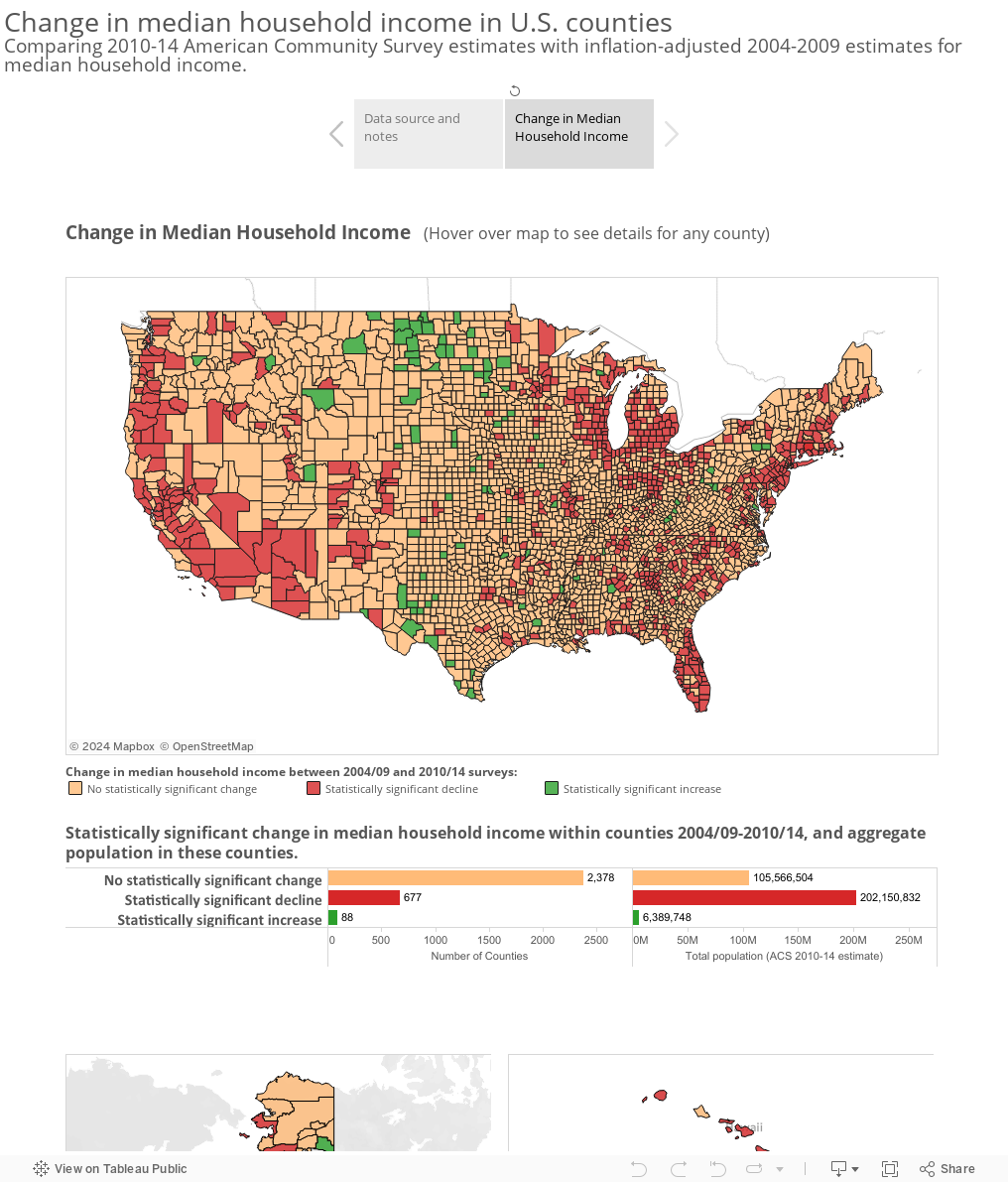
This visualization compares county-level median household income from the 2004-2009 and 2010-2014 American Community Survey 5-Year Estimates and compares the confidence intervals of the surveys to determine whether there was a significant increase or decline in median household income between the surveys, or no statistically significant change. Estimates from the 2004-2009 survey were converted to 2014 inflation-adjusted dollars using the Bureau of Labor Statistics’ ‘Consumer Price Index – All Urban Consumers‘ benchmark. These adjusted figures were compared with the median household estimate from the 2010-14 ACS (which were originally published in 2014 inflation-adjusted dollars).

Counties with inflation-adjusted median household income estimates with overlapping margins of error between the two surveys (when both survey estimates are expressed in 2014 inflation-adjusted dollars) are considered not to have experienced a statistically significant change in median household income between the survey periods. Counties which have an upper bound of the 2004-2009 confidence interval which is smaller than the lower bound of the 2010-2014 confidence interval, are considered to have had a statistically significant increase in median household income between the two survey periods. Conversely, those counties which have a lower bound of the 2009-2014 confidence interval which is greater than the upper bound of the 2010-2014 confidence interval are considered to have experienced a statistically significant decline in median household income.

The American Community Survey data showed statistically significant increase in median household income in 88 counties between these survey periods; 2,378 showed no significant change, and 677 a statistically significant decrease in median household income. Notably, the majority of the U.S. population lives in the counties that showed a significant decrease in household income: according to the 2014 ACS population figures, about 202 million people – 64% of the U.S. population – resided in these 677 counties.

Note that this visualization’s inflation adjustment uses national level Consumer Price Index, which may not reflect inflation differences that exist across geographies or regional differences in housing, transportation, or other sectors. The American Community Survey confidence intervals used here are the originally published data, which was reported at a 90% confidence interval.

Educational attainment and earnings in Connecticut towns

The latest data from the American Community Survey 2010-2014 Estimates shows a clear correlation between educational attainment and median earnings in Connecticut towns. This visualization includes data on educational attainment levels for all 169 towns for persons 25 and older, as well as median earnings for men and women of different education levels. Follow the links that appear in the mouseover tooltip to download the original tables from the Census Bureau’s American FactFinder data tool.

Census Tracts Data Browser updated with latest American Community Survey Data

The map below of Connecticut Census Tracts data provides links into the Census Bureau’s American FactFinder data engine to gain easy access to tables of economic, housing, demographics and other data from the 2010-14 American Community Survey 5-Year Estimates. Hover over any Census Tract on the map to see links to eight data tables for the tract. You can use the map tools to pan or zoom into a particular area of the state, and by holding down Control (Command on a Mac), you can select multiple tracts and follow the links to see data for all selected areas. See the Instructions tab for more information.

Linked data tables include:

  • DP05 ACS Demographic and Housing Estimates: age, race/ethnicity, and housing unit counts
  • S1501 Educational Attainment: educational attainment and median earnings by level of education for the population age 25 and over
  • S2701 Health Insurance Coverage Status: insurance coverage rates by age, race, and income
  • S1101 Households and Families: characteristics of household structures
  • S1702 Poverty Status in the Past 12 Months of Families: poverty status by age, race, educational attainment, and presence of children in the household
  • DP03 Selected Economic Characteristics: unemployment, occupation,  employment by industry, and income and benefits data
  • DP04 Selected Housing Characteristics:  size, value, age, and other characteristics of housing units in the tract
  • DP02 Selected Social Characteristics: includes marital status, fertility, place of birth, language spoken at home, ancestry, and disability status characteristics of the tract’s residents

Demographic and Economic Profiles of Connecticut’s Electorate

In advance of the Connecticut primary on April 26, the U.S. Census Bureau presents a variety of statistics that give an overall profile of the state’s voting-age population and industries. Statistics include:

Electorate Profile: Connecticut


Per-pupil expenditures by school district, fiscal year 2013

This visualization uses data from the 2013 Annual Survey of School System Finances which provides per-pupil expenditures for various instructional and support services functions for over 13,000 school districts, including salaries, wages, and benefits of instructional staff, as well as administrative, instructional staff support, and other support service costs.

(Note that total per-student expenditures include expenses not included separately in Instruction and Support Services costs (see footnote [1] in original American FactFinder table).


Per-pupil spending of public elementary and secondary school systems: Fiscal year 2013

More great data sets seem to be added to the U.S. Census Bureau’s  American FactFinder data engine all the time. This visualization uses data from the 2013 Annual Survey of School System Finances: Per pupil amounts for current spending of public elementary-secondary school systems by state , allowing comparison of expenditures on  instruction and support services among states.

Increases in income inequality within states, 2007-2014

According to the the latest American Community Survey data, the period from 2007 to 2014 saw a statistically significant increase in income inequality – represented by the Gini index – in 32 states. The Gini Index represents the concentration of income in a given state or country, in a range from 0 to 1. A higher Gini index indicates greater inequality – where income is concentrated among a relatively few individuals or households; a lower Gini score represents more even income distribution.

The ACS 1-Year reports the Gini index for households in table B19083 as the middle point of a 90% confidence interval, along with a corresponding margin of error. The visualization below calculates significant change in Gini index scores from 2007-2014 – shifts outside the margin of error. In 32 states, the lower end of the range of the 2014 Gini estimate was greater than the upper range of the 2009 Gini Index estimate. In the remaining states, there was no statistically significant change from 2009 to 2014: in these cases, taking into account the margin of error, the estimates from 2009 overlapped with those from 2014.

Gini index is a commonly used economic measure, reported by organizations such as the World Bank and CIA, in its World Factbook.

Student Survey of Transportation Access to UCONN Stamford Campus, Fall 2015

The following post and data visualization is by guest bloggers Daniel Chiang and James Froehlich, highlighting their project for Prof. Harmon’s Economics service learning class).
This project conducted a survey of the modes of transportation access used by commuters (students, staff and faculty) to the Uconn Stamford Campus in Fall 2015. The survey was conducted during the last 3 weeks of the Fall semester.  Of the 290 Survey Respondents, 213 are undergraduates, which represents 15% of the total Uconn Stamford undergraduate enrollment in Fall 2015.

Our preliminary analysis is focused on the undergraduate students.  We found that 50% of the undergraduate respondents drive to campus.  The drivers primarily use I-95 (46%), 15% use the Merrit, 43% commute via local roads. For 38% the average trip length is 25+ miles one-way.

Across all modes of transportation, for 44% the average length of time for a one-way trip to campus is 40 to 60 minutes, and for 16% the commute time is more than 1 hour.   52% of the undergraduate respondents average four trips to campus per week, and 22% average 5 trips.

Pricing and Usage Characteristics of Railroad Parking Lots Along I 95 Corridor, Lower Fairfield County, CT

(The following post and data visualization is by guest bloggers Patrick GIll, Robert Roig III, and Ryan WIlliams , highlighting their project for Prof. Harmon’s Economics service learning class).

This visualization depicts the prices for permit parking amongst rail station parking lots in Southwestern Connecticut. The data includes rail stations from Greenwich, CT to Greens Farms (Westport), CT. It includes monthly permitted lots as well as those that have annual permits. This visualization gives the ability to look at an individual parking lot’s permit price or all of the parking lots’ prices at once. In order to view an individual lot, select the lot in its respective dropdown filter and select “null” in the other dropdown filter. You also can compare all the monthly or annual lot prices by selecting all in the respective dropdown filter and selecting “null” in the other dropdown filter. The goal of this visualization was to help compare an individual lot’s permit price with that of the other lots by visually showing the lots’ prices side by side to see where a lot’s price sits with the rest of the market.

This visualization depicts the utilization of parking at rail station parking lots and garages in Southwestern Connecticut. The data includes rail stations from Greenwich to Greens Farms (Westport). The data shows the number of empty spaces vs. total number of spaces at each parking lot. The figures are based on utilization counts (performed on different days of the week in 2015.) In order to view parking utilization at an individual lot, select the lot name in the dropdown filter. This will show you total spaces (Green) and empty spaces (Red) at that lot. If you select the “All” option in the dropdown filter, the visualization will show the total sum of all parking spaces in our data set as well as the total number of empty spaces in our data set. The goal of this visualization was to help show how many unused spaces there are at rail station lots which in turn could spark new ideas in order to maximize utilization of rail station parking.