
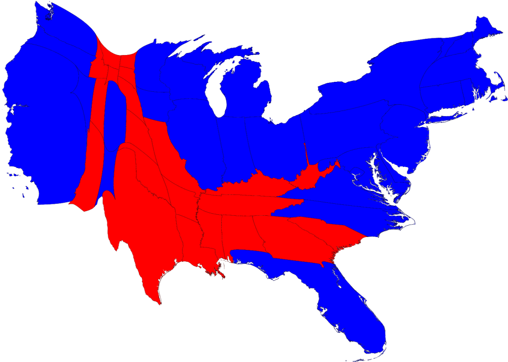
The 2012 Election is only four days away. How we make sense of the information available to us can be daunting, but can also be visually appealing. Consider first the popularity of the cartograms of the 2008 presidential election results, produced by Dr. Mark Newman of the University of Michigan. For many people, these maps evolved their understanding of effect of the distribution of the U.S. population on election results.
Polling and the Electoral College
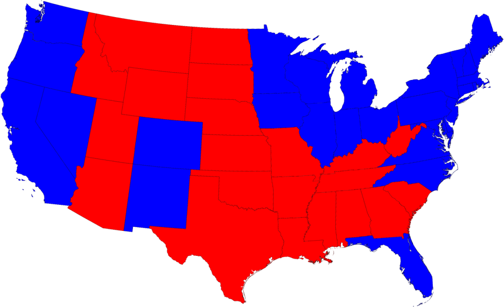
We are well into the realm of real-time information analysis and visualization in the 2012 election. For major news sources, especially, the Internet provides an ideal outlet for up-to-the-nanosecond updates on the proverbial reams of data in the air about the current status of the election. Prior to the election, multiple polls of likely voters, along with other demographic analyses, are often combined into models that seek to predict the outcome of the electoral college. These models are well-suited to geographical visualizations, the maps of so-called ‘red states’ and ‘blue states’ (for the Republican Party and Democratic Party majority popular votes, respectively, that determine to which presidential candidate each state’s electoral college votes will be allotted).
 |
| Source: NBCConnecticut.com |
The amount and variety of data now available, however, offers the opportunity for users to explore deeply into the fervent ongoing analysis in these final days leading up to the election. On the websites of many news and media outlets, users can examine the upcoming election by race (President, Senate, House, Governor), by geography (in your state and sometimes at the county level), or by polling organization. Direct links to information sources are usually available, as are the means for sharing such information through social networks. Listed below are several of the more prominent sites for exploring the 2012 election in more detail.
- The New York Times provides an example of a relatively simpler visualization, through a standard map view, a cartogram – where the size of each state is weighted by the number of electoral votes (see below for other examples of election cartograms) – along with other groupings of possible outcomes. They also have maps of the Senate and House of Representatives races.
- On the Washington Post, the presidential election can be explored further with maps available at both state and county levels. At the this closer level of detail, users can also examine the Post’s electoral vote projections in relation to a number of social, economic and demographic characteristics, with unemployment, income, and race/ethnicity among them. Visualizations are also available for races in the Senate, the House, and for governor.
- At the Wall Street Journal, their election site has provided a set of visualizations similar to the Washington Post – at the state and county level, and for the Senate, House, and governor races. More interesting is their inclusion of ‘Community Type’ data at the county level, a classification system from the Patchwork Nation project of the Jefferson Institute. Based on socioeconomic and demographic statistics, the Journal visualizes U.S. counties in categories such as “Monied ‘Burbs”, “Tractor Country”, “Immigration Nation”, and “Emptying Nests”.
- The Huffington Post aggregates a large number of opinion polls into a predictive model, providing an up-to-date outlook on the election. Users are able to go in-depth with their sources, looking at changes in the model over time and for each state. In addition, the elegance of their House of Representatives visualization is an appealing and intuitive look at the current House in comparison with projected election results.
 |
| Source: HuffingtonPost.com |
- Real Clear Politics provides a quantitatively-dense site of information on their electoral college predictions and current polling projections for the presidential and congressional races.
- Lastly, at 270 to Win, the current election is placed in the context of all presidential election results throughout U.S. history. In 1789, George Washington won the election with 69 electoral votes, in comparison to the 34 electoral votes of John Adams.
Interactive Electoral College Predictions
A very popular and prominent feature on many election websites for the 2012 presidential election is an interactive visualization of user-selected electoral college results. Anyone can create a whole range of maps for both the plausible (and implausible) scenarios of how the electoral college will vote. The electoral college vote is a fascinating aspect
One fascinating example is VoteNight.com, embedded below. By clicking on each state multiple times, the user can change the electoral results from Obama/Biden, to Romney/Ryan, to undecided. The application automatically re-tallies the results based upon the user’s changes. More interesting, however, is the ability to examine presidential election results from previous elections – as far back as the 1932 race between incumbent Herbert Hoover and eventual winner Franklin Roosevelt – and to then predict the results of the 2012 election based upon those historical results.
The degree of reality and amount of interactivity vary between the many choices, however. An interesting way to test this is to find out which are the only two states in the Union that “split” their electoral votes between the popular election results and the Congressional district election results. (Hint: it isn’t Connecticut.)
- On PBS NewsHour’s Vote 2012, you can choose to predict the current election results with your own selections, or visualize the result of the Obama-Romney contest based upon the outcomes of prior elections, going as far back as 1964.
- Politico.com only allows swing state results to be manipulated.
- The New York Times provides their non-mapped version under the heading “Make Your Own Scenarios.”
- On the Huffington Post, as with PBS, you can base predicted results on the 2008, 2000, 1980, 1960, and 1880 presidential elections.
- At Real Clear Politics, results can likewise be predicted from previous election results since 1972. Uniquely, though, states can be changed to the degree of predicted result, as being “solid”, “likely”, “leans” for one or the other candiate.
- Even the federal government is in this game! At the U.S. National Archives, predictions can be based on the 2008 and 2004 elections.