The Prison and its Past

Prisons and Prisoners, Selections from the Alternative Press Subject File Collection.

On display at the UConn Archives Gallery in the Thomas J. Dodd Research Center from March 20 – May 31, 2019, an exhibition of research collections on incarceration.  Drawn from ephemera, art, and personal and political papers, this story is Illustrated with the writings of the incarcerated from inside Connecticut prisons, the state’s documentation and formation of prisons, artists’ and activists’ responses to Guantanamo Bay Detention Camp, and advocacy from inside and out.  This exhibition is in conjunction with the Humanities Action Lab States of Incarceration exhibit at the Hartford Public Library, March 11 – April 18, 2019 and the Thomas J. Dodd Research Center from March 25th – April 18th, 2019.

Materials on display in the gallery were drawn from the Alternative Press Collection, Cal Robertson Papers, Thomas J. Dodd Papers, Connecticut Politics and Public Affairs Collections, and Storrs Experimental Station Records.

A New Perspective on The U. Roberto Romano Papers

Marijane Ceruti, Assistant Archivist of the U. Roberto Romano Papers, is a 2014 BFA graduate of the UConn School of Fine Arts. Since graduation, she has worked as a freelance photographer and photography assistant in addition to exhibiting and gaining notoriety for her fine art photography work. She has an extensive technical background in addition to her knowledge of the history of photography.

My first day on the job as the Assistant Archivist of the U. Roberto Romano Papers was a good one. I was handed the torch by fellow UConn alumnus and friend Brooke Foti Gemmell who was taking a different position within the UConn library through her work here. “The first couple of weeks will be intimidating, but you’ll get the hang of it” were words that I heard come out of her mouth more than once. As I got settled in and took the time to dive into the collection I began to realize I shared a lot with the photographer whose work I would be getting to know. Robin and I were both Italian-American photographers who spoke French, liked crass humor and made a lot of the same choices in photography. Robin cited the greats like Henri Cartier-Bresson and Robert Frank as some of his inspirations and I too could count them as some of my own.


[slideshow_deploy id=’8128′]


As I sifted through memory card after memory card of born digital images in the first couple of days, I started to notice that Robin and I made the same aesthetic decisions in our work. Photographers holding their subjects hostage in front of the lens until finally giving into the moment, making corrections to posture and hair as shoots progressed and even down to equipment choices. Without being prompted I found myself collecting my favorite images of Robin’s in a  folder on my desktop titled “Notable Images”. Now the folder is 600 images strong and I’m sure it will continue to grow. As I look at them, I am reminded of how unique of a person Robin was as he exhibited  equal parts compassion and ruthlessness, humility and prestige, documentarian and artist. These traits are necessary and rare in someone that captures such emotionally charged scenes and shares them with the world. I look forward to sharing this information with the public so that they can see the truth behind child labor, the life of an artist and the complexities that come with processing such a large and vast collection that spans a revolution in photography.

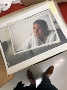
Marijane sorting through prints from Robin’s early work in Pakistan

Now that I have been in this position for 6 months, I am starting to get comfortable curating and archiving with Robin’s voice in mind. I see the choices he made and feel confident that I can respect his vision as well as his compassionate and strong voice when representing the collection. I am so grateful that I was given this opportunity to take a peek inside the collection of such an empathetic and talented photographer. I feel blessed that I get to hold a position that is important and valued within the university and the world alike. I hope that I am able to share Robin’s work in the way in which he intended, care for it in the way that it deserves and bring my talents of exhibiting and marketing to the  collection for students and scholars to learn from and enjoy.

I’m proud to say I will bring pieces of Robin’s work into my own as an artist. In a world that is hurting, I am honored to be able to represent a body of work that was founded by the desire to end suffering.

Thank you to the University of Connecticut Library for this opportunity and to everyone that donated to the Robin Romano Foundation to make this position possible.

Hilary Knight on HBO tonight

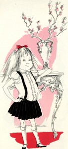
Kay Thompson's Eloise (New York : Simon and Schuster, 1955).  Illustrated by Hilary Knight.  Pg. 7.

Kay Thompson’s Eloise (New York : Simon and Schuster, 1955). Illustrated by Hilary Knight. Pg. 7.


At 9pm on March 23, 2015, HBO will present a documentary produced by Lena Dunham, titled It’s me, Hilary: the Man who Drew Eloise, in commemoration of the 50th anniversary of the first Eloise book.  Lena Dunham, now 28, bears a tattoo of Eloise that is visible at times during her appearances on the HBO show Girls, so Hilary Knight sent her a signed book and a letter asking Ms. Dunham to share Indian food with him.  The rest, as they say, is history.  Read the full LA Times story.  The Northeast Children’s Literature Collection holds some of Mr. Knight’s archival papers.  Don’t miss the show tonight at 9pm.


Dr. Kate Capshaw launches new book

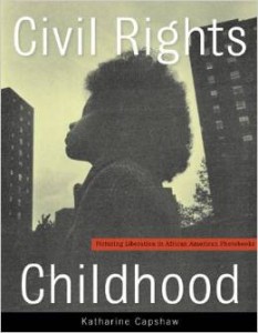
Civil Rights Childhood: Picturing Liberation in African American Photobooks (University of Minnesota Press).

Civil Rights Childhood: Picturing Liberation in African American Photobooks (University of Minnesota Press).

From Cathy J. Schlund-Vials, Ph.D., Director, Asian and Asian American Studies Institute Associate Professor of English and Asian/Asian American Studies:


On February 12, 2015 (at 4 PM) the UConn Co-op (in Storrs Center) will be hosting a book launch for Kate Capshaw’s recently published book, Civil Rights Childhood: Picturing Liberation in African American Photobooks (University of Minnesota Press). What follows is a brief description of the book and a link:

Civil Rights Childhood explores the function of children’s photographic books and the image of the black child in social justice campaigns for school integration and the civil rights movement. Drawing on works ranging from documentary photography and popular historical narratives to coffee-table and art books, Katharine Capshaw shows how the photobook-and the aspirations of childhood itself-encourage cultural transformation.  (https://www.upress.umn.edu/book-division/books/civil-rights-childhood)

Katharine Capshaw

Dr. Katharine Capshaw


This event is sponsored and hosted by the University Co-Op. For more information, please feel free to contact Cathy Schlund-Vials (cathy.schlund-vials@uconn.edu<mailto:cathy.schlund-vials@uconn.edu>).


Janet Lawler’s blog post 2: Looking at Layers

Looking at Layers

A picture book starts with a great story told in words (and in the sound of words read out loud). Illustrations accompany the author’s story. In the best picture books, the illustrations actually expand the story. The adult reader, as well as the child listening, feast visually on these layers that enrich the text in delightful and often unexpected ways.

As a picture book author, I focus my drafting and revision efforts on the story I want to tell. An illustrator’s considerable contribution to the final product most often comes long after I am done with my personal revision process (and any revisions guided by an acquiring editor). The publisher’s editor and art director usually select, guide, and supervise the artist. So the illustrator’s role seems a bit remote to me as I ply my craft. But remembering that layers can and should be added via art will help me create opportunities for an illustrator to deepen and expand my stories.

As I study the NCLC author/illustrator archives, I am examining the layering of art in picture books created by author/illustrators, whose creative talents allow them to tackle the words and art together. Author/illustrators don’t forget to leave room for layers—they create them as the picture book progresses in a unified way. They revise both words and illustrations to create balance and get it “just right.”

What does one find in the layers added to a picture book by illustration? Here are some thoughts, based on examples from author/illustrator archival material.

 Emotion

Anita Riggio writes and illustrates from the heart. Emotion is the starting point for her wonderful stories. In Smack Dab in the Middle, Rosie Roselli is “smack dab in the middle” of her large, busy Italian family. Her many joyful accomplishments at school are ignored when she tries to share them at home, and she starts to wonder if maybe she isn’t the center of her loving family universe after all.

As I reviewed Anita’s process for Smack Dab in the Middle, I studied the text and illustrations on each spread, comparing what each separately communicates to readers. A particularly touching spread contains these words on page 20:

Rosie Roselli

really needed a hug.

She needed a hug

right this minute,

but her mother’s arms

were full of Rosie’s sister.

Rosie Roselli couldn’t wait.

She stepped up close.

She breathed in.

Talcum powder

and lavender water.

It smelled like a hug.

But it didn’t feel

like one.

Then and there,

Rosie Roselli decided

just want she

must do.

Anita’s evocative words tell us of Rosie’s need; they give the reader an expanded sense of story by dwelling on the scents (which can’t be illustrated) that she associates with her mother.

The related illustration (see below) shows Rosie’s mom’s back turned; she is attending to Rosie’s sister. Rosie’s head is bowed, her eyes are closed. The text doesn’t say, “Rosie felt disappointed, ignored, and rejected.” Those emotions are flowing from the illustration, creating a strong emotional layer to add to and support the text. (Even Anita’s placement of text and art emphasize Rosie’s loneliness here; the text snakes down the left page of this spread; there is empty space continuing onto the right page, where mom is facing away, almost out of the picture at the far right margin.)
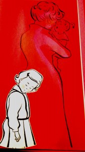
lawler 1Riggio, Anita. Smack Dab In the Middle! (New York: G.P. Putnam’s Sons, 2002), 21. Photo taken from CLDC776, Archives and Special Collections at the Thomas J. Dodd Research Center, University of Connecticut Libraries.

Plot expansion

Sometimes, illustrations take readers to places not even mentioned in the text. In Mabel the Tooth Fairy and How She Got Her Job, Katie Davis had some ideas about what might happen to a tooth fairy who works in the dark. The starting point for such an opportunity (to take the reader places) is text that is spare and full of possibilities. Here are three variations of a line of text Katie entertained (the third is final text):

After a few false starts, Mabel was considered an expert in the field.

After a few false starts, Mabel got to really like her work.

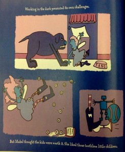
 Working in the dark presented its own challenges.

All text versions support the three scenes shown below, although the final version perhaps is the funniest, with its spare understatement. The illustrations show the tooth fairy being accosted by the household mutt, slipping and falling on spilled “marbles,” and making noise by stepping on a toy horn.

The pictures transport the reader; the text does not say, “The dog of the house attacked me. I stumbled over a jar of spilled eyeballs…” Another whole layer of action/plot (with humor—the marble jar reads, “Slimy Eyeball Game”) has been added to the story through these illustrations.
lawler 2


Davis, Katie. Mabel the Tooth Fairy and How She Got Her Job (Orlando: Harcourt, Inc., 2003), 16. Photo taken from CLCD1438, Archives and Special Collections at the Thomas J. Dodd Research Center, University of Connecticut Libraries.


Humor

Author/illustrator Tomie dePaola also shares humor via his illustrations. His creative process for Strega Nona Meets Her Match began with a handwritten story accompanied by parenthetical notes to his editor. In this picture book, Big Anthony (Strega Nona’s loyal lunk of an assistant) “defects” to work for the competition, Strega Amelia. When Strega Amelia is away and Big Anthony is left in charge, he messes up the magic big time. Tomie’s earliest draft includes pertinent text (italicized) as well as his illustration ideas set forth in parentheses:

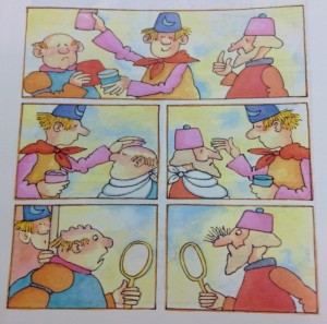
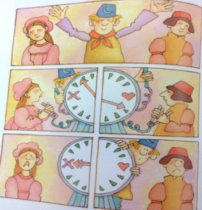
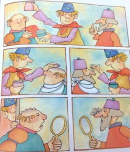
Big Anthony was in charge! (Series of pictures showing Big Anthony reading instructions and making big mistakes on the Husband and Wife wheel – mismatched couples – confusing wart cream and hair restorer – hair falls out, warts increase.)

Things weren’t going too well. (Source:Tomie dePaola Papers Box 41:125K).

Tomie then created illustrations (see below example of mixing up wart cream and hair restorer) to develop the humor of Big Anthony’s bumbling efforts.
lawler 3


Illustration for Strega Nona Meets Her Match, folder 125Y, Box 41 of Tomie dePaola papers. All rights reserved. No reproduction of any kind allowed.


What is interesting, however, is that Tomie’s editor suggested adding text to provide more at this point in the story, explaining that “for read aloud purposes it was important to have a few words.”  (Source:  Letter from Margaret Frith, Tomie dePaola Papers: Box 41:125L).  Ultimately, the spare text was revised as suggested, and lengthened to:

Big Anthony smiled. He was in charge.

The first day he ran the husband and wife machine backwards.

The second day he confused the wart cream with the hair restorer.

Things weren’t going well.

As an author, I suspect that this lengthier text is where I would start my writing process for the same story action. How else would a reader know of the funny mishaps I envision? One possibility would be to include brief illustration suggestions to go with spare text. However, unlike an author/illustrator, who can write such notes to him or herself or to the editor (as Tomie did), an author must tread carefully when making suggestions for art so as not to be directing or limiting the illustrator’s creativity.

The right balance of text and art is achieved on pages 21–23 of the published book (see below). The complexity of Tomie’s illustration panels benefit from the added text that helps communicate his intent and humor regarding Big Anthony’s bumbling. The added text also nicely paces the story, allowing the reader to dwell on these silly mishaps.
lawler 4

[text: Big Anthony smiled. He was in charge.]
lawler 5

[text: The first day he ran the husband-and-wife machine backward.]
lawler 6

[text: The second day he confused the wart cream with the hair restorer.]


dePaola, Tomie. Strega Nona Meets Her Match (New York: G.P. Putnam’s Sons, 1993), 21–23. Photo taken from CLDC776, Archives and Special Collections at the Thomas J. Dodd Research Center, University of Connecticut Libraries.

Authors as well as author/illustrators must be mindful that there is a balance to be found between the read-aloud component and the illustrations in a picture book. However, an author who writes minimal text (even though he or she has a vision for what an illustrator might add) may run the risk of creating a manuscript that seems too slight or unclear to an editor, or perhaps, to young readers who may need some words to decode illustrations.

Conclusion

As I write and revise stories, I’ll keep thinking about layers. I’ll remember that my words need not dwell on emotions that an artist can convey with illustrations. I will deepen stories by words that can’t be shown in the art. I’ll choose words that may give an illustrator opportunities to take my protagonist to places (literally) other than those I may have had in mind. And if I am writing “funny,” I’ll strive for spare text that will encourage a clever artist to add visual jokes and hyperbole. I shall have trust to let an illustrator help tell my story—so that “our” story will marry text and art in a truly memorable picture book.

 About Janet Lawler:

A recipient of a 2014 Billie M. Levy Research grant, Janet Lawler of Farmington, CT, is studying the relationship between art and text in picture books at the Northeast Children’s Literature Collection. Through studying the work and process of author-illustrators, she hopes to better understand how a story’s text interfaces with the art. She is searching for a deeper comprehension of why the best picture books are those where the final product is “greater” than the sum of the parts (text + illustrations). She looks forward to applying knowledge gleaned from her research to her own work process as a children’s author.

Ms. Lawler’s picture books have been published by major and specialty publishers. Two have been Children’s Book of the Month Club main selections, and two have been licensed into the Scholastic Book Clubs. If Kisses Were Colors has been translated into Spanish, Japanese, Hebrew, and Korean. Her recent credits include Ocean Counting (National Geographic, 2013 (named a 2014 Outstanding Science Trade Book by the National Science Teachers Association)) and Love Is Real (HarperCollins, 2014). National Geographic will publish Rain Forest Colors in November of 2014.


Sandra Horning’s Blog Post #3

Blog entry #3 – Meet William Gray

Looking through more than twenty boxes of the James Marshall Collection has made me feel close to this man I will never have the good fortune to meet. Marshall published about eighty books, many with both his illustrations and text. It is hard to imagine how much he would have produced if he had not died at the early age of 50. In fact, many days I have left the Dodd Center feeling a great sense of loss at his death. Through a friend, I was able to meet Marshall’s longtime partner, William Gray. I met William at the home he and James shared for much of Marshall’s career. For my final blog entry, I’ve included a few of William’s answers to the questions he generously and kindly provided. My thanks go out to William Gray for sharing his time and memories of James Marshall.


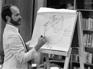
James Marshall giving a presentation (James Marshall Papers Collection File photograph, n.d.)

James Marshall giving a presentation (James Marshall Papers Collection File photograph, n.d.).  All rights reserved.  No reproduction of any kind allowed.


As I mentioned in my first blog, James Marshall wrote many of his books under the pseudonym Edward Marshall. William explained that Marshall wanted to work with more than one publisher. In order to not compete with his own picture books, the pseudonym was used and he wrote in a different genre, beginning readers. “They really suited his talent. I wouldn’t say they were easy to do just because they were easy to read.  It was something that just came more naturally to him, the smaller format.”

To clarify that the comments in the margins of the dummies and manuscripts are Marshall’s, I asked about the handwriting and if William knew if anyone else wrote comments on Marshall’s work. William replied that, “He [Marshall] used a Schaefer fountain pen with those plastic capsules to draw with and to write with. He had pretty distinctive handwriting, but no one came near his work.”

I went on to ask specifically about the Harry Allard and Jeffery Allen manuscripts I discussed in my second blog post. William told me that Allard and Allen were both friends of Marshall before each collaborated on books with him. “They would mail a manuscript to him [Marshall]. He would tear it apart limb from limb and then put it back together according to what he thought was best.”

I noted that almost all of Marshall’s changes went to print and William agreed,“Oh, they made every change he suggested. He ran the show….Jim appreciated their inventiveness. I mean Harry came up with The Stupids and with Miss Nelson. But as for shaping a story, that was always Jim’s work.

William and I talked about Marshall’s ability to critique his own work. “Jim was extremely critical of his own work and any work,” William told me. “Nothing was perfect. Even if it was a masterpiece he would find something to criticize, always. He would very seldom say, ‘I guess this is pretty good.’ He had critical faculties that kicked in and that is what kept him going.”

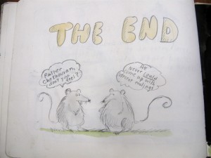
 This comment came back to me when I went through Maurice Sendak’s bequest of additional James Marshall material. Sendak and Marshall were good friends, and Sendak owned several of Marshall’s book dummies and original artwork, most of which are now with the Marshall Collection. Among these Sendak materials is a book that Marshall created for Sendak’s birthday. The book is extraordinary, with wonderful characters wishing Maurice a happy birthday. Marshall also includes a short story from his future publication Rats on the Roof.  At the end of the story, Marshall is once again critical of his endings, drawing two rats with speech bubbles. The first rat says, “Rather Chekhovian, don’t you feel?” The second rat replies, “He never could come up with decent endings.


A page from the Birthday Book for Maurice Sendak from James Marshall (Maurice Sendak Collection of James Marshall Box 2012.0152.2). All rights reserved. No reproduction of any kind allowed.

A page from the Birthday Book for Maurice Sendak from James Marshall (Maurice Sendak Collection of James Marshall Box 2012.0152.2). All rights reserved. No reproduction of any kind allowed.


I asked William if there was a work that Marshall was most proud of or that achieved what Marshall wanted? William replied,  “I can tell you I really, really appreciate the Fox books. I think his talent went into that in a way that really expressed himself and certainly delights me.”  William went on to say that Marshall “was kind of stuck in the George and Martha books pretty much in the framework of a relation between two people, but with the Fox books there would be all kinds of plots and subplots. None of those characters is two dimensional.  In just a few sentence you know exactly who they are. I even have people say, ‘Oh, well obviously he used me for Carmen.’”

This led me to ask if Marshall was most like Fox.  William said, “I think so… There is a lot of Jim in Fox.” William and I continued on to discuss the brilliant endings and humor in the Fox stories, and the way the humor was not spelled out. William said that was intentional. In fact, it was“his [Marshall’s] number one rule. Never condescend to children. Don’t do it ever.”

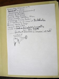
Most of Marshall’s sketchbooks and drafts are marked with a place and date. It became clear that he worked constantly, even while traveling. There are often to-do lists in the midst of his sketches. In one list from a trip to Cape Cod on March 10, Marshall is “working on a dummy for Yummers II, driving to Boston, going to lunch, meeting with someone from Houghton Mifflin, doing something at Nickelodeon, driving back to the Cape, picking up lamb shanks, and working in bed on Roberta Molesworthy (an iffy book).”

A page from Marshall's sketches. (James Marshall Papers. Box 8:Folder 170). All rights reserved. No reproduction of any kind allowed.

A page from Marshall’s sketches. (James Marshall Papers. Box 8:Folder 170). All rights reserved. No reproduction of any kind allowed.


The year isn’t dated,  but Yummers Too was published in 1986. If Marshall was working on a dummy for this book, I can guess the date would be around 1984. Williams said that Marshall always worked. “Everything was integrated into his work.” He didn’t like to fly and preferred to work on trains. “He’d take a train to Texas or California. He loved to work on the train.”


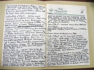
In addition to sketchbooks, William said Marshall also kept extensive diaries. William has kept these diaries, but I did find one trip diary in the collection. The year isn’t dated, however, I can guess from what he was working on that it is probably from around 1990. The diary is all text and details his trip to New Orleans, including what he read each day: “finished a book on Janet Flanner…masterful novel by Nina Berberova, The Accompanist… Editon Wharton.”

A page from Marshall's trip diary to New Orleans. (James Marshall Papers. Box 21:Folder 299). All rights reserved. No reproduction of any kind allowed.

A page from Marshall’s trip diary to New Orleans. (James Marshall Papers. Box 21:Folder 299). All rights reserved. No reproduction of any kind allowed.


Marshall was also a voracious reader. William showed me the special shelves Marshall had built around his room to hold some of his books.

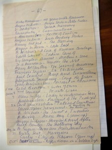
A list of books from the Marshall Collection. (James Marshall Papers. Box 21:folder 303). All rights reserved. No reproduction of any kind allowed.

A list of books from the Marshall Collection. (James Marshall Papers. Box 21:folder 303). All rights reserved. No reproduction of any kind allowed.

William said he liked “Moliere and Chekhov…and a lot of the British women novelists like Elizabeth Taylor and Jean Rhys.” I found a piece of paper with a list of books in the collection. I am assuming these were books Marshall had read or books he purchased to read.

The page was numbered 67.


I’ve learned much in going through the Marshall papers and in talking with William Gray. James Marshall was incredibly talented in his ability to do both quality text and illustrations. He worked very hard to achieve the high quality. Going forward, it will be impossible for me to view my own work without giving it a more critical look: What would James Marshall say? He would most likely say “it could be better” and he would probably be right. Achieving the highest quality takes not only talent, but the sweat, tears, and labor of hard work. On that note, with all that I have gleaned from seeing Marshall’s process, it is time that I get back to the hard work of improving my own manuscripts. Thank you James Marshall, and thank you to the Dodd Research Center and the providers of the James Marshall Fellowship.

New Exhibition: “For Young Naturalists: Ocean Ecology in Children’s Literature”

Explore the diverse ways authors and illustrators use word and image to explain to
children the complex relationships between man and the ocean in a new student-curated
exhibition “For Young Naturalists: Ocean Ecology in Children’s Literature,” on
display from March 27 to April 11 in the Thomas J. Dodd Research Center’s John P.
McDonald Reading Room. Featuring artwork and books drawn from the Northeast
Children’s Literature Collection in Archives and Special Collections, student curator
Rebecca D’Angelo presents children’s books from 1844 to 2012 that illuminate how
subjects such as ocean biodiversity, food security, and conservation have been depicted
and narrated through time.

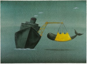
An Ocean World by Peter Sis (New York : Greenwillow, 1992). Pg. 8.

An Ocean World by Peter Sis (New York : Greenwillow, 1992). Pg. 8.

This exhibition is on view to coincide with the Edwin Way Teale Lectures “What role
will the oceans play in meeting the global demand for food?” by Steven D. Gaines,
Thursday, March 27, and “Climate, Weather, Oceans and Biodiversity: Science in Policy
and Politics” by Jane Lubchenco, Thursday, April 10, 4:00pm in the Dodd Center’s
Konover Auditorium.

Location:  The John P. McDonald Reading Room, Archives and Special Collections at the Thomas J. Dodd Research Center, University of Connecticut, Storrs, CT

Dates: March 27-April 11, 2014

Exhibition hours: 10:00am to 4:00pm, Monday through Friday

For more information contact:
Melissa Watterworth Batt, Archives and Special Collections, Thomas J. Dodd Research
Center, UConn Libraries, melissa.watterworth@uconn.edu

Marc Simont

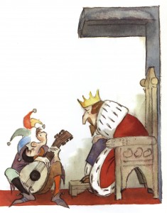
Many Moons by James Thurber (Harcourt, 1990)

Many Moons by James Thurber (Harcourt, 1990)

The Northeast Children’s Literature Collection mourns the loss of our good friend, Marc Simont. Mr. Simont placed a significant amount of his work here and joined us at the CT Children’s Book Fair four times between 1993 and 2002. He was talented, charming and witty, and will be sincerely missed.

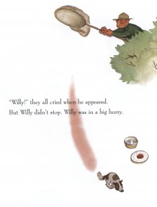
Stray Dog retold and illustrated by Marc Simont (HarperCollins, 2001)

Stray Dog retold and illustrated by Marc Simont (HarperCollins, 2001)

The finding aid at Archives & Special Collections at the Thomas J. Dodd Research Center describes Mr. Simont:

Marc Simont was born November 23, 1915, in Paris, France to Joseph and Dolores Simont from the Catalonian region of northeastern Spain. Joseph was an illustrator and artist/reporter for L’Illustration in Paris. Because his parents moved frequently Marc attended schools in Paris, Barcelona, and New York and became a U.S. citizen in 1926. Though he later attended art schools he considered his father his greatest teacher. He studied art in Paris at Académie Julian, Académie Ranson, and Andre Lhoté School. In the U.S. he attended the New York National Academy of Design and Jerry Farnsworth’s summer school in Provincetown, Mass. He worked as assistant to mural painters Francis S. Bradford (1939 N. Y. World’s Fair) and Ezra Winter (Library of Congress).

The Happy Day by Ruth Krauss (HarperCollins, 1949)

The Happy Day by Ruth Krauss (HarperCollins, 1949)

Simont’s first illustration job was for a pulp magazine that folded before he could collect his $25. Eventually he became an author and illustrator of children’s books, greatly influenced by Ursula Nordstrom, editor of Harper Bros. He illustrated books by Ruth Krauss, James Thurber, Marjorie Weinman Sharmat, Karla Kuskin among others. His illustrations for Janice May Udry’s A Tree is Nice won the Caldecott Medal in 1957, and he received Caldecott Honors for his pictures in Ruth Krauss’s The Happy Day and his own The Stray Dog. Simont has also been recognized by the Child Study Association, Society of Illustrators, N.Y. Academy of Sciences, N.J. Institute of Technology, American Institute of Graphic Arts, and Boston Globe/Horn Book Honor.  In 2008 his political cartoons were awarded the Hunter College James Aronson Award for “Cartooning With A Conscience.”

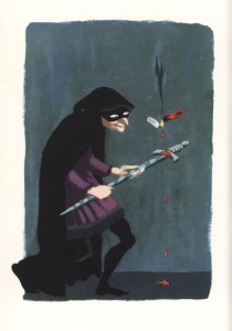
The 13 Clocks by James Thurber (Simon and Schuster, 1950)

The 13 Clocks by James Thurber (Simon and Schuster, 1950)

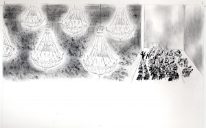
This curator’s favorite book is The Philharmonic Gets Dressed, by Karla Kuskin, published in 1982 by Harper and Row.  Kuskin’s story, in which “one hundred and five people are getting dressed to go to work”  is accompanied by Simont’s illustrations showing the musicians bathing, dressing, traveling to the concert hall, and “turning the black notes on white pages into a symphony.”Marc Simont "Philharmonic Gets Dressed"

A wonderful story about Simont is retold in his obituary which appeared in the New York Times on July 16, 2013.  Simont and Robert McCloskey lived together in Greenwich Village when McCloskey was working on his classic Make Way for Ducklings.  In order to study ducklings more thoroughly for his drawings and with Simont’s assent, he brought home a family of ducklings which lived in the bathtub for several months.

Rest in peace, Mr. Simont.

–Terri J. Goldich

David Polochanin’s new poetry

The recent James Marshall Fellowship awardee David Polochanin has published some new poems.  Check them out at  http://www.gadflyonline.com/home/index.php/how-to-write-a-poem/.

This curator’s favorite is “Dogs riding in cars, a brief analysis” with second favorite, “Moving in with Martha Stewart.”  Congratulations, David!

CT Children’s Book Fair a smashing success

And a great time was had by all at the Connecticut Children’s Book Fair this past weekend!  Many thanks to our fantastic authors Harry Bliss, Bryan Collier, Katie Davis, Bruce Degen, Cathryn Falwell, Rita Williams-Garcia, Susan Hood, Tommy Greenwald, Leo Landry, Patricia MacLachlan, Barbara McClintock, Leslea Newman, Matthew Reinhart, Sergio Ruzzier, Robert Sabuda, Jerry Spinelli and Paul O. Zelinsky.  Our attendees, little and big, raved about the presentations and how excited they were to get their books signed.  The “This is Teen” panel sponsored by Scholastic featured Judy Blundell, Kim Harrington, Kirsty McKay, and Sonia Manzano.  Thanks for the great advice for our young writers!

Katie Davis exhibit opens at the Dodd Center

The Katie Davis exhibit is up and running in the Dodd Center Gallery.  Original materials from the Davis Papers for her books The Curse of Addy McMahon, Party Animals, Mabel the Tooth Fairy, Who Hoots and Who Hops are featured as well as books and some great “Scared Guy” items.  The exhibit runs from October 29, 2012 to February 22, 2013.  There will be a reception and gallery talk by Katie on Saturday, Nov. 10, from 2-4 in the Dodd Center.  Her books will be for sale at the Book Fair.  For more information to go bookfair.uconn.edu.

Katie Davis exhibit, Dodd Center Gallery

Katie Davis exhibit, Northeast Children’s Literature Collection

Tomie dePaola receives Society of Illustrators’ Lifetime Achievement Award

Congratulations, Tomie!  According to the Society’s home page, “The Lifetime Achievement Awards were established in 2005 by past chairs of The Original Art. Nominees must be judged to have a body of work that documents an innovative and pioneering contribution to the field of children’s book illustration, and final selection is made by artists whose work has been juried into the previous year’s show. ”

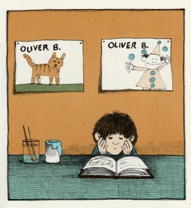
Oliver Button is a Sissy (pg. 5)

From an early age, Tomie and his parents knew he would be an artist. He received his Bachelor of Fine Arts degree from the Pratt Institute in Brooklyn, New York where he studied Art. His Master of Fine Arts degree was received from the California College of Arts and Crafts in Oakland, California. He has also been awarded three honorary Doctorate degrees from separate Universities and Colleges.

Tomie’s career as a professional artist and designer, former teacher of art, children’s author and illustrator is expansive. He has designed greeting cards, posters, magazine and catalogue covers, record album covers, and theater costumes and sets. He has illustrated over two hundred books, and written over seventy. Tomie has won numerous awards, including the prestigious American Library Association’s Caldecott Honor Award for Strega Nona (1976), the University of Minnesota’s Kerlan Award (1981), the Catholic Library Association’s Regina Medal (1983), and the Smithsonian Institution’s Smithson Medal (1990).

Tomie dePaola

Tomie’s books have been published world-wide in fifteen different languages and he has over five million copies in print. Many of his books are largely autobiographical such as Nana Upstairs, Nana Downstairs, Tom, and The Art Lesson. Tomie currently resides in New Hampshire.

The Tomie dePaola Collection contains artwork, sketch books and paintings from the beginning of his career, as well as many different editions from each book he wrote or illustrated, including foreign editions. Some of the languages represented are Portuguese, Swedish, Finnish, French Canadian, German, Afrikaans, and even Zulu. Original illustrations from books, as well as paintings and other art work spanning from his childhood years are included. The Collection also contains marketing items from his books, such as towels, porcelain jewelry containers, music boxes, paper goods (wrapping paper, cups & plates), quilts from schools, and a large selection of Christmas tree ornaments designed by Tomie for the Marshall Fields Christmas trees in Chicago.

Little Tomie

Well done, Tomie!

–Terri J. Goldich, Curator