Looking at Layers
A picture book starts with a great story told in words (and in the sound of words read out loud). Illustrations accompany the author’s story. In the best picture books, the illustrations actually expand the story. The adult reader, as well as the child listening, feast visually on these layers that enrich the text in delightful and often unexpected ways.
As a picture book author, I focus my drafting and revision efforts on the story I want to tell. An illustrator’s considerable contribution to the final product most often comes long after I am done with my personal revision process (and any revisions guided by an acquiring editor). The publisher’s editor and art director usually select, guide, and supervise the artist. So the illustrator’s role seems a bit remote to me as I ply my craft. But remembering that layers can and should be added via art will help me create opportunities for an illustrator to deepen and expand my stories.
As I study the NCLC author/illustrator archives, I am examining the layering of art in picture books created by author/illustrators, whose creative talents allow them to tackle the words and art together. Author/illustrators don’t forget to leave room for layers—they create them as the picture book progresses in a unified way. They revise both words and illustrations to create balance and get it “just right.”
What does one find in the layers added to a picture book by illustration? Here are some thoughts, based on examples from author/illustrator archival material.
Emotion
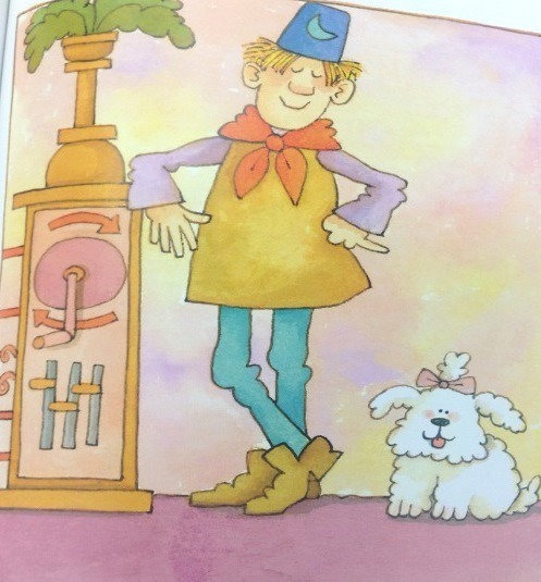
Anita Riggio writes and illustrates from the heart. Emotion is the starting point for her wonderful stories. In Smack Dab in the Middle, Rosie Roselli is “smack dab in the middle” of her large, busy Italian family. Her many joyful accomplishments at school are ignored when she tries to share them at home, and she starts to wonder if maybe she isn’t the center of her loving family universe after all.
As I reviewed Anita’s process for Smack Dab in the Middle, I studied the text and illustrations on each spread, comparing what each separately communicates to readers. A particularly touching spread contains these words on page 20:
Rosie Roselli
really needed a hug.
She needed a hug
right this minute,
but her mother’s arms
were full of Rosie’s sister.
Rosie Roselli couldn’t wait.
She stepped up close.
She breathed in.
Talcum powder
and lavender water.
It smelled like a hug.
But it didn’t feel
like one.
Then and there,
Rosie Roselli decided
just want she
must do.
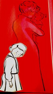
Anita’s evocative words tell us of Rosie’s need; they give the reader an expanded sense of story by dwelling on the scents (which can’t be illustrated) that she associates with her mother.
The related illustration (see below) shows Rosie’s mom’s back turned; she is attending to Rosie’s sister. Rosie’s head is bowed, her eyes are closed. The text doesn’t say, “Rosie felt disappointed, ignored, and rejected.” Those emotions are flowing from the illustration, creating a strong emotional layer to add to and support the text. (Even Anita’s placement of text and art emphasize Rosie’s loneliness here; the text snakes down the left page of this spread; there is empty space continuing onto the right page, where mom is facing away, almost out of the picture at the far right margin.)
 Riggio, Anita. Smack Dab In the Middle! (New York: G.P. Putnam’s Sons, 2002), 21. Photo taken from CLDC776, Archives and Special Collections at the Thomas J. Dodd Research Center, University of Connecticut Libraries.
Plot expansion
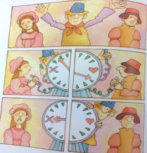
Sometimes, illustrations take readers to places not even mentioned in the text. In Mabel the Tooth Fairy and How She Got Her Job, Katie Davis had some ideas about what might happen to a tooth fairy who works in the dark. The starting point for such an opportunity (to take the reader places) is text that is spare and full of possibilities. Here are three variations of a line of text Katie entertained (the third is final text):
After a few false starts, Mabel was considered an expert in the field.
After a few false starts, Mabel got to really like her work.
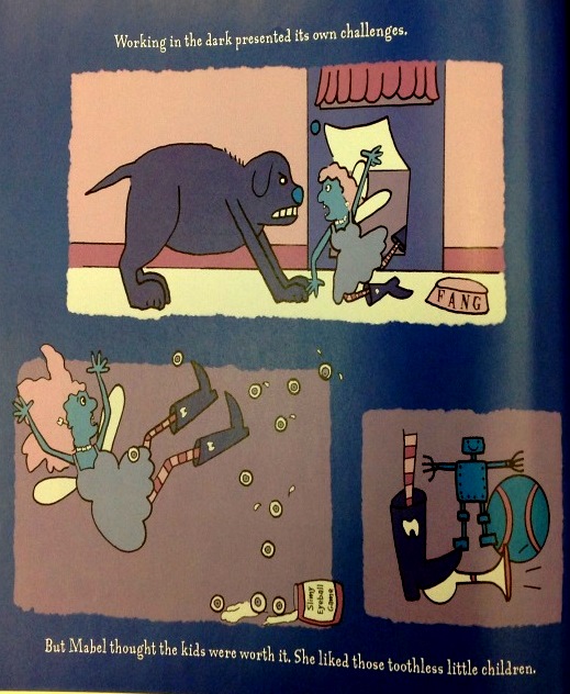
Working in the dark presented its own challenges.
All text versions support the three scenes shown below, although the final version perhaps is the funniest, with its spare understatement. The illustrations show the tooth fairy being accosted by the household mutt, slipping and falling on spilled “marbles,” and making noise by stepping on a toy horn.
The pictures transport the reader; the text does not say, “The dog of the house attacked me. I stumbled over a jar of spilled eyeballs…” Another whole layer of action/plot (with humor—the marble jar reads, “Slimy Eyeball Game”) has been added to the story through these illustrations.

Davis, Katie. Mabel the Tooth Fairy and How She Got Her Job (Orlando: Harcourt, Inc., 2003), 16. Photo taken from CLCD1438, Archives and Special Collections at the Thomas J. Dodd Research Center, University of Connecticut Libraries.
Humor
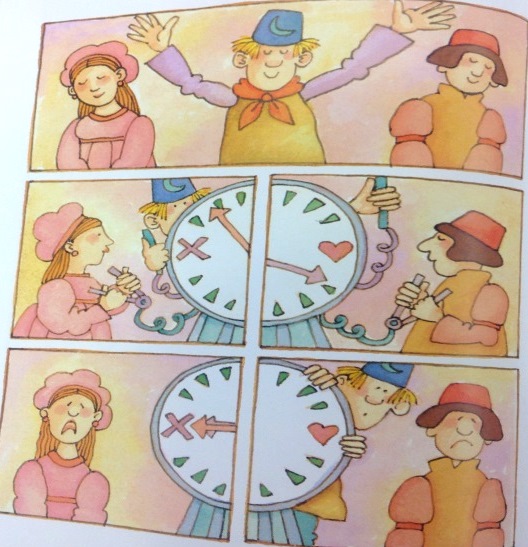
Author/illustrator Tomie dePaola also shares humor via his illustrations. His creative process for Strega Nona Meets Her Match began with a handwritten story accompanied by parenthetical notes to his editor. In this picture book, Big Anthony (Strega Nona’s loyal lunk of an assistant) “defects” to work for the competition, Strega Amelia. When Strega Amelia is away and Big Anthony is left in charge, he messes up the magic big time. Tomie’s earliest draft includes pertinent text (italicized) as well as his illustration ideas set forth in parentheses:
Big Anthony was in charge! (Series of pictures showing Big Anthony reading instructions and making big mistakes on the Husband and Wife wheel – mismatched couples – confusing wart cream and hair restorer – hair falls out, warts increase.)
Things weren’t going too well. (Source:Tomie dePaola Papers Box 41:125K).
Tomie then created illustrations (see below example of mixing up wart cream and hair restorer) to develop the humor of Big Anthony’s bumbling efforts.

Illustration for Strega Nona Meets Her Match, folder 125Y, Box 41 of Tomie dePaola papers. All rights reserved. No reproduction of any kind allowed.
What is interesting, however, is that Tomie’s editor suggested adding text to provide more at this point in the story, explaining that “for read aloud purposes it was important to have a few words.” (Source: Letter from Margaret Frith, Tomie dePaola Papers: Box 41:125L). Ultimately, the spare text was revised as suggested, and lengthened to:
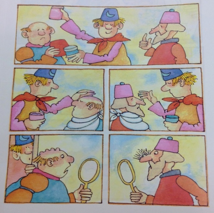
Big Anthony smiled. He was in charge.
The first day he ran the husband and wife machine backwards.
The second day he confused the wart cream with the hair restorer.
Things weren’t going well.
As an author, I suspect that this lengthier text is where I would start my writing process for the same story action. How else would a reader know of the funny mishaps I envision? One possibility would be to include brief illustration suggestions to go with spare text. However, unlike an author/illustrator, who can write such notes to him or herself or to the editor (as Tomie did), an author must tread carefully when making suggestions for art so as not to be directing or limiting the illustrator’s creativity.
The right balance of text and art is achieved on pages 21–23 of the published book (see below). The complexity of Tomie’s illustration panels benefit from the added text that helps communicate his intent and humor regarding Big Anthony’s bumbling. The added text also nicely paces the story, allowing the reader to dwell on these silly mishaps.

[text: Big Anthony smiled. He was in charge.]
[text: The first day he ran the husband-and-wife machine backward.]

[text: The second day he confused the wart cream with the hair restorer.]
dePaola, Tomie. Strega Nona Meets Her Match (New York: G.P. Putnam’s Sons, 1993), 21–23. Photo taken from CLDC776, Archives and Special Collections at the Thomas J. Dodd Research Center, University of Connecticut Libraries.
Authors as well as author/illustrators must be mindful that there is a balance to be found between the read-aloud component and the illustrations in a picture book. However, an author who writes minimal text (even though he or she has a vision for what an illustrator might add) may run the risk of creating a manuscript that seems too slight or unclear to an editor, or perhaps, to young readers who may need some words to decode illustrations.
Conclusion
As I write and revise stories, I’ll keep thinking about layers. I’ll remember that my words need not dwell on emotions that an artist can convey with illustrations. I will deepen stories by words that can’t be shown in the art. I’ll choose words that may give an illustrator opportunities to take my protagonist to places (literally) other than those I may have had in mind. And if I am writing “funny,” I’ll strive for spare text that will encourage a clever artist to add visual jokes and hyperbole. I shall have trust to let an illustrator help tell my story—so that “our” story will marry text and art in a truly memorable picture book.
About Janet Lawler:
A recipient of a 2014 Billie M. Levy Research grant, Janet Lawler of Farmington, CT, is studying the relationship between art and text in picture books at the Northeast Children’s Literature Collection. Through studying the work and process of author-illustrators, she hopes to better understand how a story’s text interfaces with the art. She is searching for a deeper comprehension of why the best picture books are those where the final product is “greater” than the sum of the parts (text + illustrations). She looks forward to applying knowledge gleaned from her research to her own work process as a children’s author.
Ms. Lawler’s picture books have been published by major and specialty publishers. Two have been Children’s Book of the Month Club main selections, and two have been licensed into the Scholastic Book Clubs. If Kisses Were Colors has been translated into Spanish, Japanese, Hebrew, and Korean. Her recent credits include Ocean Counting (National Geographic, 2013 (named a 2014 Outstanding Science Trade Book by the National Science Teachers Association)) and Love Is Real (HarperCollins, 2014). National Geographic will publish Rain Forest Colors in November of 2014.