By Richard Telford
Overwhelm. No other word so aptly describes the feeling of entering the world of Edwin Way Teale as it has been preserved in the Edwin Way Teale Papers housed in the Thomas J. Dodd Research Center at the University of Connecticut. The collection, comprised of 238 linear feet of boxed materials, is extensive. In it, one finds expected things—journals; assorted draft manuscripts; early publications; correspondence; news clippings; thousands of photographic prints and negatives; materials related to his spiritual mentors like Thoreau and Burroughs; and a host of other like contents. One also finds unexpected things—a passbook for a savings account maintained from 1943-1957; an unidentified back door key; a stack of cardstock paper, each sheet containing lines of evenly spaced “Edwin Way Teale” signatures in neat script; a pair of glasses absent their lenses; and Edwin and Nellie’s 1927 motor vehicle registration, to name a few. And within the collection there are myriad trails, so to speak, between items. The draft manuscripts of book chapters in one part of the collection link to corresponding photographic prints housed elsewhere, or to a “biography” of the final book—a kind of scrapbook that Teale created for a book following its publication. Just as Teale documented the natural world in extraordinarily fine detail, so too did he document his life. In both cases, it seems, preservation was central in his mind. Clearly, he aimed in his public life to pass on to coming generations a record of the natural world shaped by his vision of it, with the hope that they too might likewise value and, ultimately, conserve it. His compulsion to preserve a record of his private life, for whatever value that record might likewise confer to future generations, is unequivocal. In both cases, Teale left a record of extraordinary value, a record that is maintained with great care by the staff of Archives and Special Collections at the Dodd 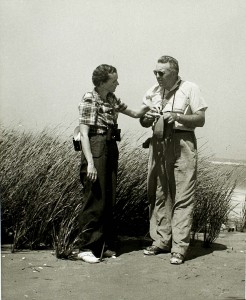 Research Center.
My mother-in-law sometimes invokes an analogy to speak of the approach to seemingly overwhelming tasks: “You need to put water in the sink.” This analogy is framed by the experience of beholding an overwhelming pile of dirty dishes in the sink, and her point, of course, is that you have to begin somewhere. Arriving to the Dodd Center in the late spring of 2014, through the generosity of a Strochlitz Travel Research Grant, I felt overwhelmed by the question of where to begin. Having researched Teale’s influence on the DDT controversy that started around 1945 and enlisted such notables as Teale, Richard Pough, and E.B. White, I had learned of the correspondence between Teale and Rachel Carson on this subject and many others. Though my larger goal for the summer was to delve deeply into Teale’s four 500-page journals kept at Trail Wood from 1959 to 1980, I felt the need to start more simply. For me, the water in the sink of the Edwin Way Teale Papers was the file of correspondence between Rachel Carson and Edwin Way Teale, which starts in 1949 and ends in 1966, shortly after Carson’s death. The correspondence is largely one-sided, in that only a few of Teale’s letters to Carson are preserved in the file via carbon paper copies or rough drafts—though some of this correspondence is also preserved in the Rachel Carson Papers at Yale’s Beinecke Library. These letters in the Teale Papers, albeit limited in number, are rich and full of meaning, inviting deep exploration and careful exposition.
In 1942, seven years before the first correspondence in this file, Teale had published Near Horizons: The Story of an Insect Garden to great acclaim, winning the John Burroughs Medal for distinguished natural history writing in 1943. Building on his success with Grassroot Jungles, published in 1937 and featured on page one of The New York Times Book Review, Teale had established himself as an expert on insect life and as one of the foremost macro photographers in the world, pioneering many insect photography techniques that subsequently came into common use. Nonetheless, despite its national prominence, the rented four-acre Baldwin, Long Island plot that had been the subject of Near Horizons and the material source for both books was soon sold by its landlord to the Baldwin School Board. The insect garden that Teale had painstakingly built over six years was abruptly subject to the bulldozer of progress. This devastated Teale, and Carson, in a typed September 19, 1950 letter in which she invites him to be a part of the 1951-1952 National Audubon Society lecture series, adds the following handwritten postscript: “I am sad about the Insect Garden. One lovely thing after another is swallowed up by ‘progress.’ But it will live on in your books.”
 Edwin Way Teale thought a great deal of Rachel Carson, both personally and professionally, and in this modest collection of letters, we see several examples of his mentorship of her. On November 3, 1950, she writes to tell him, after the fact, of her inclusion of his name as a reference for a Guggenheim Fellowship application, noting, “There was no time to ask you if it was all right, as I would always want to do in such a case.” While such an action might seriously strain both a professional and personal relationship, it also makes clear the degree to which Carson knew she had Teale’s support. Having been awarded the fellowship, she writes on April 2, 1951, “I’m most grateful for the boost you gave it [the application] and hope when you eventually see the book you will feel repaid.” When she wins the John Burroughs medal for distinguished natural history writing in 1952, for the l951 publication of The Sea Around Us, she expresses concern that she will not be logistically able to attend the ceremony and asks Teale if he might accept the award on her behalf. In a March 22, 1952 letter, she notes, “There’s no one I’d rather have represent me on that occasion.” Ann Zwinger, who would later collaborate with Teale on his final, posthumously published book, A Conscious Stillness (1982), identifies the critical role that Teale played in Carson’s literary rise. In her introduction to a 1989 special edition of The Sea Around Us, Zwinger characterizes Teale as “the quiet and quintessential nature writer” who “immediately recognized Carson’s greatness” (xxiv), freely offering his support to her by any means possible.
In addition to lending the weight of his name and literary stature to her endeavors, Teale lent the weight of his insights on the reading public and the kind of book to which they might be drawn. In a November 3, 1950 letter, Carson writes, “Do you remember that several years ago you told me you wished I would write a seashore book that would tell you, not just what the animals were, but some whys and wherefores of their existence? It seems I’m about to do something of the sort.” This “seashore book” would later take the form of her 1955 The Edge of the Sea, illustrated by U.S. Fish and Wildlife Service illustrator Bob Hines. Realizing the strength of Teale’s influence and the depth of his kindness, she adds the following postscript to an August 18, 1953 letter in which she laments her struggle to finish The Edge of the Sea: “I neglected to say that I think it would be fine if you will use your influence in Bob’s behalf, and I know he would appreciate it enormously.” She adds, “Bob does not realize his own ability and I am hoping his work on this book will attract enough notice to build up his self confidence.” After the publication of the first serialized section of the book in the summer of 1955, Teale writes to Carson on August 22, declaring that her writing in the book “is serene and fresh and strong with no residue of fatigue or stress in it—and that, in truth, is a very great accomplishment.” In this exchange, and in many others in these letters, we readily see what Ann Zwinger characterizes as “the generosity typical of the natural history community” (xxiv).
As Rachel Carson embarked on the writing of Silent Spring, she once again turned to Teale both for encouragement and to tap his vast knowledge of the insect world and his connections to others with like knowledge. In an August 15, 1955 letter to Teale, having just finished The Edge of the Sea, Carson writes, “Just now the thought of having to write makes me ill—so you know how deeply I feel for you, tied to an unfinished book! Of course I’m ‘tied’ to one not even begun, but I’m resolutely not thinking about that!” This seems a likely reference to Autumn Across America (1956) for Teale, and, though it is never directly corroborated in these letters, for Carson the book that she is “resolutely not thinking about” seems likely to be Silent Spring. The fact that Carson does not further elaborate on her book “not even begun” suggests that Teale may already have been aware of its potential contents. Given the inevitable minefield of public, corporate, and governmental response that such a book was certain to engender, it is impossible to fully comprehend the depth of Carson’s inevitable internal struggle to come to terms with writing and publishing it.
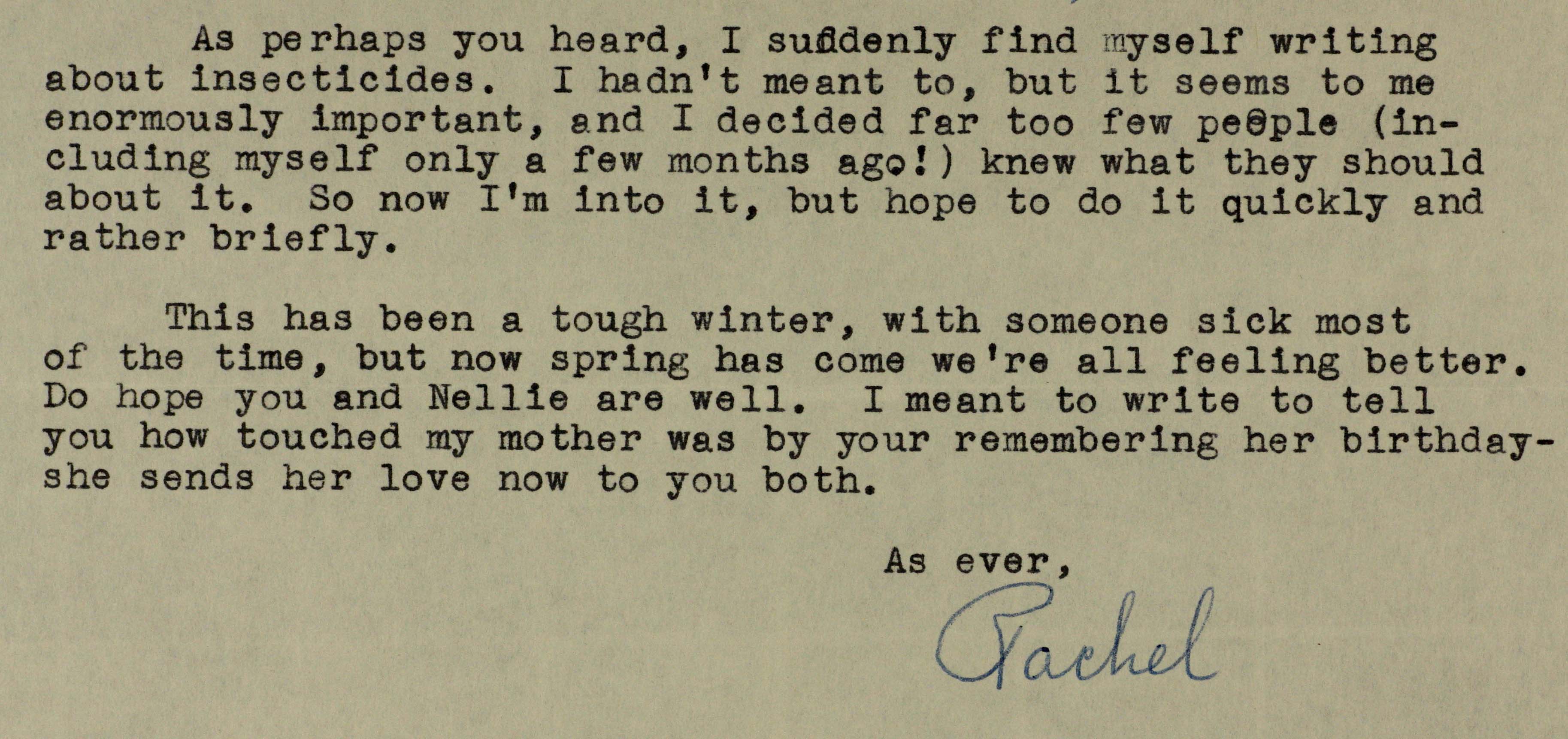
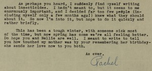
Nearly a year later, on December 30, 1956, Carson writes to Teale, excited about his upcoming visit to Washington, D.C., which she suspects is meant to overlap with the inauguration of Dwight D. Eisenhower. She is living in nearby Silver Spring, Maryland at the time and notes, “I’ll be delighted to have a chance to talk over a couple of ideas that are whirling about in my mind.” Here again this seems a likely reference to Silent Spring. Sixteen months later, on April 17, 1958, amidst a series of letters querying Teale’s recommendations for her purchase of 35mm camera equipment, Carson writes, “As perhaps you heard, I suddenly find myself writing about insecticides. I hadn’t meant to, but it seems to me enormously important, and I decided far too many people (including myself only a few months ago!) knew what they should about it.” Ironically, she adds, “So now I’m into it, but hope to do it quickly and rather briefly.” With the hindsight of history, the understatement of these sentences is striking, but perhaps it aptly illustrates the impossibility of predicting the sea-change in environmental consciousness that the publication of Silent Spring would spur as well as the tempest of controversy that would spur that sea-change—a controversy that remains in full force in some circles today.
Despite the fact that Carson’s statements above suggest a project recently begun, a letter one month later suggests otherwise. In a May 19, 1958 letter to Teale, she writes, “Besides the mountain of stuff I have here, I already have some 300 references on insecticides waiting for examination before I go to Maine. I do have the prospect of some help, but even so it is an appalling job. However, I am eager to have every scrap of information available, so I am grateful for all you have sent, or anything you may come across in the future.” It seems unlikely, if not impossible, that Carson could have gathered this volume of material in the span of a few months, especially in a pre-Internet era. Instead, one has the distinct impression that the groundwork for the writing of Silent Spring was laid deliberately over several years, despite Carson’s matter-of-fact tone on April 17th. That tone, consciously or unconsciously, may represent an attempt to mitigate the ominousness of the task that would subsequently define her life for posterity. In the correspondence that follows, we see Teale’s 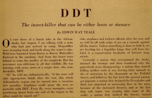 important role both in the development of Silent Spring and, more broadly, in the evolution of the twentieth-century environmental conservation movement.
From Carson’s perspective, Teale was the ideal resource: an expert entomologist, albeit not formally trained; a past president of both the New York and Brooklyn Entomological Societies, with extensive professional connections; a supportive friend and colleague willing to lend his clout to her work; and a pioneer himself in terms of his vehement opposition to the indiscriminate use of DDT. In the March 1945 issue of Nature Magazine, Teale had published a blistering, high-profile critique of indiscriminate DDT use, painting a dire picture of the potentially catastrophic results it would wreak on the natural world. Illustrating the article’s significance, the editors of the magazine dedicated a full page of commentary to it, beginning, “We commend for serious and mature consideration the leading article in this issue of the magazine. It is, we believe, significant in thought and implication, even beyond the subject it discusses—the new insecticide, DDT” (145). Teale’s article, in fact, foreshadows Silent Spring, both in message and tone. This is especially evident in the following passage:
If the insects, the good, bad, and indifferent insects, were wiped out in a wide area, the effects would be felt for generations to come. Songbirds, depending upon insects, or on seeds mainly produced by the pollinating activity of insects, would flee the area. A winter stillness would fall over the woods and fields. There would be no katydids, no crickets, no churring grasshoppers or shrilling locusts, no bright-winged and vocal birds. Trout and other gamefish, poisoned by the DDT or starving as the insects disappeared, would die in the lakes and mountain streams. Wildflowers, in all the infinite variety of their forms and shades, would gradually disappear from the openings and the hillsides. The landscape would become drab, clad in grays and greens and browns. […]. No drought, no flood, no hurricane could cause the widespread disaster that would follow in the train of the annihilation of the insects.
(162)
Although Teale’s article is not referenced in any of Carson’s correspondence preserved in the Teale Papers at the Dodd Center, it seems certain that she would have been aware of it. A simple search of the Reader’s Guide to Periodical Literature for 1945 would have identified Teale’s article. Since DDT had not been widely used as an insecticide until the latter half of World War II, the timeframe for Carson’s literature search of DDT’s pesticide use would have been necessarily narrow, further upping the likelihood that Teale’s article would have come to her attention. Additionally, the material which he sent and for which she expresses gratitude on May 19, 1958 would almost certainly have come, at least in part, from the files he had compiled while preparing his own article. In this way, the conspicuous absence of Teale’s article from the extensive references at the end of Silent Spring seems a little enigmatic, though it might be explained by the general absence of popular literature in her source material in favor of peer-reviewed academic literature.
In reviewing the Carson-Teale correspondence in the Teale Papers, it is too easy to get fixated on the DDT-related materials, given the titanic role of Silent Spring in the shaping of the modern environmental conservation movement. To do so, however, ignores the larger importance of the correspondence—its capacity to illustrate by example the complex, private interactions that shape the lives of prominent writers in a given period. The relationship between Carson and Teale, as it is illustrated in these letters, is rich and varied, informative and vital. In their letters, for example, we see gentle humor when Carson, lamenting a book-signing appearance before the Maria Mitchell Association of Nantucket, quips in an August 12, 1952 letter, “What will you give me not to tell them that Edwin Way Teale is coming to Nantucket, too, and they can have a double tea and autographing??” We see authentic sympathy for the physical and emotional rigors of the writing process when, as referenced above, Carson confides that, after completing The Edge of the Sea, “the thought of having to write makes me ill” (August 16, 1955), and Teale reassures her that “the strain and struggle and frustration that I know went into shaping the book” are not evident in the writing (August 22, 1955). We see the profound need of each for seclusion in nature when Carson writes, “I now have about 350 feet of shoreline, with the house well protected on both sides […]. Such wonderful ferns, mosses, lichens, glades full of bunchberry and Clintonia, wood lilies, Indian pipes, ladies slippers—real Maine woods” (August 16, 1955), and when she writes on June 9, 1959 to congratulate the Teales on their purchase of Trail Wood, noting her certainty that “you and Nellie will have the time of your lives in such a place.” Finally, we see the deepest intimacy of friendship when, in a December 10, 1960 letter, Carson confides that she has undergone a “radical mastectomy” to treat the cancer that will later kill her. Ultimately, these letters illustrate an abiding friendship underpinned by a deep commonality of view, of purpose, of artistic impulse, and—perhaps most importantly—of a far-reaching vision of nature, both in its wondrousness and its terrible fragility.
Richard Telford teaches literature and composition at Woodstock Academy in Connecticut. He has a BA in English from the University of New Hampshire, an MS in English Education from the University of Bridgeport, and an MS in Environmental Studies from Green Mountain College. Working with the Connecticut Audubon Society, he helped design and found the Edwin Way Teale Artists in Residence at Trail Wood program, which he directs. He was recently awarded a Rose and Sigmund Strochlitz Travel Grant by the University of Connecticut to support his ongoing research on naturalist writer and photographer Edwin Way Teale.
References
“Carson, Rachel, 1949-1966.” Correspondence. Box 150, Folder 3040. Edwin Way Teale Papers, Archives & Special Collections at the Thomas J. Dodd Research Center, University of Connecticut Libraries.
Teale, Edwin Way. “DDT: The Insect-killer that can be Either Boon or Menace.” Nature Magazine, March 1945, 121-4, 162.
Zwinger, Ann H. Introduction. The Sea Around Us. By Rachel Carson. 1950. Oxford: Oxford University Press, 1989. xix-xxvii. Print.