Is it a Map or a Chart?

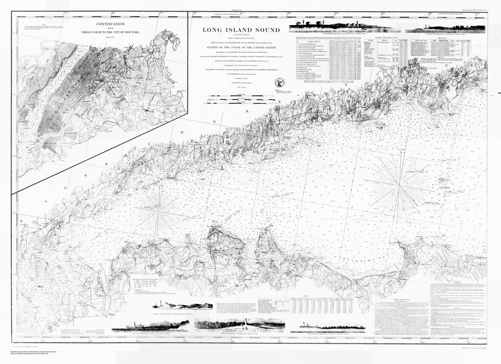
Long Island Sound (western sheet) / from a trigonometrical survey under the direction of F.R. Hassler and A.D. Bache

I’m starting a new adventure and it all came about from playing around with maps!  Last month I was hired as the supervisor of the Treworgy Planetarium at Mystic Seaport and that means you’ll probably be hearing less and less from me as an author here at Outside the Neatline.  You may be hearing about special events or items of interest that I stumble across or new geographical information related to the maritime tradition.  For example, do you know what the difference between a map and a chart?  I’ve had to learn quickly!

Part of a chart, showing Kidds Humbug, Lents Cove From the Mystic Seaport Image Archives

Reading and using a chart is one of the basic skills that are taught at the Treworgy Planetarium.  Concepts such as map projections, scale, taking bearings and plotting headings are covered in the classwork (very geographical).  Other course offerings include taking a noon sighting of the sun with a sextant, celestial navigation to find latitude and longitude, and marine weather.

In the next few months I’ll be developing a new blog platform for the Treworgy Planetarium so keep your eyes peeled!

Washington, D.C.: Then and Now

For a look into the past of Washington, D.C., check out the The Ruined Capitol Blog:

A photo depository and discussion dedicated to the comparison of buildings, culture, and society in Washington, D.C. that have been destroyed, replaced or miraculously preserved during the great architectural purge of the Federal City from 1930 to the 1980s.


This blog features historical photos from locations in the nation’s capitol that show the evolution of its urban geography. It’s amazing to see some of these older photographs compared to their contemporary counterparts for a variety of reasons, but one is the difference in scale. An example of this can be seen in the two photographs below, at the intersection of K and 15th St NW (dated ca. 1922; Present). With wider roads and taller buildings, as the author notes, the urban design and architecture have given this location a tremendously different scale and sense of place.


The location of the intersection- courtesy of Google Earth:


For more of these before and after shots of D.C., visit The Ruined Capitol.


The Atlantic Cities: Bridgeport-Stamford-Norwalk 7th Healthiest Metro

The Atlantic Cities has ranked metropolitan areas using a health index with Bridgeport-Stamford-Norwalk, CT coming in as the 7th healthiest metro. As for other location in New England- Barnstable, MA came in 15th while Burlington, VT came in 20th. The majority of the most unhealthy metros, according to the index, are located in the South and Midwest. The index is based upon two health indicators: the level of smoking and obesity. For more, check out the full article.

State Transportation Facts and Figures

A screenshot of motor fuel use per capita from RITA’s State Transportation facts. Connecticut ranks 43rd out of 51 (Washington, D.C. is included).

The Research and Innovative Technology Administration of the U.S. Department of Transportation has released an interactive application, entitled State Transportation Facts and Figures, that allows you to explore transportation statistics by state. The statistics included fall under 7 categories:

  • Infrastructure
  • Fatalities and Injuries
  • Distracted Driving 
  • Freight Transportation
  • Passenger Travel
  • Economy and Finance
  • Energy and Environment

The data can be viewed as a map, bar chart, pie chart, or scatter chart, or, by clicking the various drop down menus of the application, you have the option of downloading the source data in addition to printing the various figures.

To view data for Connecticut, click here.