 |
| PSI’s Interactive Map shows the organizations Areas of Interest |
Monthly Archives: July 2011
Geospatial Technology Is Enabling Better Power Management in California
According to this Reuters article, Geospatial Technology has enabled real-time management of electricity in California. What does this entail? For one thing, a control room equipped with “an 80 foot by 6.5 foot screen” to display the power grid in real-time. Software developed by Space-Time Insight, which uses Google Maps as a base map, allows employees at The California Independent System Operator Corporation to manage power supply in addition to determining what source of power will be cheapest for specific locations. One example this article cites is how California ISO was able to divert power flow away from areas affected by wildfires in San Diego in 2008.
The “Internet of Places”
Is Geography catalyzing a new “big step” in evolution for the Internet? The authors of this article in Directions Magazine describe how geo-enabling data is an important stepping stone for future growth in what information the web provides.
Crisis Management with Mobile Applications
Check out this article that details a “Crisis Management App” that first responders in Marietta, Georgia use in emergencies. The application, developed with ESRI’s ArcView 10 and Adobe Flex, is designed to be used by non-GIS experts. Although it is designed for easy functionality, the capabilities of the application remain rich. Users (first responders) can add features, such as incidents and roadblocks in addition to accessing imagery and live video stream.
Also, be sure to check out this CNN article that details the growing use of Social Media in times of disaster. Russ Johnson, the director for public safety and homeland security for ESRI, is quoted throughout the article describing how these tools can help emergency resources be deployed more efficiently in time sensitive situations.
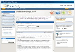
August 2011 – New American FactFinder Workshops at UConn Storrs
 Are you interested in downloading and using 2010 U.S. Census for Connecticut and having trouble using the New American FactFinder? Are you interested in learning more about how to use the New American FactFinder to access data from the 2010 U.S. Census? The Connecticut State Data Center is offering workshops at the University of Connecticut Storrs Campus to provide users with an opportunity to learn more about the New American FactFinder in a hands-on workshop environment. Included below are the upcoming workshops dates/times and registration links:
2011 GIS in Public Transportation Conference Announced
The Urban Regional Information Systems Association (URISA) and the University of South Florida’s National Center for Transit Resarch at the Center for Urban Transportation Research (CUTR) have announced the details to the 2011 GIS in Public Transportation Conference, which is September 13-15, 2011 at the Hilton Bayfront in St. Petersburg, Florida. The conference is still accepting poster submissions.
Frontlines Highlights How USAID Implements Geospatial Technology
- Mapping Out Disaster, Relief and Recovery describes how Geospatial resources are applied for disaster relief (citing recent examples in Haiti and Japan).
- Thinking Spatially With an Eye in the Sky highlights the use Remote Sensing technology in Mesoamerica, Eastern Africa and Hindu-Kush Himalaya regions.
- The Great Data Warehouse discusses the USAID funded Geographic Information Support Team Data Repository, which works to aggregate spatial data for use by the greater humanitarian community.
- What It Means to Think Spatially explains the role of geovisualization in development.
Open Geospatial Consortium 3D Management Group to Host Second 3D Summit

The Open Geospatial Consortium, a non-profit dedicated to leading the way for standardizing geospatial and location based services, is hosting its 2nd 3D summit September 20, 2011 in Boulder, Colorado. Abstracts for presentations are due Friday, August 12, 2011. Other important dates are as follows:
- 12 August 2011: Abstract submissions for Lightning Talks and Video Presentations
- 12 August 2011: Notification on accepted contributions
- August 2011: Program Announcement
- August 2011: Registration Available
- 12 September 2011: Final Video Submissions
- 20 September 2011: 3D Summit 2011 at the OGC Technical Committee Meeting
Racial Change in the Hartford Region, 1900 – 2010: An Animated Time-Slider Map
Atlas of New South Wales
 |
| A Screenshot of the Atlas of New South Wales |
How do you provide a more transparent and open government, an educational resource while utilizing emerging technology? The New South Wales government decided to develop an online atlas that includes Economic, Election, Environment, History and Demographic related information. Click here to check out this savy and information rich GIS application that uses Bing as its basemap!


