The United States Census Bureau has released the 2006-2010 American Community Survey (ACS) 5 year estimates! This dataset includes updated socio-economic statistics covering every community in the nation, including all 169 towns in Connecticut. Included below are some examples of the data variables available from the 2006-2010 American Community Survey (ACS) 5 year estimates for Connecticut:
Median Household Income (2006-2010) by Town in Connecticut:
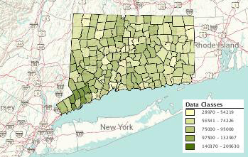 |
| Click the map above to view interactive map |
|
|
|
View Median Income Data by Town in Connecticut
Ratio of Income to Poverty Level for Families (under .5) (2006-2010) by Town in Connecticut:
 |
| Click the map above to view interactive map |
View Ratio of Income to Poverty Level for Families Data by Town in Connecticut
How can I access the 2006-2010 ACS 5 year estimates data?
The American FactFinder provides access to the 2006-2010 ACS 5 year estimates data for Connecticut as well as the entire nation. From the American FactFinder users can search datasets, download datasets, and create interactive maps based on variables from the ACS.
At what geographic levels is the data available?
The ACS 5 year data is available at the national, state, congressional district, county, county subdivision (town), tract, and block group level. For those users interested in examining block group level data the margin of error values could be significant at the block group level so be sure to review the margin of error values closely as tract level data may provide less error.
Comparing ACS data to 2010 Census
For additional details on the American Community Survey and when/if comparisons of the data can be made to the 2010 census visit: http://www.census.gov/acs/www/guidance_for_data_users/comparing_data/
What if I have questions about using the ACS?
Contact the Connecticut State Data Center at ctsdc@uconn.edu and we will be happy to assist.