Creating KMZ’s in ArcMap

Our recent blog series featuring the collaboration between MAGIC and the On The Line project has detailed the development of digital maps. Although we have given some technical detail in each post, I thought it would be fun to post a tutorial on how to create KMZ’s (for use in Google Maps and Google Earth) in ESRI’s ArcMap. For this exercise, I will create a map of Connecticut towns symbolized by total population.

1.Acquire Data: The first step in creating any cartographic project is to acquire the necessary data. For this project, I have downloaded Census data by town (county subdivision) from MAGIC’s GIS Data Page.

The shapefiles download will include shapefiles in both WGS84 and NAD83 coordinate systems. Once I download the shapefiles, I can add the P001 (which contains total population) WGS84 shapefile into ArcMap. If you are going to be working with MAGIC’s Census data, it is also important to download the spreadsheet data in addition to the shapefiles. The spreadsheet data contains a codebook that will allow you to interpret the field names of the shapefile attribute table. 
2. Remove Counties Not Defined: There are 4 features in the Connecticut County Subdivisions data set that are not really towns, but are features that occupy the Long Island Sound area. In the Name10 field of the attribute table, I can see which these are. 
To remove these, I need to write a simple Definition Query, which is done in the Properties menu of the layer. Click Apply or OK to save the changes.
3. Symbolize Layer(s): Now that I have only the 169 Connecticut towns displayed, I’m ready to symbolize the layer. This, like the Definition Query, is done in the Layer Properties. Click Apply or OK to save the changes.
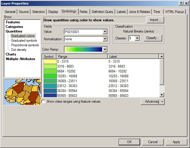
4. Hide Unnecessary Labels: Next, I am going to hide all of the fields I do not want displayed in my final product (I only want the name of the town and total population). Under the Fields tab of the Layer’s Properties, I can uncheck  the fields I don’t need or want to display. Click Apply or OK to save the changes.
5. Configure Pop-Up Labels: ArcMap allows you to export labels as pop up windows. This is done under the HTML Labels tab in the Layer’s Properties. By default, the field name will be included, but you can check the hide field name column if you don’t want it to display (as I have done). Click Apply or OK to save the changes.
6. Export Layer/Map using Conversion To KML: There are two options to export your data; you can either export an individual layer or the whole map. If you choose Layer to KML you will need to browse to your layer, if you choose Map To KML you must browse to your .MXD file.
You can adjust the output scale as well as the resolution of your output in the Layer (or Map) to KML tool.
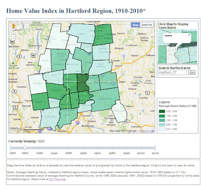
7. Display in Google Earth: If you have Google Earth already installed on your computer, you should be able to double-click your new KML to open it. 
8. Clean up Labels: To give my labels a cleaner look, I’m going to reduce their redundancy. To do this, I must go back into ArcMap and ensure my primary label is set under the display tab of the Layer Properties menu. I chose the town name field.
Note: You can also adjust transparency under the Display tab.
Then, I can turn the name field off. Click Apply or OK to save the changes.
Now, at least one of the repeated labels has been removed.
If you want to edit the labels in more detail, many times it will be more efficient to edit them in ArcMap using tools like the Field Calculator before exporting the layer or map. 

Sextante For ArcGIS….Soon

Sextante is currently capable of integrating with many Java opensource GIS and non-GIS applications.

Sextante is a Java-based geospatial data analysis library. It currently contains over 300 algorithms for data processing, performs both raster and vector analyses, and will soon be compatible with ESRI’s ArcGIS. Check out these two videos for more!

Sextante will soon be capable of integrating with ArcGIS.

Visit the Sextante Blog for future updates…

Clark Labs Awarded Grant to Develop Software for Land Management Decision Making

Clark Labs, which is a part of the Geography Department at Clark University, has been awarded a $1.8 Million grant by the Gordon and Betty Moore Foundation to develop software for land management decisions. Clark Labs has already developed an application entitled Land Change Modeler, which will be enhanced through a partnership with the Natural Capital Project (which I profile in this previous post).

Torn in Two Frames the Civil War in Cartographic and Geographic Thought

Torn in Two is a multimedia exhibit featuring maps, photos and more.


The Norman B. Leventhal Map Center at the Boston Public Library is commemorating the 150th anniversary of the American Civil War with an exhibit entitled Torn in Two. This multimedia exhibit frames the conflict in cartographic and geographic context and features historic maps, photographs, prints, diaries, political cartoons and more. On September 21 (10 AM to 3 PM), there will be a symposium featuring:

  •  Debra Newman Ham: Thenceforward and Forever Free: A brief Overview of the Quest for Emancipation in the United States
  • Susan Schulten: Mapping the Sectional Crisis: Cotton, Slavery, and the Strength of the Rebellion
  • Richard Miller: The Battle of Balls Bluff: Would Terrain Maps Have Made a Difference?
  • Ronald Grim: Remembering the War through Maps: Creating the Gettysburg Post-Battle Maps

Throughout 2011 and 2012 there will be more Civil War experts visiting The Boston Public Library as a part of the Lowell Lecture Series 2011-2012: Remembering the Civil War.

ArcGIS Toolbox Calculates the Value of Nature’s Goods and Services

Dr. Gretchen Daily co-edited this book which aims “to provide the most intensive and best technical analyses of ecosytem services to date”.

On Monday, The New York Times published this article that features Dr. Gretchen Daily’s work in which she investigates the value of natural capital, or “nature’s goods and services that are fundamental to human life”. Her interest, the article details, developed while working in Costa Rica and blossomed into her co-founding of the Natural Capital Project.

The Natural Capital Project has developed a suite of geospatial tools, InVEST (Integrated Valuation of Ecosytem Services and Tradeoffs), that quantifies the impact of land use change on natural capital. This set of tools run in ArcGIS and aim to answer questions like the following examples from the InVEST website:

  • How will a new coast management plan impact seafood harvest, renewable energy production and protection from storms?
  • Where would reforestation or protection achieve the greatest downstream water quality benefits?
  • Which parts of a watershed provide the greatest carbon sequestration, biodiversity and tourism values?

Conceptualizing the InVEST models

The InVEST toolbox is available to download for free here, but you must have ArcGIS 9.3 or 10 with Spatial Analyst installed to use it. The download includes sample data that can help you become accustomed to how the tools work. Although technical support is limited, once you have registered, you gain access to the InVEST forum of users. Lastly, Natural Capital provides information on how to incorporate analyses using InVEST into science-policy and planning.

MAGIC’s “How Do I…” Page Has New Look

MAGIC’s How Do I… page now features videos.

As of late, we have been highlighting the new organization and added capabilities of MAGIC’s website (See this post about the GIS Data Page and this post about Aerial Photography in Connecticut). MAGIC’s How Do I… page has become the latest update. This page now includes tutorials for both ArcGIS and Google products – videos included! Visit it for more!

Home Value Index in Hartford Region, 1910-2010

This is the fifth in a series of posts featuring web-based maps developed by the University of Connecticut Libraries Map and Geographic Information Center (MAGIC) for the On The Line project.

Suburbanization is a spatial phenomenon that has influenced the way in which we live in the United States. Throughout the 20th century, wealth decentralized. At the beginning of the century, the majority of wealth was concentrated in the central city and, as the century progressed, it migrated to the suburbs. Much of this occurred following World War II and the development of the interstate highway system, which made middle-class workers more mobile and proliferated commuting by automobile. A consequence of this migration pattern is that the central city is often left with a lower tax base per capita, and thus, fewer resources to provide services.

Click to visit the Home Value Index in Hartford Region (1910-2010) time-slider map.

As a part of our collaboration with On The Line, MAGIC produced a dynamic time-slider map of home values that shows this migration of wealth in the Hartford metropolitan area. To correct for inflation, we indexed each town’s average home value to the regional average for each decade (labeled as 1.00). Darker green areas represent home values higher than the regional average. This map brings together nearly a century of town-level data from two sources: assessed dwelling values that have been equalized for comparison (from the Connecticut Tax Commissioner reports, 1910-1980) and market sales transactions of single-family homes (from the Capitol Region Council of Governments, 1990s-2000s).
Note: We are still working on obtaining comparable home value data for 2010.

The wealth migration map above is similar to the racial change time-slider map that was featured in an earlier blog post, but differs in how the towns are symbolized. In the map of racial change, each town is symbolized based on the percentages in each town. In the map home value index change, each town is symbolized by how its average home value compares to the average for the region as a whole.

With support from the National Endowment for the Humanities, MAGIC created this and other interactive maps with Jack Dougherty of Trinity College for the On The Line project. This and other maps are freely accessible in a public history web-book, entitled On The Line: How Schooling, Housing and Civil Rights Shaped Hartford and its Suburbs. On The Line tells the story of schooling and housing boundary lines that divided metropolitan Hartford, Connecticut over the past century, as well as the struggles of ordinary families and civil rights activists who sought to cross over, redraw or erase these lines.

Technical Detail:
The cartographic layers for the Home Index in Hartford Region animated time slider map were created using ESRI’s ArcMap software, then exported as KMZ files using the ArcToolbox conversion tool.
This interactive map utilizes the Google Maps API v3 in addition to JavaScript code developed by Thomas Bachant and Jean-Pierre Haeberly to create the interface that incorporates each KMZ file by year with a time slider. Each time the time slider is moved, the corresponding KMZ file for that year is asdded to the map to allow users to visualize the data.

Special Thanks to Thomas Bachant and Jean-Pierre Haeberly for developing the custom JavaScript for this map!