Hurricane Irene – Road Closure Map

Despite best efforts to clear roads in Connecticut after hurricane Irene there are still some obstacles that drivers will have to face.  The Connecticut Department of Transportation has compiled this interactive map that indicates trouble spots that drivers will have to face.  Click on the image to be directed to the live map and plan your route before leaving home!

Connecticut’s Interactive Travel Information Map

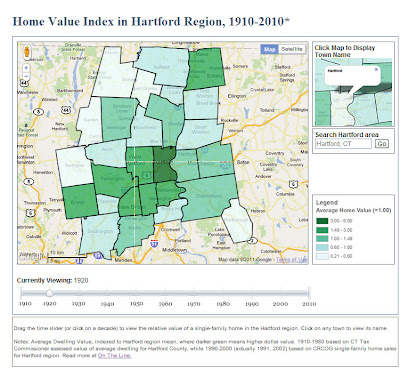
Home Value Index in Hartford Region, 1910-2010

This is the fifth in a series of posts featuring web-based maps developed by the University of Connecticut Libraries Map and Geographic Information Center (MAGIC) for the On The Line project.

Suburbanization is a spatial phenomenon that has influenced the way in which we live in the United States. Throughout the 20th century, wealth decentralized. At the beginning of the century, the majority of wealth was concentrated in the central city and, as the century progressed, it migrated to the suburbs. Much of this occurred following World War II and the development of the interstate highway system, which made middle-class workers more mobile and proliferated commuting by automobile. A consequence of this migration pattern is that the central city is often left with a lower tax base per capita, and thus, fewer resources to provide services.

Click to visit the Home Value Index in Hartford Region (1910-2010) time-slider map.

As a part of our collaboration with On The Line, MAGIC produced a dynamic time-slider map of home values that shows this migration of wealth in the Hartford metropolitan area. To correct for inflation, we indexed each town’s average home value to the regional average for each decade (labeled as 1.00). Darker green areas represent home values higher than the regional average. This map brings together nearly a century of town-level data from two sources: assessed dwelling values that have been equalized for comparison (from the Connecticut Tax Commissioner reports, 1910-1980) and market sales transactions of single-family homes (from the Capitol Region Council of Governments, 1990s-2000s).
Note: We are still working on obtaining comparable home value data for 2010.

The wealth migration map above is similar to the racial change time-slider map that was featured in an earlier blog post, but differs in how the towns are symbolized. In the map of racial change, each town is symbolized based on the percentages in each town. In the map home value index change, each town is symbolized by how its average home value compares to the average for the region as a whole.

With support from the National Endowment for the Humanities, MAGIC created this and other interactive maps with Jack Dougherty of Trinity College for the On The Line project. This and other maps are freely accessible in a public history web-book, entitled On The Line: How Schooling, Housing and Civil Rights Shaped Hartford and its Suburbs. On The Line tells the story of schooling and housing boundary lines that divided metropolitan Hartford, Connecticut over the past century, as well as the struggles of ordinary families and civil rights activists who sought to cross over, redraw or erase these lines.

Technical Detail:
The cartographic layers for the Home Index in Hartford Region animated time slider map were created using ESRI’s ArcMap software, then exported as KMZ files using the ArcToolbox conversion tool.
This interactive map utilizes the Google Maps API v3 in addition to JavaScript code developed by Thomas Bachant and Jean-Pierre Haeberly to create the interface that incorporates each KMZ file by year with a time slider. Each time the time slider is moved, the corresponding KMZ file for that year is asdded to the map to allow users to visualize the data.

Special Thanks to Thomas Bachant and Jean-Pierre Haeberly for developing the custom JavaScript for this map!

Aerial Photography of Connecticut

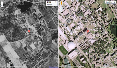
On the left, UConn (Storrs Campus) in 1934; on the right UConn (Storrs Campus) present-day.

A recent blog post highlighted the new GIS Data Distribution Page on MAGIC’s website. In addition to the new look on this page, the Aerial Photography Page has been updated as well! Now, when you visit this page, you will find aerial photography of Connecticut from the following sources:

  • Connecticut Ecological Conditions Online (CT ECO) Aerial Photography Viewer
  • Connecticut Historical Aerial Imagery from MAGIC
  • Connecticut Historical Aerial Photography from the Connecticut State Library
  • Connecticut Historical Aerial Photography Mosaic Map Mash-Ups from MAGIC
A Screenshot from MAGIC’s CT Aerial Photography Mosaics Mash-Ups. The red marker indicates our location, Homer Babbidge Library. On the left, imagery from 1934, and to the right, Google’s current imagery.
The Connecticut Aerial Photography Mosaic Mash-Ups enable you to view, pan and zoom linked historical (1934, 1991, 2006, or 2008) and and contemporary imagery…check it out!

Race Restrictive Covenants in Hartford area, 1940s: A Map with Linked Documents

This is the fourth in a series of posts on web-based maps developed by the University of Connecticut Libraries Map and Geographic Information Center (MAGIC) for the On The Line project.

Today’s posting on interactive maps showcases the Race Restrictive Covenants in Property Deeds, Hartford area, 1940s, which exemplifies the use of Geospatial technologies in the humanities. Geospatial technology allows us to show historic data in new and interesting ways and enables the user to see the data from a new perspective. Working with Professor Jack Dougherty at Trinity College, MAGIC developed this digital map as part of the On The Line project, a public history of schooling, housing, and civil rights in the Hartford metropolitan region.

Click image to explore our Race Restrictive Covenants Map

Restrictive covenants are barriers — typically against African-Americans, Jews, or Catholics — that were written into property deeds by individual home owners or real estate developers, to legally block them from owning or occupying housing. In 1921, the U.S. Supreme Court affirmed the right of private property owners to insert these restrictions, but when challenged by civil rights organizations such as the NAACP, it eventually ruled in the 1948 Shelley v Kraemer case that these restrictions were no longer enforceable by governmental authority. Yet restrictive language still exist in the legal paper trail of property records. Based on their search of property records in West Hartford, Professor Dougherty and a Trinity student researcher, Katie Campbell, so far have found 5 examples of racial restrictive covenants in suburban housing developments from the early 1940s. Click the map above to see the location of each covenant, with a link to scanned source document.

For example, the developer of High Ledge Homes, located near South Main Street in West Hartford, inserted this restriction when filing the property deed in June 1940:

“No persons of any race except the white race shall use or occupy any building on any lot except that this covenant shall not prevent occupancy by domestic servants of a different race employed by an owner or tenant.”


While students generally learn about the history of segregation in Southern and border states, this map reveals a hidden chapter in our history of the North. Racially restrictive covenants have been extensively documented in other northern cities, such as Chicago, Detroit, and Seattle. In their digital history website, the Seattle Civil Rights and Labor History Project, students and faculty from the University of Washington built community awareness that helped to pass a 2006 state law making it easier for homeowners associations to rid themselves of these historical racial covenants.

Within the Hartford region, can you help us find other examples of restrictive covenants by race, religion, or nationality? Do you recall seeing or hearing about similar barriers in the property deed of a family member or neighbor? If so, please post a comment on the On The Line website or contact MAGIC via email.

Technical Detail:

The cartographic layer for the Race Restrictive Covenants in Hartford area, 1940s: A Map with Linked Documents map was created using ESRI’s ArcMap software. Professor Dougherty and Katie Campbell from Trinity College located housing development deeds in West Hartford, CT containing restrictive language.

Using the deeds, we digitized the location of housing developments that contained restrictive covenants, and then exported the shapefile as a KMZ file using ArcGIS ArcToolbox conversion tool. We then edited the individual pop-up balloons using Google Earth and added HTML code to link PDF documents of the property deeds and to improve the overall display of the data, and then this layer was saved as a KMZ file. This is similar to the customization of the Redlining in Hartford KMZ discussed in a previous blog posting. We also integrated a point file for each housing development with restrictive covenants in West Hartford, CT to enhance the geographic visibility of the five developments.

The linked documents map utilizes the Google Maps JavaScript API V3 and custom javascript code by Ben Spaulding and Thomas Bachant. The interactive map interface overlays our content on a Google Maps interface.

Coming next in this series — Home Value Index in the Hartford Region, 1910-2007: An Animated Time Slider Map

Neighborhood Change, 1934-Present: A Dual View Map with Linked Controls

This is the second post in the Outside the Neatline Blog series focusing on web-based maps developed by the University of Connecticut Libraries Map and Geographic Information Center (MAGIC) for the On The Line project.

When our research team began working with digital aerial photographs, we asked ourselves: how can we display two views of the same terrain at different points in time? Our solution was to develop a linked-control dual-view map, titled Neighborhood Change in Connecticut, 1934 to Present, which allows users to compare aerial images from past and present, side by side. Since this interactive tool is based on Google Maps web technology, it features the familiar controls to zoom and pan around the map, as well as a Google search engine for any address in Connecticut. Best of all, the linked controls means that the two images are synced: when a user moves or zooms into one side of the map, the other side automatically matches it.

This map is a wonderful tool for examining changes in land use anywhere in Connecticut. For example, compare Hartford’s Parkville neighborhood, before and after the construction of the Interstate-84 highway exchange in the 1960s, which benefited suburban commuters but divided urban neighborhood irrevocably. See also the conversion of rural farmland into post-war suburban residential and commercial developments, such as the WestFarms Mall area in Farmington/West Hartford, or the Bishop’s Corner shopping center in West Hartford.

neighborhood_change_map

Caption: Click image to explore our Neighborhood Change map for Hartford’s Parkville area (shown above) or any other region in Connecticut.

At present, the Neighborhood Change map displays aerial imagery for selected years: 1934, 1991, 2008, and Google’s current view. Soon we will add more options to the drop-down menu: 1951-2 and 1970. Our goal is to create a tool to show neighborhood comparisons in approximately twenty-year intervals from 1934 to the present.

Another feature of this map allows anyone to create a custom URL web address to point any visitor to a specific location in Connecticut. To do this create a URL using this format,

 http://magic.lib.uconn.edu/otl/dualcontrol_aerialchange.html?lat=[insert latitude]&long=[insert longitude]  

and identify the latitude and longitude you are interested by going to Google Maps and right-clicking on a point, select “What’s Here?” and copying the latitude and longitude coordinates added to the Google Maps search box into the URL.

For example a URL for Westfarms shopping mall, Farmington would look like this:

 http://magic.lib.uconn.edu/otl/dualcontrol_aerialchange.html?lat=41.7222&long=-72.7632  


This linked-control dual-view tool may also be used to compare other types of maps, such as historic census data to the newly released 2010 census data of the United States.

We invite you to explore the Neighborhood Change in Connecticut, 1934 to Present web-based map and On The Line.

Technical detail:

This linked-control dual view map uses similar Google Maps JavaScript API version 3 and customized javascript coding for the Federal HOLC “Redlining” Map, Hartford region, 1937 map discussed in last weeks On The Line series post, but with enhanced WMS server integration. We incorporated aerial imagery into the linked-control dual view map by using Web Map Service (WMS), which is a standard protocol for using georeferenced images over the internet. MAGIC’s WMS is a Cadcorp GeognoSIS based server that includes historical aerial images and maps. All of our imagery is projected in WGS84, which allows them to be overlaid on Goggle Maps. The WMS server enables us to link aerial imagery and historical maps into our web-based maps. Integrating WMS into the web-based map was facilitated by using custom JavaScript developed by Ben Spaulding of TheGISDoctor.com and assistance from other sources. The code allows Google Maps to read the WMS server for a particular image or map and then overlay it on a Google Map interface. WMS is basically a tiled image on another server you can overlay on your Google interface. This could be done with ArcGIS Server as well. To actually reference an image or historical map from the WMS server you need the WMS server address plus the layer name; we have a page that details this at http://magic.lib.uconn.edu/mash_up/wms_layers.html

Coming next in this series — Racial Change in the Hartford Region, 1900-2010: An Animated Time Slider Map

Connecticut Geo-Focus Newsletter – Summer 2011

The latest issue of the Connecticut Geo-Focus newsletter is now available. In this issue you will find articles and updates on the following topics:

  • Emergency Sirens 
  • Japan Debris Tracking 
  • Marine Debris Tracking 
  • UCONN Invasive Aquatic Plants
  • Geo-Tidbits 
  • Educational Offerings 
  • Coastal Resilience Project  
  • High School Geography 
  • News of the Bee 
  • CT DOT Bicycle Map Website
  • GIS Day Announcements 
  • GIS and Public Safety 

Connecticut GIS Day – Share your Ideas!


GIS Day is a few months away, and the Connecticut GIS Council Education and Outreach working group is gathering thoughts and ideas to help make this the best Connecticut GIS Day yet! In order to achieve that goal, they want your input. They want to know what you- the attendees, would like to see at this year’s GIS Day. They have set up an Ideascale page at http://ctgisday.ideascale.com/ to record and capture those ideas and thoughts!

Is there a particular topic you’d like to see presented on?

Is there a particular speaker you’d like us to contact?

Is there some type of new feature you’d like to see at GIS Day (i.e. Lightening Talks)?

Share your opinion- it matters to us! The Connecticut GIS Council Education and Outreach working group wants to hear from you!

Redlining in Hartford area, 1937: A Web-Based Map with Linked Documents

This is the first in a series of posts on web-based maps developed by the University of Connecticut Libraries Map and Geographic Information Center (MAGIC) for the On The Line project.

Today’s web technology can help us to tell more meaningful and visually engaging stories about the past. During the 1930s, a federal agency (the Home Owners’ Loan Corporation, or HOLC) cooperated with private mortgage lenders to assess investment risks across neighborhoods in over 200 U.S. metropolitan regions. These ratings were not based exclusively on the housing stock, but also on racial, ethnic and social class makeup of the residence. These color-coded maps ranked the safest areas for investment in green and the riskiest in red, which in later years became associated with the phrase “redlining,” or discriminatory lending by geographic area. Although some historians have argued that these HOLC maps were not directly implicated in post-war urban decline, they nevertheless reflect the dominant views of the times against racial and ethnic minorities and lower-income families.

HOLC_Image

Caption: Click image to explore our web-based HOLC map for the Hartford area.

At MAGIC, we digitized a 1937 HOLC map of the Hartford area (covering the city, West Hartford, and East Hartford) and created an interactive version using Google Maps API, which can be explored at http://magic.lib.uconn.edu/otl/doclink_holc.html. Click on any color-coded region to view the pop-up bubble, with a link to the original neighborhood appraisal report. For example, see how the HOLC field agent described African-Americans, Jews, Italians, and working-class families as negative factors on home values in several areas.

With support from the National Endowment for the Humanities, MAGIC created this and other interactive maps with Jack Dougherty of Trinity College for the On The Line project. This and other maps are freely accessible in a public history web-book, titled On The Line: How Schooling, Housing, and Civil Rights Shaped Hartford and its Suburbs, which tells the story of schooling and housing boundary lines that have divided metropolitan Hartford, Connecticut over the past century, as well as the struggles of ordinary families and civil rights activists who have sought to cross over, redraw, or erase these lines. See other examples of web-based HOLC maps for other cities, such as “Redlining in Philadelphia” (by Amy Hillier), “Mapping Decline: St. Louis and the American City” (by Colin Gordon), “Redlining Richmond” (by Robert K. Nelson), and “T-RACES: Testbed for the Redlining Archive of California’s Exclusionary Spaces” (by Richard Marciano et al.), which also appears in the Los Angeles section of HyperCities.

Technical detail:

This document-linked dual-view map was created through a multistep process. First, Jack Dougherty scanned the 1937 paper map and neighborhood appraisal reports at the National Archives II in College Park, Maryland. Next, MAGIC staff georectified, “heads-up” digitized, and attributed the map into polygons using ArcMap. After creating the shapefile, the symbologies were selected based on the historical map color scheme and converted to a KML file using the ArcToolbox conversion tool.

The mashup was created using Google Maps Javascript API version 3, which allows the KML file to be layered on top of a Google Map. We enhanced the standard mashup by adding a custom search box to locate any address on the map, and customized JavaScript to link controls for zoom and pan for the dual views. The HTML code for the pop-up windows, which links each of the KML areas to a specific PDF document, can be created in Google Earth. All of our web-based maps use open-source code to the maximum extent feasible, and we encourage users to borrow freely and create their own versions. In the near future, a detailed write-up will be provided on the MAGIC website detailing how the interactive web-based maps were created.

Coming next in this series — Neighborhood Change, 1934-Present: A Dual View Map with Linked Controls

Census Bureau to Release 2010 Census Summary File 1 for Connecticut on Thursday June 30

Next week, the U.S. Census Bureau will release the 2010 Census Summary File 1 for Alaska, Colorado, Connecticut, Nebraska and North Carolina. During June through August, the Census Bureau will provide statistics for states each week on a flow basis. These Summary File 1 tables will provide the most detailed information available so far from the 2010 Census, including cross-tabulations of age, sex, households, families, relationship to householder, characteristics of owners and renters, detailed race and Hispanic or Latino origin groups, and group quarters.

The Summary File will be available for each of the 50 states, the District of Columbia and Puerto Rico. The information will be available for a variety of geographic areas, with most tables available down to the block or census tract level.

When:

The Summary File 1 for these states will be available on an embargoed basis for accredited media who are registered for access on Tuesday, June 28 at 10 a.m. The embargo will be lifted and the information released publicly on Thursday, June 30 at 12:01 a.m.

To apply for embargo access, go to our Newsroom at <http://www.census.gov/newsroom> and click on “Embargoed Releases.” Please review the Embargo Policy carefully before submitting the embargo registration form.

Online Press Kit:

For more information about the release of Summary File 1, please visit <http://2010.census.gov/news/press-kits/summary-file-1.html>