Congratulations Dr. Weixing Zhang

Quote

Over the past five years, if you have contacted the UConn Library MAGIC and/or the Connecticut State Data Center either virtually or in person, you have likely had an opportunity to interact with our graduate assistant Weixing Zhang. At the end of Spring 2018, Weixing Zhang graduated with his PhD in Geography from the University of Connecticut!
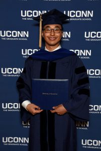
 

Weixing_Zhang_graduation_2018

Dr. Weixing Zhang

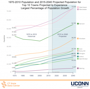
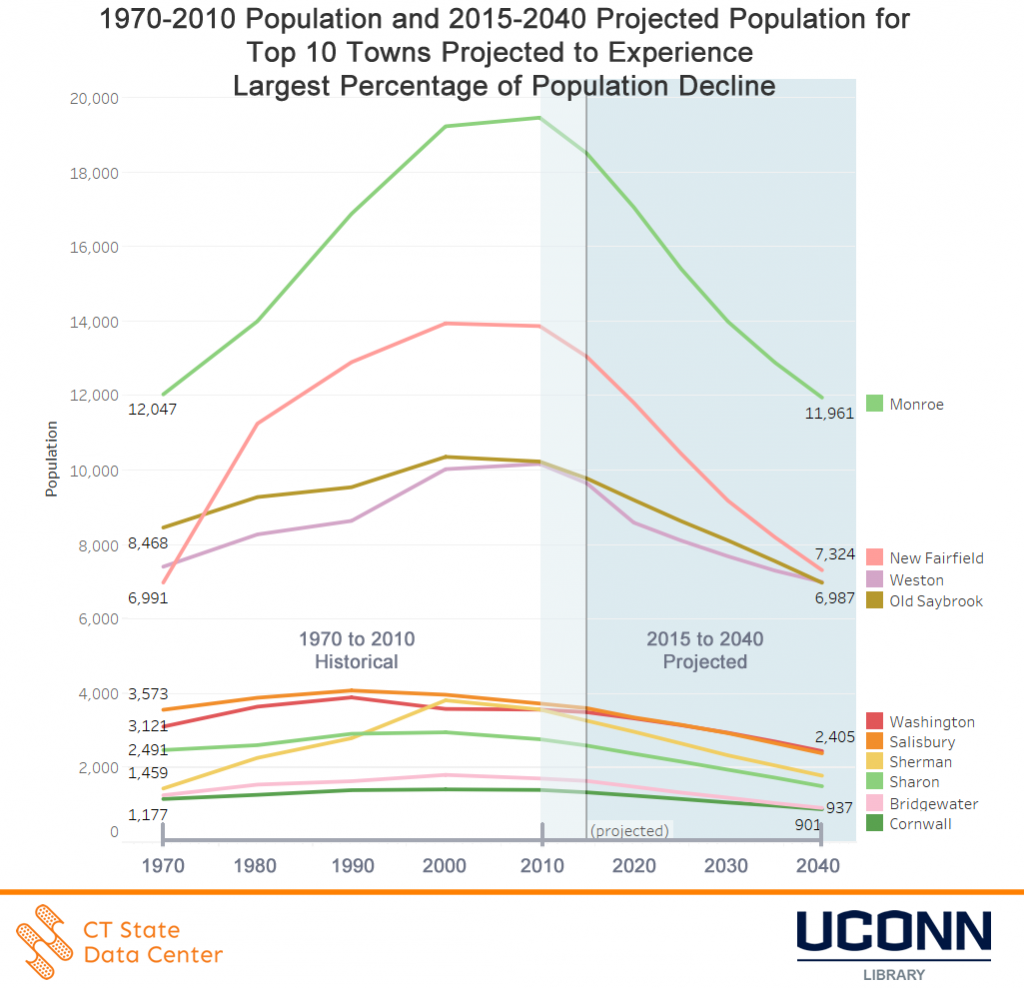
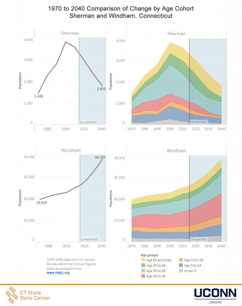
During Weixing’s tenure at both the UConn Library MAGIC and the Connecticut State Data Center, he has assisted users on a number of data requests, developed custom maps, developed scripts to process and visualize data, and contributed or led a number of projects and initiatives. One of the largest and most in-depth projects Weixing helped make a reality was developing the 2017-2018 release of the 2015 to 2040 Population Projections for the State of Connecticut, a project which involved over 2.5 years of research, analysis, and working with multiple collaborators before the final projections could be developed and published to the Connecticut State Data Center and Connecticut Open Data websites.


Prior to his last day at the UConn Library MAGIC and the Connecticut State Data Center we asked Weixing about his experiences these past five years and he shared the following:

“I would like to highlight how MAGIC gave me opportunities to collaborate with individuals, agencies, and organizations throughout the region so that I could have a better understanding of the value of maps, census data, and geospatial technologies in society. I am sure that these skills and connections I have made while at MAGIC will benefit me tremendously in my future career.”

– Dr. Weixing Zhang


Dr. Weixing Zhang is one of a series of graduate assistants and undergraduate interns which the UConn Library MAGIC and/or the Connecticut State Data Center has had the opportunity to work with to develop resources and provide assistance to our users. We are especially appreciative of the Office of Policy and Management, UConn Department of Geography, and the UConn Library for making these graduate assistantships and internships possible.


Thank you Dr. Weixing Zhang for all your hard work, dedication, and collaborative initiatives you contributed to at the UConn Library MAGIC and the Connecticut State Data Center and we wish you well and best of luck on your new adventures post graduation!

Open Data in Action – October 26, 2017 at Hartford Public Library

Open Data In Action brings together a wide range of researchers to showcase how their work has benefited from openly and freely accessible data. Presenters from the public, private, and academic sectors will discuss how open data, ranging from historical documents to statistical analyses, is being used to create projects, change policies, or conduct research and highlight the importance open data has on shaping the world around us.

This event will feature a number of open data focused researchers and open data providers and is open to the public.
When: Thursday, October 26, 11:00am-2:00pm

Where: Hartford Public Library, Atrium 500 Main Street, Hartford, CT

Who can participate: Free and open to the public

Cost: Free
Opening Remarks:

Tyler Kleykamp, Chief Data Officer, State of Connecticut


Presenters:

Rachel Leventhal-Weiner, CT Data Collaborative, CT Data Academy

Jennifer Snow, UConn Library, Puerto Rico Citizenship Archives: Government Documents as Open Data

Tina Panik, Avon Public Library, World War II Newsletters from the CTDA

Rebecca Sterns, Korey Stringer Institute, Athlete Sudden Death Registry

Andrew Wolf, UConn Digital Media & Design, Omeka Everywhere

Steve Batt, UConn Library /Connecticut State Data Center, Tableau Public and CT Census Data

Anna Lindemann/Graham Stinnett, UConn/DM&D, & Archives, Teaching Motion
Graphics with Human Rights Archives

Thomas Long, UConn Nursing, Dolan Collection Nursing History Blog

Jason Cory Brunson, UConn Health Center, Modeling Incidence and Severity of Disease using Administrative Healthcare Data

Brett Flodine, GIS Project Leader, City of Hartford Open Data

Stephen Busemeyer, The Hartford Courant, Journalism and the Freedom of Information

Open_Data_Sponsors


Connecticut’s Towns Experiencing a Demographic Shift from 2015 to 2040, Connecticut State Data Center Reports

August 31, 2017 – Towns in Connecticut are projected to slowly gain population as a total, according to the 2015 to 2040 population projections for all 169 towns in the state of Connecticut, released today by the Connecticut State Data Center.

2015_2040_town_projected_growth

1970-2010 Population and 2015-2040 Projected Population for Top 10 Towns Projected to Experience Largest Percentage of Population Growth

The new projections show that multiple towns are approaching a demographic shift due to an aging population, a near net zero overall migration rate, and a relatively low, but stable, birth rate.  Windham, East Windsor, Avon, Oxford, Ellington, Sterling, Norwich, West Haven, Rocky Hill, and Manchester are expected to experience the largest percentage of increase in overall population projected from 2015 to 2040.

2015_2040_town_projected_decline

1970-2010 Population and 2015-2040 Projected Population for Top 10 Towns Projected to Experience Largest Percentage of Population Decline

The towns of Sherman, New Fairfield, Bridgewater, Sharon, Monroe, Cornwall, Salisbury, Old Saybrook, Washington, and Weston are projected to experience the largest percentage of decline in the overall population from 2015 to 2040.

The changing demographics by age cohort for towns in Connecticut provides a more complete picture of the overall trends within towns over time.  The Connecticut State Data Center has released an interactive data dashboard to accompany the release which enables users to view demographic changes town by town with data from 1970 to 2040.  When reviewing the age cohort data, long-term trends in demographics shifts within towns, and more broadly across the state when comparing multiple towns, indicate which towns are experiencing stable or declining births by examining the under 5 age cohort, as well as visually presenting the demographic shift between age cohorts as individuals age 55 to 64 age into the 65+ age cohort.


The comparison between are largest percentage of population gain (Windham) versus our largest percentage of population decline (Sherman) highlights the shifts in age cohorts within these towns.

1970_2040_age_cohort_change_Sherman_Windham

1970 to 2040 Comparison of Change by Age Cohort for Sherman and Windham, Connecticut


Connecticut’s eight most populous towns will see a growing or stable population based on the projections from 2015 to 2040, following an overall trend for several of these towns since 2000.

Overview, Connecticut will grow slowly in population from 2015 to 2040. The projected populations for each town can differ over time based on factors not included within the projections model, and thus these population projections are reviewed annually by the Connecticut State Data Center and compared to the most recent data to adjust projections if data reflects changes in the projected trend for a town. For more details on the data release and how to view and access data, visit the Connecticut State Data Center 2015 to 2040 Town Population Projections site.

Change in median household income within U.S. counties between 2004-09 and 2010-14 American Community Surveys

This visualization compares county-level median household income from the 2004-2009 and 2010-2014 American Community Survey 5-Year Estimates and compares the confidence intervals of the surveys to determine whether there was a significant increase or decline in median household income between the surveys, or no statistically significant change. Estimates from the 2004-2009 survey were converted to 2014 inflation-adjusted dollars using the Bureau of Labor Statistics’ ‘Consumer Price Index – All Urban Consumers‘ benchmark. These adjusted figures were compared with the median household estimate from the 2010-14 ACS (which were originally published in 2014 inflation-adjusted dollars).

Counties with inflation-adjusted median household income estimates with overlapping margins of error between the two surveys (when both survey estimates are expressed in 2014 inflation-adjusted dollars) are considered not to have experienced a statistically significant change in median household income between the survey periods. Counties which have an upper bound of the 2004-2009 confidence interval which is smaller than the lower bound of the 2010-2014 confidence interval, are considered to have had a statistically significant increase in median household income between the two survey periods. Conversely, those counties which have a lower bound of the 2009-2014 confidence interval which is greater than the upper bound of the 2010-2014 confidence interval are considered to have experienced a statistically significant decline in median household income.

The American Community Survey data showed statistically significant increase in median household income in 88 counties between these survey periods; 2,378 showed no significant change, and 677 a statistically significant decrease in median household income. Notably, the majority of the U.S. population lives in the counties that showed a significant decrease in household income: according to the 2014 ACS population figures, about 202 million people – 64% of the U.S. population – resided in these 677 counties.

Note that this visualization’s inflation adjustment uses national level Consumer Price Index, which may not reflect inflation differences that exist across geographies or regional differences in housing, transportation, or other sectors. The American Community Survey confidence intervals used here are the originally published data, which was reported at a 90% confidence interval.

Census Tracts Data Browser updated with latest American Community Survey Data

The map below of Connecticut Census Tracts data provides links into the Census Bureau’s American FactFinder data engine to gain easy access to tables of economic, housing, demographics and other data from the 2010-14 American Community Survey 5-Year Estimates. Hover over any Census Tract on the map to see links to eight data tables for the tract. You can use the map tools to pan or zoom into a particular area of the state, and by holding down Control (Command on a Mac), you can select multiple tracts and follow the links to see data for all selected areas. See the Instructions tab for more information.

Linked data tables include:

  • DP05 ACS Demographic and Housing Estimates: age, race/ethnicity, and housing unit counts
  • S1501 Educational Attainment: educational attainment and median earnings by level of education for the population age 25 and over
  • S2701 Health Insurance Coverage Status: insurance coverage rates by age, race, and income
  • S1101 Households and Families: characteristics of household structures
  • S1702 Poverty Status in the Past 12 Months of Families: poverty status by age, race, educational attainment, and presence of children in the household
  • DP03 Selected Economic Characteristics: unemployment, occupation,  employment by industry, and income and benefits data
  • DP04 Selected Housing Characteristics:  size, value, age, and other characteristics of housing units in the tract
  • DP02 Selected Social Characteristics: includes marital status, fertility, place of birth, language spoken at home, ancestry, and disability status characteristics of the tract’s residents

Data from the 2013 Annual Survey of Public Pensions

This visualization uses data from the U.S. Census Bureau’s 2013 Annual Survey of Public Pensions State-Administered Defined Benefit Pensions Systems downloaded from American FactFinder. The thematic map indicates the ratio of pension obligations to each state’s total cash and investment holdings in its state-run public pension system at the close of fiscal year 2013. Bar graphs indicate FY13 pension fund net investment earnings, and overall pension fund investments by category (i.e. stocks, Treasury bonds, etc). Locally administered (e.g. municipal) public pension data is excluded from the graphs.

American Community Survey Median Household Income Distressed Tracts 2010 to 2013

This visualization uses data from the American Community Survey to display distressed census tracts, which is a tract at 60% or less of the state median household income level. This study ranges from the year 2010 to 2013.

by: Zachary Guarino


Connecticut Census Tract Data Browser for American Community Survey Data

Census Tracts, statistical areas of roughly three to seven thousand individuals, are the smallest practical geography for analysis using American Community Survey estimate data. In Connecticut many smaller towns have a single Census Tract, while larger cities can have more than a dozen.The Census Bureau’s American FactFinder data tool provides more than 3,500 different tables of data from the American Community Survey for Census Tracts on a wide range of topics. While the organization, documentation, downloading capabilities of American FactFinder are extremely sophisticated, it can be difficult to identify and select particular Census Tract for analysis – say, those in the northern portion of Hartford – without already being familiar with the boundaries of the tracts. (While this can be done using the Reference Map interface in American FactFinder, it is a fairly cumbersome process).

The shaded map of Census Tracts below allows the user to select single or multiple tracts for analysis, and takes advantage of the deep linking capabilities of American FactFinder.  By holding down the Control key, multiple tracts can be selected with the mouse. The links to demographic, economic, and other data which then appear in the mouseover ‘Tooltip’ menu can be a starting point for exploring additional data for the selected tracts, because the geographies chosen remain selected in the resulting American FactFinder session. Upon following the link in the Tooltip to a table in American FactFinder, click the Advanced Search tab above the table to return to the American FactFinder search screen, to browse among the thousands of tables of data for the tract(s), using a keyword search or the Topics menu.

Gini Index of Income Inequality for U.S. Counties

This visualization displays U.S. Census Bureau American Community Survey Gini index estimates for U.S. counties.  The Census Bureau defines the Gini index as “a statistical measure of income inequality ranging from 0 to 1. A measure of 1 indicates perfect inequality, i.e., one household having all the income and rest having none. A measure of 0 indicates perfect equality, i.e., all households having an equal share of income.” For an analysis of the ACS Gini index data, see the Census Brief: Houshold Income Inequality Within U.S. Counties.

The visualization allows the viewer to filter the counties displayed on the map by Gini index. Links into American FactFinder from the mouseover Tooltip for each county on the map provide further economic data including median household income, poverty, and insurance coverage data for the county.