Flooding From Irene Devastates Catskills Region

Flooding caused by Irene has been especially devastating to the Catskills Region in upstate New York. For residents of Hunter, Prattsville, Windham and the surrounding area, Irene was cataclysmic. Roads and bridges have been washed out while homes have been completely destroyed.

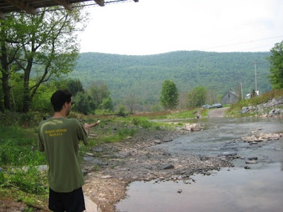
I have been visiting this area my whole life and I am as heartbroken by the devastation that those in the area must be feeling (visit this page for information on relief efforts) as I am fascinated by the power of nature that has been displayed by the Schoharie Watershed. Below are two pictures: the first is of yours truly on the south bank of the Batavia Kill in Ashland, NY in 2009. The second, taken recently, is of the same area but taken on the north side of the stream (along Route 23). The second picture shows a dramatic rise in water level, even a couple days after the storm with no additional rain.

The Batavia Kill, Ashland, NY (June 2009)

The Batavia Kill, Ashland, NY (A couple days post-Irene, August 2011)

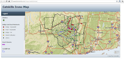
The transportation network in this area was obliterated by the flooding. Pictured below is a map (generated with ESRI products) showing impassable bridges, washed out roads in addition to shelters.

Lastly, below is a video that shows some of the damage in the towns across the region.

CL&P’s Power Outage Map

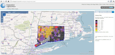
Hurricane/Tropical Storm Irene wreaked havoc upon the electrical infrastructure in Connecticut this past weekend. If, like me, you are without power at home still (UConn is back to near full power), you are probably wondering when electrical services will return. Unfortunately, it could take a while. Judging by CL&P’s Outage Map (pictured above), more than half of the eastern part of Connecticut is still without power.

Mapping Hurricane Irene

NOAA’s Google Map’s overlay shows Irene’s projected path.
Hurricane Irene is approaching the US mainland and NOAA is regularly updating their cartographic products to show the past, present and possible future locations and conditions of the storm. One such product is the Google Maps overlay pictured above. If you are interested in past storms, check out the Historic Hurricane Tracks application from NOAA which is pictured below.

Irene is projected to strengthen to a Category 4 storm in the next couple days while near the Bahamas. Watch this time-lapse video of satellite imagery (from NOAA) below to see Irene’s evolution to a Category 3 storm:

Where is the Recovery Act Funding ($780 Billion) Going?

An introduction to the American Recovery and Reinvestment Act.

In response to the economic downturn of late 2008, the American Recovery and Reinvestment Act was signed into law in February 2009 with the intent to create jobs and catalyze long term economic growth. Through this piece of legislation, hundreds of billions of dollars worth of contracts, grants and loans have been allocated to various organizations.

How money is allocated.

The massive amount of transactions have been tracked and made publicly available through Recovery.Gov. This site provides access to data related to the Recovery Act in addition to the ability to report abuses and fraud.

Click to open the Recipient Projects Map

Data is available in various formats including charts, interactive maps, and tables.

An overview of the Recovery.Gov maps.

For more information, like to see what projects have been funded for individual agencies or what projects have been funded near you, visit Recovery.Gov!

Creating KMZ’s in ArcMap

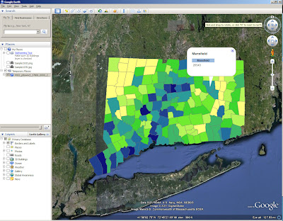
Our recent blog series featuring the collaboration between MAGIC and the On The Line project has detailed the development of digital maps. Although we have given some technical detail in each post, I thought it would be fun to post a tutorial on how to create KMZ’s (for use in Google Maps and Google Earth) in ESRI’s ArcMap. For this exercise, I will create a map of Connecticut towns symbolized by total population.

1.Acquire Data: The first step in creating any cartographic project is to acquire the necessary data. For this project, I have downloaded Census data by town (county subdivision) from MAGIC’s GIS Data Page.

The shapefiles download will include shapefiles in both WGS84 and NAD83 coordinate systems. Once I download the shapefiles, I can add the P001 (which contains total population) WGS84 shapefile into ArcMap. If you are going to be working with MAGIC’s Census data, it is also important to download the spreadsheet data in addition to the shapefiles. The spreadsheet data contains a codebook that will allow you to interpret the field names of the shapefile attribute table. 
2. Remove Counties Not Defined: There are 4 features in the Connecticut County Subdivisions data set that are not really towns, but are features that occupy the Long Island Sound area. In the Name10 field of the attribute table, I can see which these are. 
To remove these, I need to write a simple Definition Query, which is done in the Properties menu of the layer. Click Apply or OK to save the changes.
3. Symbolize Layer(s): Now that I have only the 169 Connecticut towns displayed, I’m ready to symbolize the layer. This, like the Definition Query, is done in the Layer Properties. Click Apply or OK to save the changes.
4. Hide Unnecessary Labels: Next, I am going to hide all of the fields I do not want displayed in my final product (I only want the name of the town and total population). Under the Fields tab of the Layer’s Properties, I can uncheck  the fields I don’t need or want to display. Click Apply or OK to save the changes.
5. Configure Pop-Up Labels: ArcMap allows you to export labels as pop up windows. This is done under the HTML Labels tab in the Layer’s Properties. By default, the field name will be included, but you can check the hide field name column if you don’t want it to display (as I have done). Click Apply or OK to save the changes.
6. Export Layer/Map using Conversion To KML: There are two options to export your data; you can either export an individual layer or the whole map. If you choose Layer to KML you will need to browse to your layer, if you choose Map To KML you must browse to your .MXD file.
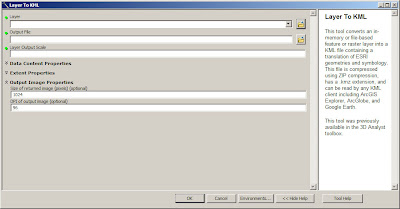
You can adjust the output scale as well as the resolution of your output in the Layer (or Map) to KML tool.
7. Display in Google Earth: If you have Google Earth already installed on your computer, you should be able to double-click your new KML to open it. 
8. Clean up Labels: To give my labels a cleaner look, I’m going to reduce their redundancy. To do this, I must go back into ArcMap and ensure my primary label is set under the display tab of the Layer Properties menu. I chose the town name field.
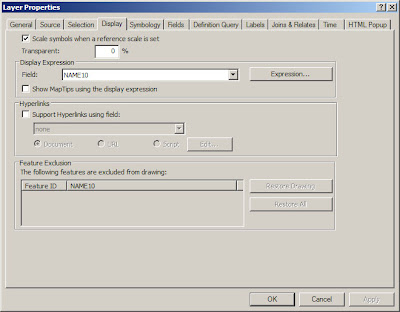
Note: You can also adjust transparency under the Display tab.
Then, I can turn the name field off. Click Apply or OK to save the changes.
Now, at least one of the repeated labels has been removed.
If you want to edit the labels in more detail, many times it will be more efficient to edit them in ArcMap using tools like the Field Calculator before exporting the layer or map. 
Clark Labs Awarded Grant to Develop Software for Land Management Decision Making

Clark Labs, which is a part of the Geography Department at Clark University, has been awarded a $1.8 Million grant by the Gordon and Betty Moore Foundation to develop software for land management decisions. Clark Labs has already developed an application entitled Land Change Modeler, which will be enhanced through a partnership with the Natural Capital Project (which I profile in this previous post).