Bike to Work Week and Other Connecticut Commuting Data

(Posted on behalf of Nicole Toussaint, Census & Geospatial Data Intern, MAGIC & Connecticut State Data Center)

This week is bike to work week. In celebration of this I have created a visualization that shows the modes of transportation Connecticut residents use on their commute to work. The percentages shown are the percent of the population using that mode of transportation within that individual country, not the state as a whole. Currently, the data on Connecticut bikers is on the screen. By clicking the arrows left and right on the slider information on other modes of transportation can be seen.

This visualization shows some interesting trends in the state. In regards to biking, New Haven County has by far the largest percentage of bikers in its population. Also, when looking at the visualization of the people commuting with 7 or more people carpooling together Windham County stands out significantly. It would be interesting to see why this is the case and what type of vehicle is being used to transport all of these people. All of this data was obtained from the Census Bureau’s  American Community Survey 2008-12 5-year dataset.

Sources of home heating used by Connecticut households

As Connecticut braces for arctic-like weather in the coming days, various energy sources will be used to heat our homes. The American Community Survey data collects on what home heating fuel sources are used in the state – fuel oil, grid-connected natural gas, electricity, wood, etc. Among Connecticut households, the majority (about 644,000) use fuel oil of some type, followed by households using utility gas (i.e. connected to street lines) – about 432,000 households – and electricity in 206,000 households. Wood is used by about 26,000 households in Connecticut, and its use is especially prevalent in the northeast corner of the state.

Use the Heating Source filter to display the use of that energy source across Census tracts in the state.

Connecticut GIS Day – Wed Nov 20th

Wednesday November 20th is Connecticut GIS Day! 

9am – 3pm with CT GIS User Meeting from 3:00 to 3:30

Connecticut Leglisative Office Building, Hartford, CT (see map)

More info can be found at the CT GIS User to User network site (http://ctgis.uconn.edu)

Schedule:
9:00 Map Gallery Viewing
9:20 Opening Remarks
9:30 GIS in Connecticut – Tyler Kleykamp
9:45 GIS in Rhode Island – Shane White
10:00 The UConn GIS Project – Christopher Renshaw and Tom Hine, UConn Fire Department
10:30 FDNY GIS Response to Hurricane Sandy – Steven Pollackov, NYFD
11:00 Keynote: WEAVE – Dr. Georges Grinstein
12:00 Lunch
1:00 Priceline GIS – Dave Taylor and Robert Higgins
1:30 ArcGIS for Water Utilities – Al Frauenfelder
2:00 Lightning Talks: New England Geosystems, Applied Geographics, Tighe & Bond
2:30 Certificate Award to the 2013 CT Geography Bee Winner
2:45 Closing Remarks
2:50 CT GIS User to User Meeting
3:30 After Conference Session at Local Restaurant

Census Bureau update on new release dates for ACS 3 and 5 year data

From the US Census Bureau:

The U.S. Census Bureau today announced revisions to its public release schedule for local statistics from the American Community Survey and results from the Supplemental Poverty Measure. These data have been delayed because of the recent lapse in federal funding.

2010-2012 American Community Survey — The Census Bureau plans to release American Community Survey statistics derived from data collected from 2010 to 2012 on Nov. 14, (originally scheduled for Oct. 24). Embargo subscribers will have access to the statistics beginning Nov. 12. The estimates will cover all geographic areas with populations of 20,000 or more. For the first time, comparison profiles will be available for the three-year statistics. These profiles will permit users to compare changes over two non-overlapping three-year periods (2007-2009 versus 2010-2012).

The American Community Survey provides a wide range of important statistics about all communities in the country. The American Community Survey gives communities the current information they need to plan investments and services. Retailers, homebuilders, police departments, and town and city planners are among the many private- and public-sector decision makers who count on these annual results.

Ever since Thomas Jefferson directed the first census in 1790, the census has collected detailed characteristics about our nation’s people. Questions about jobs and the economy were added 20 years later under James Madison, who said such information would allow Congress to “adapt the public measures to the particular circumstances of the community,” and over the decades allow America “an opportunity of marking the progress of the society.”

2008-2012 American Community Survey — The Census Bureau plans to release the five-year American Community Survey statistics covering 2008-2012 on Dec. 17, (original release date was Dec. 5). These statistics are available for all areas regardless of population size, down to the block group. No embargo period will be offered for these statistics.

American Community Survey Public Use Microdata Sample Files — The Public Use Microdata Sample files for the 2012 American Community Survey one-year statistics will be released on Dec. 17, (original release date was Oct. 24); the files for the three-year statistics will be released on Feb. 6, 2014 (original release date was Dec. 5); the files for the five-year statistics will be released on March 6, 2014 (original release date was Jan. 23).

2012 Supplemental Poverty Measure — The third annual report from the Census Bureau describing research on this measure, which complements, but does not replace, the official measure will be released on Nov. 6 (original release date was Oct. 30). The report compares U.S. 2012 supplemental poverty statistics with 2012 official poverty statistics for numerous demographic groups. In addition to the national-level statistics, the report presents supplemental poverty estimates for states using three-year averages (2010-2012). It also compares national 2011 supplemental poverty statistics with 2012 supplemental poverty statistics and examines the effect of excluding individual benefits and necessary costs.

Other Products — The Census Bureau has also posted anticipated dates for the remaining statistical data products expected to be released in 2013. To view the full revised release calendar through the end of 2013, visit the Census Bureau’s release calendar.

A Geographic Look at the Proposed Keystone XL Pipeline: Where Does Tar Sands Oil Get Refined?

In the United States, the answer is a whole bunch of places (excluding the Eastern Seaboard). In the wake of President Obama’s rejection of TransCanada’s proposed route of the Keystone XL Pipeline, check out this map of refineries in the US that handle tar sands oil (pictured above; source: Mother Jones). As you can see, there are nearly 50 refineries who handle tar sands oil in the country. Besides furthering a seemingly never ending addiction to fossil fuels that will continue to change our climate, an important item that has been glossed over by many reporting on this decision in regards to energy security is the fact that the proposed pipeline would have ended in the Gulf Coast region. From a geographic point of view, this route can be interpreted as a clear signal that the pipeline’s intended purpose is to maximize the ability to export the refined products and maximize corporate profits, without necessarily being the dependable source of domestic energy that some have touted it to be. In fact, according to the TransCanada website, a newly built pipeline from Alberta to Illinois already exists and is in service as you can see in the map below.

With this decision by the Obama Administration, TransCanada is believed to be moving ahead on an alternative route.

CT ECO Website Maintenance (Jan 10-11, 2012)

Certain sections of the Connecticut Ecological Conditions Online (CT ECO) website  http://cteco.uconn.edu will be unavailable Jan 10-11, 2012 due to scheduled maintenance. The Simple Map Viewer, Aerial Photo Viewer, Advanced Map Viewer, and some of the Map Services for GIS users may not be available during this period. This outage will also impact some of MAGIC’s map mash-ups that utilize imagery from CT ECO and as a result some imagery may not be available during this outage.


We apologize for any inconvenience this may cause and be sure to check the CT ECO website for the latest updates at: http://cteco.uconn.edu 

A Look at Childcare arrangements, LIVE on CSPAN’s “Washington Journal” on 12/23/2011 at 9:15am

On Friday, Dec. 23, from 9:15 a.m. to 10 a.m, Lynda Laughlin, family demographer, US. Census Bureau’s Fertility and Family Statistics Branch, will appear live on C-SPAN’s “Washington Journal” to discuss child care arrangements in the 21st century.  Her presentation will include a rich mix of statistical visualizations and discussion, including a public call-in segment.  This part of a weekly Friday series called “America By the Numbers” that features the federal statistical agencies.


You are invited to tune in and watch the program.  C-SPAN is available live through the Internet at http://www.c-span.org/Series/Washington-Journal/.


For more information and to view the presentation graphs, please visit the following link, which will be live Friday morning (Dec 23, 2011): http://www.census.gov/newsroom/cspan/childcare.html

Brookings Maps Economic Recovery

Yesterday, The Brookings Institution, a Washington, D.C. based nonprofit policy organization, released a report that classifies the economic recovery of the 100 largest metropolitan areas in the country through the third quarter of 2011. The report classified each metro area into 5 categories based on four indicators: employment change, unemployment rate change, gross metropolitan product change, and housing price index change. The full list of metro areas with their classification is available here, but Brookings has also created a very cool interactive map, which is symbolized by economic recovery. Additionally, clicking on one of the map’s metro areas reveals an economic recovery report for the respective metro area.

According to the report, the strongest 20 metros are:

  • Albuquerque, NM 
  • Bakersfield, CA
  • Boston-Cambridge-Quincy, MA-NH
  • Dallas-Fort Worth-Arlington, TX 
  • Des Moines-West Des Moines, IA 
  • Detroit-Warren-Livonia, MI 
  • Grand Rapids-Wyoming, MI 
  • Houston-Sugar Land-Baytown, TX
  • Lakeland-Winter Haven, FL 
  • McAllen-Edinburg-Mission, TX
  • New Orleans-Metairie-Kenner, LA 
  • North Port-Bradenton-Sarasota, FL 
  • Ogden-Clearfield, UT 
  • Phoenix-Mesa-Glendale, AZ 
  • Provo-Orem, UT 
  • Rochester, NY 
  • San Jose-Sunnyvale-Santa Clara, CA 
  • Toledo, OH 
  • Worcester, MA 
  • Youngstown-Warren-Boardman, OH-PA 

Mother Jones Maps U.S. Crime Exonerations

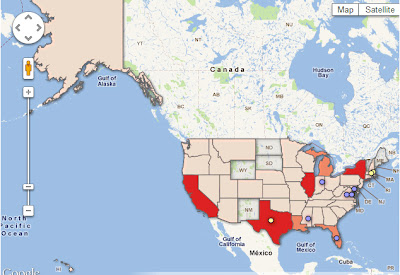
A new map from Mother Jones (pictured above) depicts 825 known crime exonerations in the United States since 1989. Clicking a state on the map allows you to find out specific information including the number of exonerations during this time period in the respective state as well as whether or not the exonerations were based on DNA evidence. For example, in Connecticut, the map indicates there have been 7 verified exonerations since 1989, 4 of which came via DNA evidence and 3 of them via non-DNA evidence. In addition, the map label indicates that Connecticut has a Compensation Law. The map also indicates the states where posthumous exonerations have occurred. Visit the Mother Jones article for more.

TypeBrewer – Visualize Typography Before Committing

Visualize your typography for your cartographic representation before you begin and save yourself time!

TypeBrewer.org

 TypeBrewer.org presents an interactive mapping interface that allows a user to play with font types, character spacing, and density of labels before even beginning their map in their chosen software.  After selecting the style that suits the author of the map, you can download a template for graphic design software or create a style specification sheet to use as a reference in a GIS platform.

If you crave more information about cartographic representation check out Semiology of Graphics by Jacques Bertin, available from ESRI Press.