2016 Connecticut Aerial Photography Now Available via CTECO

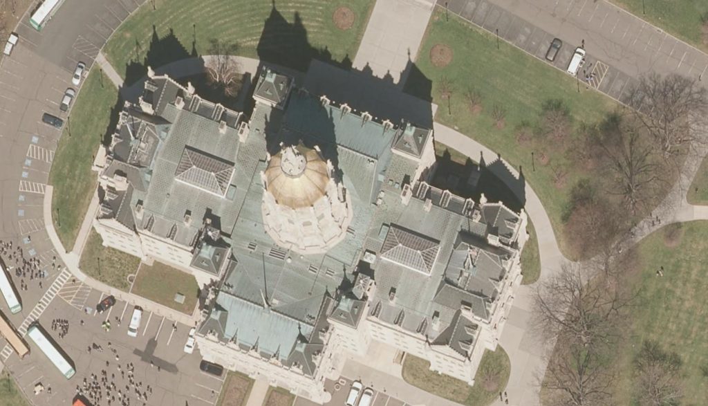
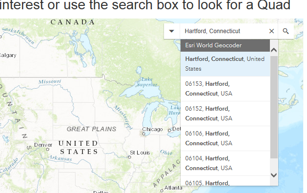
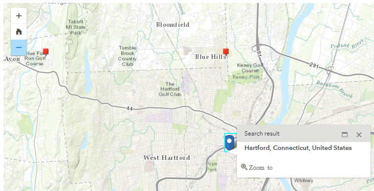
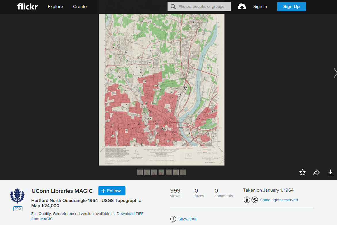
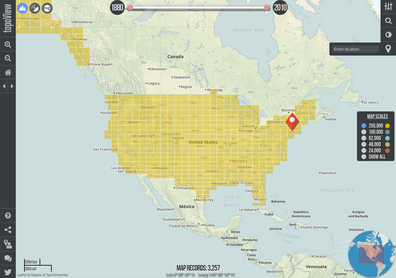
Our colleagues at the Center for Land Use Education and Research (CLEAR) have just announced the statewide, 2016, 3 inch aerial imagery is now available via the CT ECO Website! This imagery is available for use in a wide range of ways depending on the users need/application. Included below is an overview of the options available for viewing and downloading the 2016 Connecticut aerial photography:

  • as a dynamic image service and a cached image service
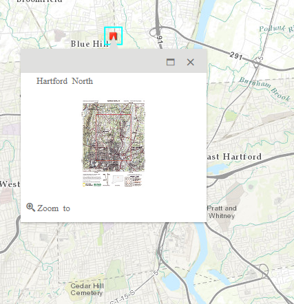
  • for download by tile (PLEASE use the download manager if you will be downloading more than a couple of tiles) and
  • in the Aerial Imagery Viewer for viewing

2016 Aerial Photo Sample

Stay tuned for more options as town mosaics for download an all lidar products including DEM tiles, elevation image services and LAS files are made available from CT ECO and CLEAR.

The project was managed by the Capitol Region Council of Governments (CRCOG), on behalf of the Connecticut regional councils of governments, and funded by the Connecticut Office of Policy and Management (OPM) with contributions from the Connecticut Department of Transportation (DOT) and the Connecticut Department of Emergency Services and Public Protection (DESPP).  The project management team includes municipal, regional, state and university representatives. 


Poverty and Educational Attainment by Gender in Connecticut

The following visualization explores poverty levels in Connecticut by township; as well as by educational attainment. The data is provided by the US Census Bureau through the American Community Survey 2015 5-year estimates (2011-2015). My goal in assessing this data was to observe trends of poverty in Connecticut, as it relates to education level, location, and gender. Through the visualization it can be observed that the highest pockets of poverty are found in Bridgeport, Hartford, New Haven and Waterbury. These cities have the largest populations in the state which also correlates to the largest numbers of poverty. There was a large discrepancy in poverty rates, in the category of gender. Females had a greater instance of poverty at 60% compared to males at 40%. In the category of education, individuals whose highest level of education was a high school diploma were found to have the highest occurrence of poverty. Contrary to popular belief, people who have some college/associates degree were in many cases, just as likely to be living in poverty as people who earned less than a high school degree.

The most effective way to utilize this dashboard is to view it for statewide trends or town data. If you are looking for information on a particular town in Connecticut, select that town in the table on the right. By selecting the town, the other charts and map will be updated to reflect information only for this town. If you would like to look at multiple towns at once you can select more than one by holding the control key (Windows) or command key (Mac) and selecting the additional town(s). It is important to note that by comparing multiple towns, the statistics will be a sum of all towns included.

Data Source:
https://factfinder.census.gov/bkmk/table/1.0/en/ACS/15_5YR/B17003/0400000US09.06000

Changes in economic indicators in Connecticut towns

Last week’s release of the 2011-2015 American Community Survey 5-Year Estimates by the U.S. Census Bureau provides new demographic and socioeconomic data for all Connecticut towns, including estimates of  income, poverty, and workforce characteristics. One especially detailed table in this new dataset – made available by the American Community Survey since the program began – is DP03: Selected Economic Characteristics (see links appearing to the left of the table in American FactFinder to view data for previous years). Because the survey periods don’t overlap, the economic estimates published in the  2015 5-Year Estimates dataset can be compared with the 2010 5-Year Estimates data for evidence of change. The graphics below employ a calculation which determines whether town-level economic measures increased or decreased beyond the margin of error of the survey estimates, and illustrate these statistically significant changes between the 2006-10 and 2011-15 survey periods  for several economic indicators.

For help with locating U.S. Census Bureau data for Connecticut, including American Community Survey data, please contact the Connecticut State Data Center.

Educational Attainment in CT 2010-2015

This data looks at trends in the maximum level of education attained in Connecticut for residents over the age of 25 from 2010 to 2015. Across the state, the percentage of peoples who have achieved less than the equivalent of a high school education is much lower than those who have. Additionally, the percentage of people who have some college education but no degree or who hold an Associate’s degree is much lower than the percentage of those who hold a Bachelor’s degree. From 2010 to 2015 there is an increase in Graduate or Professional degrees earned and a subsequent decrease in the percentage of people who hold only Bachelor’s degrees. Urban areas such as Hartford, New Haven, and Bridgeport are more likely to have lower rates of degree attainment. Attainment of education beyond a high school diploma or its equivalent is less prevalent in the eastern part of the state while the southwestern part of the state has higher percentages of people who have obtained either their Bachelor’s or a Graduate degree. From 2010 to 2015, many towns saw increases in higher education attainment and decreases in the relative percentages of people who have not attained an education beyond the high school level.

Health Insurance Enrollment Across New England for Age Group 18-24 between 2009-2015: What the U.S. Census Shows

The following visualizations showcase health insurance trends across New England since 2009 for people aged 18-24. The data is provided by the U.S. Census Bureau through the American Community Survey 1-Year Estimates for 2009 – 2015. 2009 is a great starting point for any analysis concerning health insurance trends given that the Affordable Care Act did not come into effect until after March 2010. For this post, I decided to explore insurance trends for the age group 18-24, due to one of the main aspects of the Affordable Care Act being that an individual can stay on their parents health insurance until age 26.


Some observations:

  1. Massachusetts seems to be in a category of its own with enrollment above 90% for every year between 2009-2015. It is worth considering the effects and legacy of the Massachusetts health care reform of 2006.
  2. Rhode Island had only 76.37% of its population aged 18-24 covered with health insurance in 2009. Enrollment would eventually increase by 15.35% between 2009 and 2015, all the way to 91.72% coverage.
  3. Rhode Island went from being the New England state with the lowest health insurance enrollment in 2009, to being the state with the third highest enrollment by 2015.
  4. Massachusetts and Vermont having the highest health insurance enrollments for age group 18-24 in New England interestingly corresponds with these states being considered the most ‘liberal’ states in the U.S. according to a Gallup poll. A quick comparison across the continental U.S. and Puerto Rico shows that this holds true for not just New England, but also for the entire nation as of 2015.
  5. Going on a similar direction as note #3, Maine and New Hampshire are the most conservative New England states according to the same Gallup poll, and they also happen to be the ones with the lowest health insurance enrollments for this particular age group inside New England.
  6. Vermont experienced a noteworthy increase in enrollment of 7.17% between 2010 and 2011.
  7. How did the 2007-2010 recession impacted Health Insurance enrollment for this particular age group? Although the states of Connecticut, Massachusetts, New Hampshire and Rhode Island experienced drops in health insurance enrollment just by looking at the percentages displayed in the visualizations, none of them had a drop of more than 2%; so effectively all drops in health insurance enrollment between 2009-2010 are covered by the margin of errors for the data corresponding to each state.
  8. Between 2009-2015, all of the New England States saw increases in health insurance enrollment for this particular age group.

Minor correction by the author: Observation #6 initially implied that Vermont’s increase in health insurance enrollment for age group 18-24 between 2010 and 2011 could be attributed to a decrease in the estimated population for said group between those two years. That was a data misread. Vermont actually experienced a population increase of 1.4% between 2010 and 2011 – not a decrease. Therefore, Vermont’s increase in enrollment is actually noteworthy.

Data Source:

Health Insurance Coverage Status by Sex by Age: U.S. Census Bureau, 2009-2015 American Community Survey 1-Year Estimates, Table B27001.

Trends in Occupations and Income, CT

The following visualization is a comparison of per capita income of different races of civilians within Connecticut and then taking a look at the occupations that lead to a drop or increase of capita of each race group. This information was obtained from the American Community Survey 2006-2015.

Descriptions of each occupational group:

Management- business and financial operations occupations, management occupations.

Computer Sci- computer and mathematics occupations, architecture and engineering, life physical and social science occupations.

Education- community and social service, legal occupations, education, training and library, arts, entertainment, sports and media.

Healthcare- health diagnostics, technologists, technicians, and health practitioners.

Service- healthcare support, protective service, food preparation and serving occupations. building and grounds maintenance, and personal care.

Sales- sales, office and administrative support.

Maintenance- farming, fishing, forestry, construction and extraction, installation, maintenance and repair.

Production- production, transportation, and material moving.

Languages Spoken at Home in Connecticut 2011-2015

This visualization explores changes in the languages spoken at home in Connecticut counties over a five year period from 2011 to 2015.

In the last five years, much of Connecticut has seen a slow trend of decreasing English usage at home and an increase in other languages. Spanish is the most prevalent language spoken in Connecticut after English. Counties that are less populous have more limited lingual variation and have seen less growth in non-English language usage. Litchfield, Tolland, and Middlesex counties are the only counties where Spanish is not the most common non-English language spoken at home and is rivaled by the use of other Indo-European languages. These counties also have a very low percentage of people who speak a language other than English in comparison to the rest of the state. Most counties have seen a general increase in the use of Spanish at home, but other language groups have not displayed the same trends. Asian and Pacific Island languages showed a decrease from 2011 to 2013 and an increase from 2013 to 2015. Conversely, Indo-European languages saw increases from 2011 to 2013 and decreases from 2013 to 2015.

Windham county lacked language data for both 2011 and 2013 and had no data for 2015.

Discovering and Downloading USGS Topographic Maps

On a nice summer day, you may be thinking about going for a hike or exploring areas for your research. Whether you are looking for current or historical topographic maps, there are a number of options to discover and download this maps for free. Included below are examples of how to locate printer friendly, historic, and Connecticut focused USGS Topographic Quadrangle maps.

Printer-Friendly USGS Topographic Maps

Recently National Geographic released a U.S. Geological Survey (USGS) topographic map PDF Quad interface which allows users to search for a location and then obtain printer friendly topographic maps for that area in PDF format. Included below is an overview of the process for searching and downloading your own topographic map which will print on an 8.5″ by 11″ paper as a multi-page map.

  1. Go to http://www.natgeomaps.com/trail-maps/pdf-quads and scroll down to the interactive map.
  2. In the search bar at the top right corner of the interactive map, search for a town, quadrangle, or place. search_national_geo_quad_PDF
  3. The map will zoom to your area of interest. If you do not see any red pins on the map, zoom out the map by clicking the minus (-) sign on the left side of the map. pins_maps_national_geographic_quad_PDF
  4. Click the red pin closest to your location of interest, this pin represents the center of the topographic quadrangle which covers the area. The pin will display a preview quadrangle map. Click on the quadrangle map image. map_preview_national_geographic_quad_PDF
  5. This will download a PDF map of the quadrangle map which includes a total of 5 pages, the first being an overview quadrangle map, the next 4 maps which include a section of each quadrangle. These maps are designed to be printed on 8.5″ by 11″ paper and include scale, latitude, longitude, along with all the other details included on a USGS topographic map. If you want to know more about the different symbols on the map, check out the USGS Topographic Map Symbols legend.

Historical Topographic Maps from USGS

The USGS also offers a national index of digitized historical topographic maps called topoView which allows you to search by location for historical topographic maps and to download the maps in JPEG, KMZ, GeoPDF, and GeoTIFF format. While these maps may not be as printer-friendly as the PDF Quads from National Geographic, the topoView interface provides nationwide access to historical topographic maps at a range of scales. Included below is a quick overview of how to use the topoView interface:

  1. Go to http://ngmdb.usgs.gov/maps/topoview/ and click on Get Maps.topoView_interface
  2. From the topoView browser, search for a location and hit enter. This will zoom the map to area of interest. From the map scales menu (along the right side of the map screen) select the map scale you are interested in viewing or select Show All to see all the scales available. topoView_mapscales
  3. Click on the orange map pin to bring up the map preview and download menu which will appear in the bottom left corner of the map. This will provide the option to download the map in JPEG, KMZ (Google Earth friendly format), GeoPDF, and GeoTIFF formats. If there is more than one map available, just to the right of the preview map will be a link with the number of maps available. In the sample below there are 13 historical maps to choose from for Hartford North, Connecticut.topoView_map_preview

Connecticut Historical Topographic Maps from MAGIC

If you are interested in more topographic maps for Connecticut, MAGIC offers a number of digitized topographic quadrangle maps which can be accessed via MAGIC’s website with a majority of this historic topographic maps available via the topoView application. Included below is a quick outline of how to locate and download topographic maps for areas in Connecticut from MAGIC’s website:

  1. Got to http://magic.lib.uconn.edu/topographic_maps.html and from the interactive Connecticut USGS Topographic Maps Mash-up interface, search for town (ex. Hartford, Connecticut).
  2. The map will zoom to the area of interest which will show a pin and an outline of the topographic quadrangle(s) nearby. Multiple scales of topographic maps may be available for your area and you can select which scale you want from the Toggle menu along the top right corner of the interactive map interface. More detailed maps will be at 1:24k scale while more general maps will be available at higher scales up to 1:125k.magic_topographic_maps_interface
  3. Click the topographic quadrangle outline which covers your area and a pop-up menu will appear. Select the map of interest and click the View and Download link.magic_topographic_maps_interface_popup
  4. This will take you to MAGIC’s Flickr page where you can download the map as a JPEG (down area in right corner of map view window) or as a full-quality TIFF image (link is located below image). magic_topographic_maps_flickr

Three separate interfaces, each providing access to USGS topographic maps and providing access to current and/or historical quadrangle maps. Enjoy exploring each interface!


Change in median household income in U.S. counties (adjusted for inflation), 1979-2014

This visualization converts county-level median household income from the 1980 Census to inflation-adjusted 2014 dollars, and compares these figures with the latest household income data from the 2010-2014 American Community Survey.

Diversity trends in undergraduate enrollments and faculty at research universities and colleges: 2001 to 2014

The following post and data visualization is by guest blogger Lisa Bernardo, highlighting her project for Prof. Harmon’s Economics Independent Study class.

This project aimed to analyze diversity of student enrollment versus faculty members at research universities in the United States.  Through our research and analysis, we wanted to determine whether the make up of the student population in terms of race and ethnicity was well represented within that of faculty members.  This was done by calculating race and ethnicity shares of undergraduate students and faculty members from the years 2001 through 2014 using data downloaded from the IPEDS Data Center.

From our analysis, it was concluded that the shares of black and Hispanic faculty members remained significantly below these shares for students consistently over the time period of 2001 to 2014.

We also found that shares of black and Hispanic students as well as faculty members did show significant increases from 2002 to 2014, though the faculty increase lagged the student increase.  The black and Hispanic enrollment share for undergraduate students increased from 4.04 percentage points from 14.87% in 2002 to 18.91% in 2014.  Whereas, this same share for faculty members only increased 3.16 percentage points from 12.65% in 2002 to 15.81% in 2014.