Certain sections of the Connecticut Ecological Conditions Online (CT ECO) website http://cteco.uconn.edu will be unavailable Jan 10-11, 2012 due to scheduled maintenance. The Simple Map Viewer, Aerial Photo Viewer, Advanced Map Viewer, and some of the Map Services for GIS users may not be available during this period. This outage will also impact some of MAGIC’s map mash-ups that utilize imagery from CT ECO and as a result some imagery may not be available during this outage.
We apologize for any inconvenience this may cause and be sure to check the CT ECO website for the latest updates at: http://cteco.uconn.edu
2006-2010 American Community Survey (ACS) 5 Year Data now available
The United States Census Bureau has released the 2006-2010 American Community Survey (ACS) 5 year estimates! This dataset includes updated socio-economic statistics covering every community in the nation, including all 169 towns in Connecticut. Included below are some examples of the data variables available from the 2006-2010 American Community Survey (ACS) 5 year estimates for Connecticut:
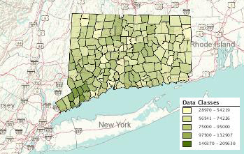
Median Household Income (2006-2010) by Town in Connecticut:
 |
|||
| Click the map above to view interactive map |
View Median Income Data by Town in Connecticut
Ratio of Income to Poverty Level for Families (under .5) (2006-2010) by Town in Connecticut:
 |
| Click the map above to view interactive map |
View Ratio of Income to Poverty Level for Families Data by Town in Connecticut
How can I access the 2006-2010 ACS 5 year estimates data?
The American FactFinder provides access to the 2006-2010 ACS 5 year estimates data for Connecticut as well as the entire nation. From the American FactFinder users can search datasets, download datasets, and create interactive maps based on variables from the ACS.
At what geographic levels is the data available?
The ACS 5 year data is available at the national, state, congressional district, county, county subdivision (town), tract, and block group level. For those users interested in examining block group level data the margin of error values could be significant at the block group level so be sure to review the margin of error values closely as tract level data may provide less error.
Comparing ACS data to 2010 Census
For additional details on the American Community Survey and when/if comparisons of the data can be made to the 2010 census visit: http://www.census.gov/acs/www/guidance_for_data_users/comparing_data/
What if I have questions about using the ACS?
Contact the Connecticut State Data Center at ctsdc@uconn.edu and we will be happy to assist.
The Atlas of Economic Complexity
 |
| The Atlas of Economic Complexity examines the connections of the global economy. |
The Atlas of Economic Complexity: Mapping Paths to Prosperity is a fascinating look at the global economy. The Center for International Development at Harvard University, The Harvard Kennedy School, and Macro Connections at MIT have collaborated to create a project that includes both a detailed report and a dynamic set of interactive visualizations regarding countries’ varying economic complexity. The report includes an economic complexity index ranking in which Japan ranks first (the US is ranked 13th).
 |
| A map of Economic Complexity Index rankings from the Atlas of Economic Complexity: Mapping Paths to Prosperity. |
The aforementioned visualizations can be created at The Observatory of Economic Complexity, which allows you to generate a number of different economic charts and maps. For example, you can choose to show imports or exports, different products, and years. In addition, you can view charts as animations (from the years 1962-2009). Below are a few examples of these with the focus being on beer imports in the United States:
 |
| A map of beer imports around the world. |
 |
| A Tree Map of beer imported to the United States. |
 |
| A Stacked Area Chart of beer imported to the United States. |
Redesigned Census.gov website now available
- A prominent dashboard showing off the Census Bureau’s economic indicators
- A top dropdown menu for quick navigation to key topics
- A new interactive map showing a mash up of economic and demographic statistics
- A “Stat of the Day” highlighting Census Bureau statistics across all the data we collect
- A mega footer with links categorized under familiar topics and highly trafficked pages
- A feature for users to provide feedback
Connecticut GeoFocus Winter Edition
The latest issue of the Connecticut GeoFocus newsletter is now available and includes the following topics:
A Look at Childcare arrangements, LIVE on CSPAN’s “Washington Journal” on 12/23/2011 at 9:15am
On Friday, Dec. 23, from 9:15 a.m. to 10 a.m, Lynda Laughlin, family demographer, US. Census Bureau’s Fertility and Family Statistics Branch, will appear live on C-SPAN’s “Washington Journal” to discuss child care arrangements in the 21st century. Her presentation will include a rich mix of statistical visualizations and discussion, including a public call-in segment. This part of a weekly Friday series called “America By the Numbers” that features the federal statistical agencies.
You are invited to tune in and watch the program. C-SPAN is available live through the Internet at http://www.c-span.org/Series/Washington-Journal/.
For more information and to view the presentation graphs, please visit the following link, which will be live Friday morning (Dec 23, 2011): http://www.census.gov/newsroom/cspan/childcare.html
Brookings Maps Economic Recovery
Yesterday, The Brookings Institution, a Washington, D.C. based nonprofit policy organization, released a report that classifies the economic recovery of the 100 largest metropolitan areas in the country through the third quarter of 2011. The report classified each metro area into 5 categories based on four indicators: employment change, unemployment rate change, gross metropolitan product change, and housing price index change. The full list of metro areas with their classification is available here, but Brookings has also created a very cool interactive map, which is symbolized by economic recovery. Additionally, clicking on one of the map’s metro areas reveals an economic recovery report for the respective metro area.
According to the report, the strongest 20 metros are:
- Albuquerque, NM
- Bakersfield, CA
- Boston-Cambridge-Quincy, MA-NH
- Dallas-Fort Worth-Arlington, TX
- Des Moines-West Des Moines, IA
- Detroit-Warren-Livonia, MI
- Grand Rapids-Wyoming, MI
- Houston-Sugar Land-Baytown, TX
- Lakeland-Winter Haven, FL
- McAllen-Edinburg-Mission, TX
- New Orleans-Metairie-Kenner, LA
- North Port-Bradenton-Sarasota, FL
- Ogden-Clearfield, UT
- Phoenix-Mesa-Glendale, AZ
- Provo-Orem, UT
- Rochester, NY
- San Jose-Sunnyvale-Santa Clara, CA
- Toledo, OH
- Worcester, MA
- Youngstown-Warren-Boardman, OH-PA
Bring Geography With You When Travelling!
Many of us will be traveling this holiday season to visit family and friends and this might involve some long car, train or plane trips. To pass the time I propose bringing some geography with you as you travel! How is this possible? With podcasts of course! Here are some blog and podcasts sites that you can download as mp3’s for your trip.
Geography or (geo related) Podcasts:
- VerySpatial.com
- Stanford University Geography of World Cultures
- University of California Berkeley Geography Podcasts
- Astronomy Cast
Search for more at the link below:
More Free Podcasts at Online Education Database
Mother Jones Maps U.S. Crime Exonerations
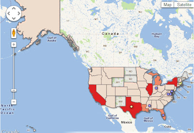
A new map from Mother Jones (pictured above) depicts 825 known crime exonerations in the United States since 1989. Clicking a state on the map allows you to find out specific information including the number of exonerations during this time period in the respective state as well as whether or not the exonerations were based on DNA evidence. For example, in Connecticut, the map indicates there have been 7 verified exonerations since 1989, 4 of which came via DNA evidence and 3 of them via non-DNA evidence. In addition, the map label indicates that Connecticut has a Compensation Law. The map also indicates the states where posthumous exonerations have occurred. Visit the Mother Jones article for more.
The Impact of High Speed Rail on Accessibility in China
 |
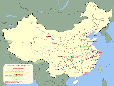
| The planned National High Speed Rail Network in the People’s Republic of China. |
Jie Lin, who is a colleague of mine both at the CtSDC and the Department of Geography Ph.D. program, recently examined the impacts of the planned High Speed Rail Network in the People’s Republic of China. Specifically, Jie’s focus has been on the increase in accessibility that would be a result of implementing the planned high speed network. Before we dive into Jie’s results, however, a little background.
The total area of China is comparable to the size of the United States and the majority of that land is continuous. China has varying local physical geography that can isolate places- like the mountainous region of Tibet. Consequently, the successful implementation of a transportation network with higher travel speeds and greater accessibility has consequences in the realms of culture, the economy, and the overall social fabric of the country. Greater accessibility means the spatiotemporal size of the country decreases (ie. it takes a shorter amount of time to go from A to B, thus making A and B “closer”).
But, how does one calculate accessibility? Accessibility is defined by the ease of getting from place to place in a network. It is commonly calculated using a connectivity matrix like this:
- Speed of Normal Rail: 130 km/h
- Speed of High Speed Rail: 280 km/h


