Statistics to measure the employment of the American worker

The following data comes from the US Census Bureau and describes both recent and current employment trends and related statistics. Many demographic factors influence and are influenced by our professional careers. The data presented below express different aspects of the life of the American worker: how education and employment history influences income and earnings; how much those earnings are based on demographic characteristics; how employees and employers are currently dealing with employment-based healthcare; the influence of work on child-care; and when the employee finally ends their career, how much money is allotted for pensions by state or federal governments.

LED Extraction tool (beta)

LED

The Bureau has released a new extraction tool for Local Employment Dynamics Data. It gives users the ability to access all 30 Local Employment Dynamics Quarterly Workforce indicators. This includes measures of employment, turnover, hiring, job creation, job destruction and average monthly earnings. Data is available in comma separated value (.csv) format for states, counties, and metro/micropolitan areas. You can access the tool here (or by clicking on the above image): http://ledextract.ces.census.gov/static/data.html

trends in the current business environment

Based on the 2007 North American Industry Classification System, estimates for business spending in 2011 have been calculated by the Census Bureau. The estimates cover spending for new and used structures and equipment at the sector level, and information about the private sector and business community.  Tables and figures are available here: http://www.census.gov/econ/aces/xls/2011/full_report.html

Employment History, education and earnings: 2004 and 2008

The Survey of Income and Program Participation has put together detailed tables and charts, documented in this report, that examine the relationship between years of work experience, job tenure (years at a particular job), work status (full or part-time), presence of gaps in employment of six months or more, age, sex, educational attainment and earnings.

As an example, the findings show that individuals who had a college degree when entering the job market received greater earnings than those who did not graduate college.

MedMthEarnings

Economic characteristics of households in US, Third Quarter 2011

These tables, released by the Census Bureau (Survey of Income and Program Participatin), “examine the role of government-sponsored benefit programs and the labor market among the nation’s people and households within the economic climate of the third  quarter of 2011.” This includes statistics on average monthly income, participation in government-sponsored social welfare or social insurance programs, and labor force activity. The tables can be accessed here: http://www.census.gov/sipp/tables/quarterly-est/household-char/hsehld-char-11.html

income and earnings estimates by selected demographic characteristics, 2011 fourth quarter

The Census Bureau has recently released income and earnings estimates for the fourth quarter (October through December) of 2011. The data was collected by the Survey of Income and Program Participation and is organized by gender, race/ethnicity, age, martial status, and highest level of educational attainment. A quick glance at Table 1B, Mean Monthly Income, shows that individuals with post-graduate degrees by far had the highest mean income per month at $5,415.

The tables are available here:

Decline in employment-based health insurance

Income, earnings, and education are just a few ways to keep the pulse of the American economy and the American worker. Other statistics calculated by the Census Bureau, detailed in this report, show that the rate of employment-based health insurance coverage declined from 64.4 percent in 1997 to 56.5 percent in 2010. In 2011, the number fell still to 55.1 percent.

Highlights:

  • In 2010, 71.1 percent of employed individuals age 15 and older worked for an employer that offered health insurance benefits to any of its employees.
  • 42.9 percent of individuals who did not complete high school worked for an employer that offered health insurance to any of its employees, compared with 78.9 percent for individuals with a college degree.
  • 75.7 percent of workers age 45 to 64 worked for an employer that offered health insurance benefits, compared with 60.0 percent for workers 19 to 25.
  • Among married couples with only one member employed in a firm that offered health insurance benefits, 68.7 percent of married couples provided coverage for the spouse.
  • While 37.6 percent of firms with 0 to 24 employees offered more than one health insurance plan, 65.6 percent of firms with 1,000 or more employees offered more than one plan.
  • About 1.1 percent of nonparticipating workers whose employer offered health insurance benefits were not insured by their employer because they were denied coverage.
  • Among nonparticipating workers whose employer offered health insurance benefits, approximately half (50.4 percent) declined coverage by choice.
  • The two most common reasons among workers who chose not to obtain health insurance coverage through their employer were health insurance obtained through another source (66.4 percent) and cost (27.4 percent).

Child Care costs on the upswing

The Census Bureau also reports that child care costs are on the rise. In fact, they have nearly doubled in the last 25 years – though the percentage of families who pay for child care has actually declined. The Bureau’s report, Who’s Minding the Kids? Child Care Arrangements: Spring 2011, was recently released and details both demographic and financial aspects of understanding this phenomenon.

retirement: quarterly survey of public pensions: 4th quarter 2012

This survey provides national summary statistics on the revenues, expenditures and composition of assets of the 100 largest state and local public employee retirement systems in the US. For more information, see: http://www.census.gov/govs/qpr/


Digital Public Library of America [DPLA]

On Thursday, the Digital Public Library of America website was launched. The website brings together digitized cultural heritage from libraries, archives, and museums which it makes freely available to users. Currently the DPLA provides access to over 2 million items. The website also serves as a platform by providing its own API which developers can use to create apps. Users can search by keyword, but also use features such as Timeline, or Map to find digital objects.

The website is accessible at http://dp.la and their blog can be accessed here: http://dp.la/info/news/blog/

DPLA_2


May 2013 is “Older Americans Month”

Older Americans Month: May 2013

A meeting with the National Council of Senior Citizens resulted in President John F. Kennedy designating May 1963 as Senior Citizens Month, encouraging the nation to pay tribute to older people across the country. In 1980, President Jimmy Carter’s proclamation changed the name to Older Americans Month, a time to celebrate those 65 and older through ceremonies, events and public recognition.

OlderAmericansViz

(Click on visualization to interact with data)

Connecticut has 499,474 individuals who are 65 and older, comprising 14% of the state’s total population.

OlderAmericansCT

41.4 million

The number of people who were 65 and older in the United States on July 1, 2011, up from 40.3 million on April 1, 2010 (Census Day). In 2011, this group accounted for 13.3 percent of the total population.
Source: Population estimates <http://www.census.gov/popest/data/national/asrh/2011/index.html>

92.0 million

Projected population of people 65 and older in 2060. People in this age group would comprise just over one in five U.S. residents at that time. Of this number, 18.2 million would be 85 or older.
Source: Population projections <http://www.census.gov/population/projections/data/national/2012.html>

2.4 million

Projected number of baby boomers in 2060. At that time, the youngest baby boomers would be 96 years old.
Source: Population projections <http://www.census.gov/population/projections/data/national/2012.html>

2056

The year in which, for the first time, the population 65 and older would outnumber people younger than 18 in the U.S.
Source: Population projections <http://www.census.gov/population/projections/data/national/2012.html>

Nearly 17%

Projected percentage of the global population that would be 65 and older in 2050, up from 8 percent today. In 2005, Europe became the first major world region where the population 65 and older outnumbered those younger than 15. By 2050, it would be joined by Northern America (which includes Canada and the United States), Asia, Latin America and the Caribbean and Oceania (which includes Australia and New Zealand).
Source: International Data Base <http://www.census.gov/population/international/data/idb/informationGateway.php>

Income and Wealth

$33,118

The 2011 median income of households with householders 65 and older, not significantly different from the previous year.
Source: Income, Poverty, and Health Insurance Coverage in the United States: 2011
<http://www.census.gov/prod/2012pubs/p60-243.pdf>

8.7%

The percent of people 65 and older who were in poverty in 2011, statistically unchanged from 2010. There were 3.6 million seniors in poverty in 2011.
Source: Income, Poverty, and Health Insurance Coverage in the United States: 2011
<http://www.census.gov/prod/2012pubs/p60-243.pdf>

$170,128

Median net worth for householders 65 and older in 2010, down from $195,890 in 2005.
Source: Net Worth and Asset Ownership <http://www.census.gov/people/wealth/>

Serving Our Nation

9.2 million

Estimated number of people 65 and older who were veterans of the armed forces in 2011.
Source: 2011 American Community Survey <http://factfinder2.census.gov/bkmk/table/1.0/en/ACS/11_1YR/B21001>

Jobs

16.1%

The percentage of people 65 and older who were in the labor force in 2010, up from 12.1 percent in 1990. These older workers numbered 6.5 million in 2010, up from 3.8 million in 1990. By 2011, this rate had increased to 16.2 percent.
Source: Labor Force Participation and Work Status of People 65 and Older <http://www.census.gov/prod/2013pubs/acsbr11-09.pdf>

22.3%

The percentage of people 65 and older in Alaska in the labor force in 2011. Labor force participation rates for people 65 years and over ranged from 22.3 percent in Alaska to 12.5 percent in West Virginia.
Source: Labor Force Participation and Work Status of People 65 and Older <http://www.census.gov/prod/2013pubs/acsbr11-09.pdf>

44.3%

Among those 65 and older who worked in 2011, the percentage who worked full-time, year-round. Among states and equivalents, the District of Columbia had the highest rate, at 62.2 percent.
Source: Labor Force Participation and Work Status of People 65 and Older <http://www.census.gov/prod/2013pubs/acsbr11-09.pdf>

Education

81.1%

Proportion of people 65 and older in 2012 who had completed high school or higher education.
Source: Educational Attainment in the United States: 2012
<http://www.census.gov/hhes/socdemo/education/data/cps/2012/tables.html>

24.3%

Percentage of the population 65 and older in 2012 who had earned a bachelor’s degree or higher.
Source: Educational Attainment in the United States: 2012
<http://www.census.gov/hhes/socdemo/education/data/cps/2012/tables.html>

Marital Status and Living Arrangements

58%

Percentage of people 65 and older who were married in 2012.
Source: Families and Living Arrangements <http://www.census.gov/hhes/families/data/cps2012.html>

26%

Percentage of people 65 and older in 2012 who were widowed.
Source: Families and Living Arrangements <http://www.census.gov/hhes/families/data/cps2012.html>

Voting

70.3%

Percentage of citizens 65 and older reporting casting a ballot in the 2008 presidential election. Not statistically different from those 45 to 64 (69.2 percent), people 65 and older had the highest turnout rate of any age group.
Source: Voting and Registration in the Election of November 2008 (Table 2) <http://www.census.gov/prod/2010pubs/p20-562.pdf>

Homeownership

80.7%

Percentage of householders 65 and older who owned their homes as of fourth quarter 2012.
Source: Current Population Survey/Housing Vacancy Survey <http://www.census.gov/housing/hvs/>

Centenarians

53,364

The number of people 100 years old and older counted by the 2010 Census.
Source: Centenarians: 2010 <http://www.census.gov/prod/cen2010/reports/c2010sr-03.pdf>

20.7

For every 100 centenarian women, the number of centenarian men in 2010.
Source: Centenarians: 2010 <http://www.census.gov/prod/cen2010/reports/c2010sr-03.pdf>

43.5%

In 2010, percentage of centenarian men who lived with others in a household, the most common living arrangement for this group. For their female counterparts, the most common living arrangement was residing in a nursing home (35.2 percent).
Source: Centenarians: 2010 <http://www.census.gov/prod/cen2010/reports/c2010sr-03.pdf>

3.29

Number of centenarians per 10,000 people in North Dakota in 2010. North Dakota was the only state with more than three centenarians per 10,000 people.
Source: Centenarians: 2010 <http://www.census.gov/prod/cen2010/reports/c2010sr-03.pdf>

States and Counties

17.6%

Percentage of Florida’s population 65 and older in 2011 — which led all states.
Source: Population estimates <http://www.census.gov/popest/data/national/asrh/2011/index.html>

45.5%

Percentage of the population of Sumter County, Fla., that was 65 or older in 2011, which led all of the nation’s counties.
Source: Population estimates <http://www.census.gov/popest/data/national/asrh/2011/index.html>

The foreign born population in the US and Connecticut

According to the Census Bureau, America’s foreign born population has undergone dramatic changes in size, origins and geographic distribution within the past 50 years.  This infographic created by the Census Bureau depicts some of the major trends and statistics. As just one example: in 1960, 75% of foreign born individuals in the US were from Europe; but in 2010 only 12% were from Europe, while 53% were from Latin America and 28% were from Asia.

Here’s a snippet:

Foreignborn

So, who is emigrating from Asia to the United States? In 1960 only 0.5 million people immigrated to the US from Asia, but by 2000 it had risen to 8.2 million, and in 2011 that number had reached 11.6 million, according to the ACS report linked to above.

Here in Connecticut, the 2007-2011 ACS data from American FactFinder shows that the total population was 3,558,172 with foreign-born individuals (both citizens and non-citizens) numbering 474,139 (+/- 5,979); thus comprising between 13.2% and 13.5% of the total population. By comparison, in 1960 the US Census reported that the total population of Connecticut was 2,535,234 and that 38.7% of that total (982,143) was foreign born with a majority (237,146) of individuals from Italy. The following visualization shows countries where foreign-born individuals emigrated from in 1960 that had numbers of emigrants higher than 20,000 individuals. Click the visualization to interact more with the data.

The other countries or areas that the Census recorded individuals emigrating from include: Norway, Denmark, Netherlands, Switzerland, France, Finland, Yugoslavia, Romania, Greece, Portugal, Asia and Mexico. There were also categories for Other and Unknown. Both Asia and Mexico now comprise higher emigration rates; but in 1960, only 645 people from Mexico came to Connecticut, and 11,786 came from Asia. The ACS 2007-2011 estimates for foreign born place of birth show that by 2011 there were 105,365 emigrants from Asia and 25,743 from Mexico. The emigration pattern has certainly changed in Connecticut since the 1960s, see below visualization for the countries in 2011 from which more than 20,000 people emigrated (including those with a MOE that causes the estimate to exceed 20,000); and unlike the 1960s, there are very few countries from which 20,000 or more people emigrated.The one country with the single highest number of foreign-born individuals in CT was Jamaica, with 34,742 individuals. In terms of regions broken down by continent, the highest number of individuals collectively came from Latin America which includes the Caribbean, Central and South America (197,224).
2011_fbp


Demographic bits and bytes

The Census Bureau records quite numerous useful data beyond demographics here in the US. Included below are some examples, provided by the US Census Bureau, that exemplify just how informative some of this data can actually be!

Schools

This working paper discusses the decline in attendance at private schools over the past decade. According to the census bureau:

Data from several surveys, including the Current Population Survey and American Community Survey, show a decline in private school enrollment over the last decade. The working paper compares trends across datasets and subgroups and explores possible underlying causes of the decline in enrollment, which occurred particularly at larger, religiously affiliated schools in cities and suburbs. Possible causes explored by the paper include the growth in charter schools, home schooling and the recession.


Disability, Employment, and Government Assistance

The Census Bureau also reports that workers with a disability are less likely to be employed and for those who are employed, are more likely to hold jobs with lower earnings. The three most common occupations for men with disabilities were drivers/sales workers and truck drivers (246,000); janitors and building cleaners (217,000); and laborers and freight, stock, and material movers (171,000). For women, as cashiers (195,000); secretaries or administrative assistants (189,000); and nursing, psychiatric or home health aides (172,000). These data can be found on the Census website under the Disability Employment Tabulation available through American Factfinder.

DisabilityGraphThe report, which uses data from 2011, indicates that 30% of of the 46 million adults that receive government assistance have a disability of some kind. There is a relationship to these statistics and those regarding employment as well; Bernice Boursiquot, co-author of the report and Census Bureau statistician noted that “On average, people with disabilities have lower employment and earnings; therefore, understanding what assistance people with disabilities receive may help governments better coordinate and administer their programs.”

DisabilityandAssistance

Demographics & Income

And if you were wondering about demographics and income, the Bureau has also released income/earnings estimates for the third quarter (July-September) of 2011 by selected demographic characteristics such as gender, age, race/ethnicity, martial status, and educational attainment. Tables are available here:

A different report, released Feb 11 shows that the Bridgeport-Stamford-Norwalk, CT metropolitan area near NYC has the highest percentage of households with high income in the nation at 17.9 percent. High income is defined as being in the top 5 percent of national income distribution, which is an annual household income of at least $191,469.

Megacommuters

How long is your commute to work? How many miles do you usually drive? The ACS (American Community Survey) collects and provides this information. See ACS report  here by Brian McKenzie, a Census Bureau statistician, to see how you compare to the rest of the US workforce. As an example, about 342,000 workers commute into Suffolk County, Massachusetts (Boston area) every day from outside of that county; if you’ve ever driven on I-93 or I-95 at rush hour, it certainly seems like it makes sense!

MegacommutingDid you know that:

  • 600,000 people in the US travel 90 minutes and 50 miles to work; 10.8 million travel an hour each way.
  • 8.1 percent of US workers have commutes of 60 minutes or longer
  • 4.3 percent walk from home
  • The average one-way daily commute for workers across the country is 25.5 minutes.
  • Of those who were classified as “megacommuters”,  75.4 percent were male and 24.6 percent were female.

For more information about Megacommuting in the US, see the below links:

Home-based workers

Working at home is on the rise! In contrast to megacommuting, it is now apparent that more and more individuals are choosing to work from home. The Census Bureau has also compiled an infographic to dissect some of the statistics involved with this phenomenon.

Snippet from infographic

Snippet from infographic


Visualizing the 2012 Presidential Election

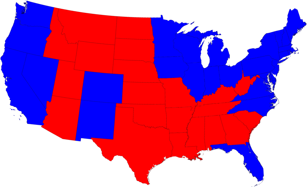
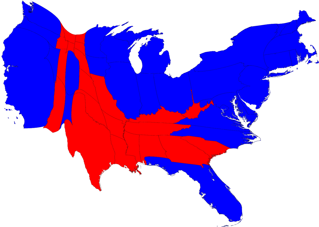
The 2012 Election is only four days away. How we make sense of the information available to us can be daunting, but can also be visually appealing. Consider first the popularity of the cartograms of the 2008 presidential election results, produced by Dr. Mark Newman of the University of Michigan. For many people, these maps evolved their understanding of effect of the distribution of the U.S. population on election results.


Polling and the Electoral College

We are well into the realm of real-time information analysis and visualization in the 2012 election. For major news sources, especially, the Internet provides an ideal outlet for up-to-the-nanosecond updates on the proverbial reams of data in the air about the current status of the election. Prior to the election, multiple polls of likely voters, along with other demographic analyses, are often combined into models that seek to predict the outcome of the electoral college. These models are well-suited to geographical visualizations, the maps of so-called ‘red states’ and ‘blue states’ (for the Republican Party and Democratic Party majority popular votes, respectively, that determine to which presidential candidate each state’s electoral college votes will be allotted).

Source: NBCConnecticut.com

The amount and variety of data now available, however, offers the opportunity for users to explore deeply into the fervent ongoing analysis in these final days leading up to the election. On the websites of many news and media outlets, users can examine the upcoming election by race (President, Senate, House, Governor), by geography (in your state and sometimes at the county level), or by polling organization. Direct links to information sources are usually available, as are the means for sharing such information through social networks. Listed below are several of the more prominent sites for exploring the 2012 election in more detail.

  • The New York Times provides an example of a relatively simpler visualization, through a standard map view, a cartogram – where the size of each state is weighted by the number of electoral votes (see below for other examples of election cartograms) – along with other groupings of possible outcomes. They also have maps of the Senate and House of Representatives races.
  • On the Washington Post, the presidential election can be explored further with maps available at both state and county levels. At the this closer level of detail, users can also examine the Post’s electoral vote projections in relation to a number of social, economic and demographic characteristics, with unemployment, income, and race/ethnicity among them. Visualizations are also available for races in the Senate, the House, and for governor.
  • At the Wall Street Journal, their election site has provided a set of visualizations similar to the Washington Post – at the state and county level, and for the Senate, House, and governor races. More interesting is their inclusion of ‘Community Type’ data at the county level, a classification system from the Patchwork Nation project of the Jefferson Institute. Based on socioeconomic and demographic statistics, the Journal visualizes U.S. counties in categories such as “Monied ‘Burbs”, “Tractor Country”, “Immigration Nation”, and “Emptying Nests”.
  • The Huffington Post aggregates a large number of opinion polls into a predictive model, providing an up-to-date outlook on the election. Users are able to go in-depth with their sources, looking at changes in the model over time and for each state. In addition, the elegance of their House of Representatives visualization is an appealing and intuitive look at the current House in comparison with projected election results.
Source: HuffingtonPost.com

  • Real Clear Politics provides a quantitatively-dense site of information on their electoral college predictions and current polling projections for the presidential and congressional races.
  • Lastly, at 270 to Win, the current election is placed in the context of all presidential election results throughout U.S. history. In 1789, George Washington won the election with 69 electoral votes, in comparison to the 34 electoral votes of John Adams.

Interactive Electoral College Predictions

A very popular and prominent feature on many election websites for the 2012 presidential election is an interactive visualization of user-selected electoral college results. Anyone can create a whole range of maps for both the plausible (and implausible) scenarios of how the electoral college will vote. The electoral college vote is a fascinating aspect

One fascinating example is VoteNight.com, embedded below. By clicking on each state multiple times, the user can change the electoral results from Obama/Biden, to Romney/Ryan, to undecided. The application automatically re-tallies the results based upon the user’s changes. More interesting, however, is the ability to examine presidential election results from previous elections – as far back as the 1932 race between incumbent Herbert Hoover and eventual winner Franklin Roosevelt – and to then predict the results of the 2012 election based upon those historical results.

The degree of reality and amount of interactivity vary between the many choices, however. An interesting way to test this is to find out which are the only two states in the Union that “split” their electoral votes between the popular election results and the Congressional district election results. (Hint: it isn’t Connecticut.)

  • On PBS NewsHour’s Vote 2012, you can choose to predict the current election results with your own selections, or visualize the result of the Obama-Romney contest based upon the outcomes of prior elections, going as far back as 1964. 
  • Politico.com only allows swing state results to be manipulated.
  • The New York Times provides their non-mapped version under the heading “Make Your Own Scenarios.
  • On the Huffington Post, as with PBS, you can base predicted results on the 2008, 2000, 1980, 1960, and 1880 presidential elections.
  • At Real Clear Politics, results can likewise be predicted from previous election results since 1972. Uniquely, though, states can be changed to the degree of predicted result, as being “solid”, “likely”, “leans” for one or the other candiate.
  • Even the federal government is in this game! At the U.S. National Archives, predictions can be based on the 2008 and 2004 elections.
Check with Outside the Neatline again in the coming days and weeks for more information on the 2012 Election, in Connecticut and across the country.

Geography Awareness Kick-off Event – November 8, 2012

Please join us for an evening of food, fellowship, and geography. The Connecticut Geographic Alliance along with the National Geographic Society, University of Connecticut Department of Geography, and the Connecticut Data Center at the University of Connecticut Libraries Map and Geographic Center (MAGIC) would like you to explore the theme of interdependence. 


What: Geography Awareness Kick-off Event 

Where: University of Connecticut – Storrs Campus

When: November 8, 2012

Time: 4:30-8:30pm


Program Agenda
4:00‐5:15       Pre‐conference Teale Lecture – “The Long Thaw: How Humans are Changing the Next 100,000 Years of Earth’s Climate” by Dr. David Archer, Professor of Geophysical Sciences, University of Chicago (held at the Konover Auditorium of the Dodd Center)
4:30‐5:30       Registration
5:30‐5:40       Welcome – Andy Jolly-Ballantine & Bill DeGrazia, CGA Co‐Coordinators
5:40‐6:40       Keynote Address – “Globalization from the Ground Up” by
                        Mark Boyer, GlobalEd Project and Chair of Political Science, UConn
6:40‐7:20       Buffet Dinner and Remarks
7:25‐8:15       Breakout Sessions with Victoria Despres, Kristie Blanchard, and possibly others; check out the CGA website for an updated list!
8:15‐8:30       CEU Records and Drawings

Registration
To register and to view the complete agenda for this 
http://www.ctgeoalliance.org/awareness-week-kickoff.html


Who Should Attend
Teachers, Professors, Pre-service teachers, Student Teachers, and the UConn community at large. We are all connected through the decisions we make on a daily basis.  


Questions
Please contact committee member, William A. DeGrazia, at william.degrazia@uconn.edu should any questions arise.


TIGERweb Map Viewer and WMS from US Census Bureau

The U.S. Census Bureau has released a new version of TIGERweb, a Web-based map viewer from the agency’s Topologically Integrated Geographic Encoding and Referencing System (TIGER) database. TIGERweb allows users to view and query census geographic areas and features such as roads, railroads, rivers, lakes and other larger bodies of water. It currently displays boundaries, names and codes for 2010 Census legal and statistical geographic areas, such as counties, cities, towns and townships, census tracts and urban areas. In addition, TIGERweb contains population and housing unit counts from the 2010 Census for each of the geographic areas.

To access TIGERweb, go to: http://tigerweb.geo.census.gov

WMS Service now available!

In addition to the TIGERweb viewer, the TIGER data also is available as a Web service via the Open Geospatial Consortium Web Map Service standard. Users who have a client that supports the Web Map Service (such as ArcGIS) may access the TIGERweb service at
http://tigerweb.geo.census.gov/ArcGIS/services/tigerWMS/MapServer/WMSServer

Explore TIGERweb by watching this brief video

Using GIS to Evaluate Vulnerability to Climate Change: A Case Study of Martha’s Vineyard

Dukes County, Massachusetts is composed of the county subdivisions on the island of Martha’s Vineyard and the Elizabeth Islands, which form the town of Gosnold. A few weeks ago, I completed my M.A. thesis in the Geography department which investigates where climate change could impact Dukes County. My study evaluates vulnerability to climate change through the examination of social vulnerability and vulnerability to climate sensitive hazards (i.e. sea level rise and storm surge events) and is designed to coincide with the jurisdiction of the Martha’s Vineyard Commission. The thesis includes maps created in ArcMap, with data from MassGIS, that locate vulnerable areas in the county as well as quantify the potential impact of hazards on specific land use categories. Additionally, a social vulnerability index quantifies vulnerability based upon demographic data from the 2010 Census and 2010 American Community Survey.

The overarching goal for this project was to develop a theoretical framework that serves as a GIS-based decision support system for policy makers to determine where climate change adaptation policies are needed. This framework is operationalized through a case study of vulnerability of Dukes County, Massachusetts. The abstract of the study can be seen below:

Climate Action Plans (CAP’s) are recent innovations in policy that have been catalyzed by a need to adjust the relationship between human activity and the Earth’s climate system. CAP’s often are composed of methods to mitigate greenhouse gas emissions in addition to adaptation strategies. Research indicates, however, that many plans focus on mitigation strategies while adaptation policies related to predicted changes caused by climate change are often overlooked. This thesis presents an integrative framework for locating areas that are in need of adaptation strategies through a GIS based decision support system that visualizes vulnerability. It is operationalized through an empirical study of Dukes County, Massachusetts.


Dukes County is a New England county composed of the islands of Martha’s Vineyard and Gosnold. The county has a long history of commercial fishing, but more recently caters to affluent seasonal tourists. With both economic activities heavily reliant upon the ocean as a resource, climate sensitive hazards, such as sea level rise and tropical storms, pose an important risk to the population, built environment, and the natural environment that has made the study area a highly desirable New England tourist destination.

The results of my case study conclude that long term climate processes have shaped the way in which Dukes County has developed through the geomorphic influence of the last glaciation. The up-island towns of Martha’s Vineyard (Aquinnah, Chilmark, & West Tisbury) and Gosnold differ in geography- both physically and socially- from their down-island counterparts (Edgartown, Oak Bluffs, & Tisbury). This geographic variation results in an unequal distribution of vulnerability related to climate sensitive hazards distributed throughout the county, which have been identified as storm surge events in addition to chronic sea level rise. Generally speaking, my study concludes that…

Flatter land that is also lower in elevation down-island has traditionally been developed and inhabited more than the up-island land of Martha’s Vineyard and the islands of Gosnold. Consequently, larger populations and more developed land are at risk to hazards whose exposure is largely dependent upon elevation, like storm surge and sea level rise (down-island). 

The full text of this study is now available online through Digital Commons@UConn: An Integrated Approach for Developing Adaptation Strategies in Climate Planning: A Case Study of Vulnerability in Dukes County, Massachusetts

Historical Aeronautical Navigation Maps at MAGIC

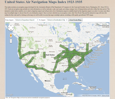
Today in the United States we can fly coast to coast in a commercial airliner comfortably in less than 6 hours. Air travel has not always been this easy or seamless. Historical air navigation techniques and practices can help us envision the beginnings of air travel and air mail, and really show how drastically aviation navigation technology has evolved in just over 100 years of flight. To help relive and appreciate air navigation from the onset of commercial flight, the University of Connecticut Libraries Map and Geographic Information Center (MAGIC) brings you an interactive index to help users identify flight routes commonly used for passenger and air mail service in the 1920’s and 30’s. Back then there was no such thing as hitting the direct button on your Garmin and following the pink line to your destination!
The creation of this historical aeronautical navigation chart index provides pilots and aviation enthusiasts with a glimpse into how far air navigation methods and technology have progressed since the inception of powered flight. The University of Connecticut Map and Geographic Information Center (MAGIC) includes an extensive collection of navigation charts spanning in time from 1923 through 1935. There are more than 150 charts in the collection that span across the contiguous United States. Pilots at the time used the charts for navigation purposes including airmail delivery and the first commercial passenger service provided by the Ford Tri-Motor aircraft. Ford Motor Company produced an artistic route overview map in 1928 that is contained in the collection.
When the collection was digitized by the University of Connecticut Libraries in spring of 2011, Trevor was in the process of trying to procure an internship as part of my undergraduate major in Geography for fall 2012. When Trevor mentioned his interests and background to the staff at MAGIC, immediately a project was identified to georeference and create an interactive index for the collection of historical air navigation maps from MAGIC’s collections. The project focused on developing an interface for fellow pilots and enthusiasts to access and appreciate these relics of aeronautical navigation technology that bear many striking resemblances to aeronautical sectional navigation charts of present day. In preparation for this project, the historical navigation charts would be digitized using a high-resolution camera in multiple sections over the summer of 2011 to be later digitally reassembled. For more information on the digitization equipment utilized by the University of Connecticut Libraries visit: http://digitalcollections.uconn.edu/equipment/equipment.html.  
In the fall, Trevor began the process of creating mosaics of two images captured for each chart. After a mosaic was created and the complete charts were saved in raw uncompressed TIFF format, they were ready to be georeferenced. Georeferencing the image provides a way for each map to be overlaid within GIS software applications, Google Earth, Google maps and other applications in a spatially meaningful way. Trevor Utilized Adobe Photoshop to convert the JPF files from the digitized original photographs to TIFF images, and then created mosaics of the full charts. It was a slow and tedious process and had to be done with great care so that the georeferencing would go smoothly and with minimal error. It took an entire semester and a few weeks of another semester to complete the mosaicing and georeferencing of each image. Once this was completed the files were digitally archived.
To make these maps accessible to the public, an index was created to enable users to easily locate and identify maps for specific routes. To create this index, ESRI’s ArcGIS ArcMap 10 software was used to create a shapefile based on the geographic extent of each map. Then this shapefile was converted to a Keyhole Markup Language (KML) file for viewing with Google Earth and Google Maps. The KML file was then uploaded to Google Fusion Tables and joined to a spreadsheet that included links to each air navigation map. To ensure the index interface was easy to use, the Google Fusion Tables map interface was customized using the Google Fusion Tables API to develop custom dropdown menus and to refine the appearance of the map. This index will enables users to locate and download full-quality georeferenced images of each map and will be the first time that these historic air navigation charts will be easily identified and made available for public viewing and use. 
Interface for viewing air navigation maps in the MAGIC collection