Web and mobile application development at the Census Bureau

The Census Bureau is keeping up to speed with not only different types of statistics and data, but how users and developers can access and visualize that data in more meaningful and streamlined ways.

The Census Bureau was recently named a 2013 Honors Laureate by Computerworld for development of its open data API, an application programming interface implemented in July 2012 that allows developers to take data sets and reuse them to create online and mobile apps – for more information see: http://www.census.gov/developers/

The Bureau was recognized by the magazine “for its visionary applications of information technology promoting positive social, economic and educational change.” The story will be featured in the June 3 edition of Computerworld.

Recently, the Bureau developed a new mobile app that allows users to “take the pulse of the U.S. Economy” straight from their phone! According to the Bureau:

The America’s Economy app provides real-time updates for 16 key economic indicators released from the U.S. Census Bureau, Bureau of Labor Statistics, and Bureau of Economic Analysis. Key economic measures on employment, manufacturing, international trade, retail sales, and residential construction and sales allow those who follow the U.S. economy to be the first to see whether the indicator has gone up or down since the previous report, and trends over time.


Learn more about this app by using the link above, or click one of the following to download:

AmEcAppApple
Download iPhone Version
Download iPad Version

Android
Download Phone Version
Download Tablet Version


Key Features

  • Quick overview of indicators measuring the U.S. economy
  • Detailed page for each indicator with trend data
  • Share indicators on Facebook, Twitter and via email
  • View release schedules for indicators
  • Set up notifications and custom views
Indicators
  • Advance Monthly Retail Sales
  • Advance Report Durable Goods
  • Business Inventories
  • Construction Spending
  • Homeownership Rate
  • International Trade
  • Manufacturers’ Goods
  • Monthly Wholesale
  • New Residential Construction
  • New Residential Sales
  • Personal Income
  • QFR–Manufacturing
  • QFR–Retail Trade
  • Quarterly Services Survey
  • Real Gross Domestic Product
  • Unemployment Rate

Additionally, the Census Bureau’s website is home to many different web-based mapping applications that provide excellent visualizations of data. One example is the US County Migration Patterns map, available here: http://flowsmapper.geo.census.gov/flowsmapper/map.html  USMigrationMap

or the 2010 Census Interactive Population map, available here: http://www.census.gov/2010census/popmap/

Censuswebapp

The foreign born population in the US and Connecticut

According to the Census Bureau, America’s foreign born population has undergone dramatic changes in size, origins and geographic distribution within the past 50 years.  This infographic created by the Census Bureau depicts some of the major trends and statistics. As just one example: in 1960, 75% of foreign born individuals in the US were from Europe; but in 2010 only 12% were from Europe, while 53% were from Latin America and 28% were from Asia.

Here’s a snippet:

Foreignborn

So, who is emigrating from Asia to the United States? In 1960 only 0.5 million people immigrated to the US from Asia, but by 2000 it had risen to 8.2 million, and in 2011 that number had reached 11.6 million, according to the ACS report linked to above.

Here in Connecticut, the 2007-2011 ACS data from American FactFinder shows that the total population was 3,558,172 with foreign-born individuals (both citizens and non-citizens) numbering 474,139 (+/- 5,979); thus comprising between 13.2% and 13.5% of the total population. By comparison, in 1960 the US Census reported that the total population of Connecticut was 2,535,234 and that 38.7% of that total (982,143) was foreign born with a majority (237,146) of individuals from Italy. The following visualization shows countries where foreign-born individuals emigrated from in 1960 that had numbers of emigrants higher than 20,000 individuals. Click the visualization to interact more with the data.

The other countries or areas that the Census recorded individuals emigrating from include: Norway, Denmark, Netherlands, Switzerland, France, Finland, Yugoslavia, Romania, Greece, Portugal, Asia and Mexico. There were also categories for Other and Unknown. Both Asia and Mexico now comprise higher emigration rates; but in 1960, only 645 people from Mexico came to Connecticut, and 11,786 came from Asia. The ACS 2007-2011 estimates for foreign born place of birth show that by 2011 there were 105,365 emigrants from Asia and 25,743 from Mexico. The emigration pattern has certainly changed in Connecticut since the 1960s, see below visualization for the countries in 2011 from which more than 20,000 people emigrated (including those with a MOE that causes the estimate to exceed 20,000); and unlike the 1960s, there are very few countries from which 20,000 or more people emigrated.The one country with the single highest number of foreign-born individuals in CT was Jamaica, with 34,742 individuals. In terms of regions broken down by continent, the highest number of individuals collectively came from Latin America which includes the Caribbean, Central and South America (197,224).
2011_fbp


Upcoming Webinars

The Census Bureau’s Education, Training & Dissemination Branch has scheduled several webinars over the next three months. These webinars do have a finite number of slots available, so you may want to register early to make sure you are able to participate!

Registration information and webinar descriptions are available in the upper left corner of the Training Events page http://www.census.gov/mso/www/training/training_events.html

• The Economic Census and Other Economic Programs (April 17, 1:00 – 3:30 EDT)

• Understanding Census Geography (April 18, 1:00 – 3:00 EDT)

• Introduction to the American Community Survey (April 24, 1:00 – 2:30 EDT)

• The Current Population Survey & Survey of Income and Program Participation (May 8, 1:00 – 3:00 EDT)

• Population Estimates and Projections (May 22, 1:00 – 2:30 EDT)

• Customized Searching Through DataFerrett (May 29, 1:00 – 3:30 EDT)

• How to Navigate American FactFinder (June 19, 1:00 – 3:00 EDT)

• Government Statistics (June 26, 1:00 – 2:30 EDT)

If you are unable to attend these webinars, you might also find these tutorials from the Census Bureau’s Training Resources Library useful or informative:

eLearn

US Population projected to be 315.1 Million on New Year’s Day


As we approach the beginning of 2013 you may be wondering… what will the population of the United States be on January 1, 2013. The U.S. Census Bureau projects that the United States population will be 315,091,138 as of January 1, 2013.  This
represents an increase of 2,272,462, or 0.73 percent, from New Year’s Day 2012
and an increase of 6,343,630, or 2.05 percent, since the most recent Census Day
(April 1, 2010).

In January 2013, one birth is
expected to occur every eight seconds in the United States and one death every
12 seconds.


To view the latest projected population of the United State or the World visit the U.S. Census Bureau’s population clock at: http://www.census.gov/main/www/popclock.html


Visualizing the 2012 Presidential Election

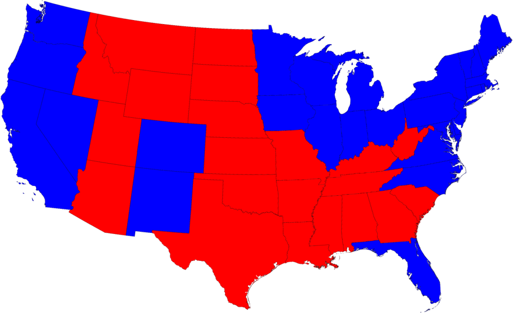
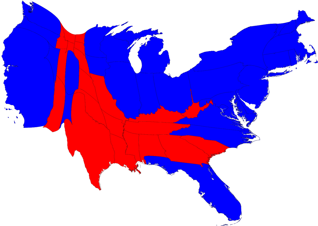
The 2012 Election is only four days away. How we make sense of the information available to us can be daunting, but can also be visually appealing. Consider first the popularity of the cartograms of the 2008 presidential election results, produced by Dr. Mark Newman of the University of Michigan. For many people, these maps evolved their understanding of effect of the distribution of the U.S. population on election results.


Polling and the Electoral College

We are well into the realm of real-time information analysis and visualization in the 2012 election. For major news sources, especially, the Internet provides an ideal outlet for up-to-the-nanosecond updates on the proverbial reams of data in the air about the current status of the election. Prior to the election, multiple polls of likely voters, along with other demographic analyses, are often combined into models that seek to predict the outcome of the electoral college. These models are well-suited to geographical visualizations, the maps of so-called ‘red states’ and ‘blue states’ (for the Republican Party and Democratic Party majority popular votes, respectively, that determine to which presidential candidate each state’s electoral college votes will be allotted).

Source: NBCConnecticut.com

The amount and variety of data now available, however, offers the opportunity for users to explore deeply into the fervent ongoing analysis in these final days leading up to the election. On the websites of many news and media outlets, users can examine the upcoming election by race (President, Senate, House, Governor), by geography (in your state and sometimes at the county level), or by polling organization. Direct links to information sources are usually available, as are the means for sharing such information through social networks. Listed below are several of the more prominent sites for exploring the 2012 election in more detail.

  • The New York Times provides an example of a relatively simpler visualization, through a standard map view, a cartogram – where the size of each state is weighted by the number of electoral votes (see below for other examples of election cartograms) – along with other groupings of possible outcomes. They also have maps of the Senate and House of Representatives races.
  • On the Washington Post, the presidential election can be explored further with maps available at both state and county levels. At the this closer level of detail, users can also examine the Post’s electoral vote projections in relation to a number of social, economic and demographic characteristics, with unemployment, income, and race/ethnicity among them. Visualizations are also available for races in the Senate, the House, and for governor.
  • At the Wall Street Journal, their election site has provided a set of visualizations similar to the Washington Post – at the state and county level, and for the Senate, House, and governor races. More interesting is their inclusion of ‘Community Type’ data at the county level, a classification system from the Patchwork Nation project of the Jefferson Institute. Based on socioeconomic and demographic statistics, the Journal visualizes U.S. counties in categories such as “Monied ‘Burbs”, “Tractor Country”, “Immigration Nation”, and “Emptying Nests”.
  • The Huffington Post aggregates a large number of opinion polls into a predictive model, providing an up-to-date outlook on the election. Users are able to go in-depth with their sources, looking at changes in the model over time and for each state. In addition, the elegance of their House of Representatives visualization is an appealing and intuitive look at the current House in comparison with projected election results.
Source: HuffingtonPost.com

  • Real Clear Politics provides a quantitatively-dense site of information on their electoral college predictions and current polling projections for the presidential and congressional races.
  • Lastly, at 270 to Win, the current election is placed in the context of all presidential election results throughout U.S. history. In 1789, George Washington won the election with 69 electoral votes, in comparison to the 34 electoral votes of John Adams.

Interactive Electoral College Predictions

A very popular and prominent feature on many election websites for the 2012 presidential election is an interactive visualization of user-selected electoral college results. Anyone can create a whole range of maps for both the plausible (and implausible) scenarios of how the electoral college will vote. The electoral college vote is a fascinating aspect

One fascinating example is VoteNight.com, embedded below. By clicking on each state multiple times, the user can change the electoral results from Obama/Biden, to Romney/Ryan, to undecided. The application automatically re-tallies the results based upon the user’s changes. More interesting, however, is the ability to examine presidential election results from previous elections – as far back as the 1932 race between incumbent Herbert Hoover and eventual winner Franklin Roosevelt – and to then predict the results of the 2012 election based upon those historical results.

The degree of reality and amount of interactivity vary between the many choices, however. An interesting way to test this is to find out which are the only two states in the Union that “split” their electoral votes between the popular election results and the Congressional district election results. (Hint: it isn’t Connecticut.)

  • On PBS NewsHour’s Vote 2012, you can choose to predict the current election results with your own selections, or visualize the result of the Obama-Romney contest based upon the outcomes of prior elections, going as far back as 1964. 
  • Politico.com only allows swing state results to be manipulated.
  • The New York Times provides their non-mapped version under the heading “Make Your Own Scenarios.
  • On the Huffington Post, as with PBS, you can base predicted results on the 2008, 2000, 1980, 1960, and 1880 presidential elections.
  • At Real Clear Politics, results can likewise be predicted from previous election results since 1972. Uniquely, though, states can be changed to the degree of predicted result, as being “solid”, “likely”, “leans” for one or the other candiate.
  • Even the federal government is in this game! At the U.S. National Archives, predictions can be based on the 2008 and 2004 elections.
Check with Outside the Neatline again in the coming days and weeks for more information on the 2012 Election, in Connecticut and across the country.

2012 Economic Census Website Launched for Businesses and the Public

To facilitate successful completion of business surveys, while also helping the media and public to understand the importance and impact of the Economic Census, the Census Bureau will be hosting a series of Webinars throughout the survey period this fall. The first in the series will be held on Thursday, October 11, 2012 at 1pm EDT, and will help prepare businesses for receiving and completing the survey during the coming months. It is geared towards the members of organizations that will be involved in completing their survey.

Every five years, the U.S. Census Bureau conducts the Economic Survey to assess the state of the nation’s economy and businesses. The survey involves the over four million businesses that operate in this country, regardless of industry, organization size, or location. Information gathered through this survey informs both individual business decisions and economic policy at all levels of government.

In anticipation of the latest economic census being taken this October, November, and December, the Census Bureau has launched business.census.gov, an all-encompassing resource gateway for business owners, economists, policy analysts, chambers of commerce, the media and the general public. There, they will be provided the opportunity to participate in the survey, to make use of past Economic Census data, or to simply better understand the economy of one’s own community. The Snapshots Center provide quick access to state- or industry-specific briefs on economy activity.

2011 American Community Survey Release Schedule

The U.S. Census Bureau schedule for the release of the American Community Survey data for 2011 starting in September of 2012 is now available. Included below are details on each release so be sure to make your calendars as this data will be available via the American FactFinder website once the data is released.

2011 American Community Survey — The Census Bureau plans to release one-year estimates from the 2011 ACS on Thursday, Sept. 20, 2012. The ACS produces estimates for numerous social, economic and housing characteristics including language, education, the commute to work, employment, mortgage status and rent, as well as income, poverty and health insurance. Embargo subscribers will have access on an embargoed basis to the estimates beginning Tuesday, Sept. 18. Estimates will be available for the nation, all 50 states, the District of Columbia, Puerto Rico, every congressional district, every metropolitan area, and all counties and places with populations of 65,000 or more. In June 2011, the ACS annual sample size was increased from 2.9 million to 3.54 million addresses, which should result in an improvement in the reliability of the estimates.

On Sept. 20, the Census Bureau will also release the first in a series of short briefs that analyze a wide range of topics. Additional briefs will follow. Each year, the Census Bureau varies the topics of these short briefs.

2009-2011 American Community Survey — The Census Bureau plans to release the three-year estimates from the 2009-2011 ACS on Oct. 25, 2012. Embargo subscribers will have access to the estimates up to 48 hours in advance of the public release. The estimates will cover all geographic areas with populations of 20,000 or more. They will include the first set of three-year estimates for field of degree of bachelor’s degree holders.

2007-2011 American Community Survey — The Census Bureau plans to release the five-year ACS estimates covering 2007-2011 on Dec. 6, 2012. Embargo subscribers will have access to the estimates on Dec. 4. These estimates are available for all areas regardless of population size, down to the block group.
The ACS Public Use Microdata Sample (PUMS) files for each of the three sets of statistics will be released one to two months after each public release.

Overviews provided by U.S. Census Bureau

Data Visualization Gallery from the U.S. Census Bureau

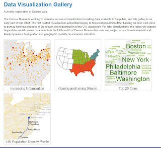
Each week the U.S. Census Bureau is featuring a new data visualization on the census.gov website. These visualizations will highlight various datasets and variables provided by the U.S. Census Bureau with a new visualization posted each week.

Explore visualizations on the following:

Explore the most recent data visualizations from the U.S. Census Bureau at: http://www.census.gov/dataviz/

U.S. Census Bureau API now available

The U.S. Census Bureau has released an Application Programming Interface (API) to enable developers to create applications for the web and mobile platforms to enable users to explore census data via customized interfaces. The API enables developers to access the 2010 Census (Summary File 1) and the 2006-2010 American Community Survey (ACS) 5 Year Estimates allowing users to view data on population, age, sex, race, Hispanic origin, households, education, income, employment, commuting, occupations, housing, and more.

The U.S. Census Bureau has developed an “App Gallery” which will feature applications developed using the API. Currently there are two examples in the App Gallery that provide examples of the potential for using the Census API. These applications include:

  • Age-Finder – enables users to count population for single years or for a range of customized age ranges. 
  • Poverty Map – provides poverty statistics from the American Community Survey for New York state and includes an visualization of margin of error and more.

Want to explore the Census API and develop your own application? Developers can access the Census Bureau API at: http://www.census.gov/developers/.  Have an idea for an application using the API? Share your ideas through the Census Bureau’s Developers Forum.

Try out the Census Bureau API and if you create something be sure to share it with the U.S. Census Bureau. Enjoy!

Quarterly Survey of Public Pensions – First Quarter 2012

Quarterly Survey of Public Pensions for 1st Quarter 2012 Now Available

This U.S. Census Quarterly Survey of Public Pensions (formerly known as the Finances of Selected State and Local Government Employee Retirement Systems Survey) provides national summary statistics on the revenues, expenditures and composition of assets of the 100 largest state and local public employee retirement systems in the United States. These 100 systems comprise 89.4 percent of financial activity among such entities, based on the 2007 Census of Governments.

This survey presents the most current statistics about investment decisions by state and local public employee retirement systems, which are among the largest types of institutional investors in the U.S. financial markets. These statistical tables are published three months after each calendar quarter and show national financial transactions and trends for the past five years.

To view this data, summary report, and download the data visit http://www.census.gov/govs/qpr/.